Saturday, April 2, 2022

3-to-Inspire with Ingunn


Happy Saturday, friends! For my 3-to-Inspire this week, I want to focus on keeping things clean and simple. I was hit with a pretty bad case of RMS (Reverse Midas Syndrome, where everything I touch turns to crap) this winter. RMS usually requires some time off, which I took, and it also helps to flip through old albums to remind myself of what I love about this hobby. 

This time, my RMS was definitely based in design – I felt like everything I made was ugly, especially compared to what I was seeing online from other scrapbookers. After looking through my albums, I noticed that the pages I loved the most (at least design-wise) were super simple, with the photos in focus and just an embellishment or two to add interest. When I try to be all cool and fancy with layering of die cuts, the way I see so many scrapbookers I admire do, it just doesn’t look right. And you know what? That’s okay. I can love those pages from afar, while keeping my own stuff ridiculously simple. So this one is for us clean and simple gals, which means I’ll keep my three categories this week more vague than usual - instead of listing specific products, I'm writing a recipe for a clean and simple Life Crafted spread:

(1) Your favorite embellishment from a kit to highlight 

(2) A striking title

(3) An additional embellishment to make your title look less naked


In order to keep the focus on my photos here, I spread my main photo across the two pages (the measurements of this entire spread is 10.5in x 8.25 in), leaving space for journaling underneath. I added an instax page protector in order to include some of the underwater photos we took while snorkeling around the cay, and left a white border around them to help them stand out (and have room for captions).


I left one pocket empty so that I could highlight my very favorite piece from the Travelogue kit – this puffy circle designed by Elif Sahin. I just adore the design of this thing, and I am trying to be better at not hoarding my favorite pieces. I added another sticker in the same size to the back of the page protector, and, happily, the color matched the coral in one of the photos. Woot!


Next, I added the my title using the beautiful puffy letter stickers from the kit. This color is so perfect for beach vacations!


One of the chipboard stickers matched my title perfectly, so I adhered it on top of the title. And then I stopped. No more products! And it’s okay. Bonus: now my kit will stretch so far!


Thanks for hanging in there with me as I attempt to scrapbook therapy my way out of Reverse Midas Syndrome – if you’ve been feeling the same way, try to look through your albums to remember what it is about scrapbooking that makes you happy!


Friday, April 1, 2022

Life Crafted Inspiration with Amy


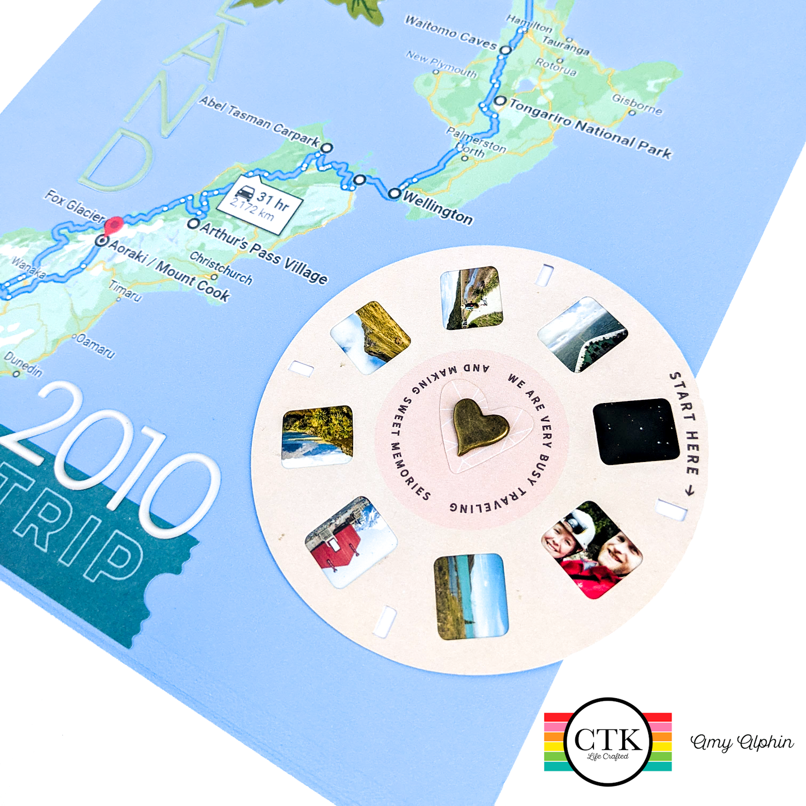
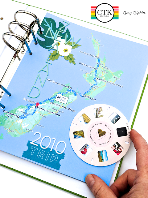
Hello everyone and welcome to April!  I am super excited to introduce not only the new Travelogue kit for this month, but also the BRAND NEW, totally awesome, get-'em-while-they're-hot 6x8 Life Crafted albums!  I love working in the 6x8 size and am thrilled that they will be joining the Citrus Twist Kits family.  For this week's Life Crafted Inspiration, I created the title page for a travel album I am making of a trip my husband and I took to New Zealand way back in 2010.  I will be using the aforementioned new 6x8 album size in Leaf.


This layout was inspired by one piece of diecut ephemera: the viewmaster. As soon as I saw it, I knew I wanted to use it on my title page, and I wanted it to "work", as in spin freely. I also decided I wanted it to be a literal highlights reel from our trip, so I picked the 8 main stories I wanted to tell in this album and chose 8 photos that related to those places and stories.  The eight pictures and stories also correspond to the locations marked on the map.  

To assemble the piece, I resized the pictures in Photoshop and created a collage on a 4x6 canvas so they would all print on one 4x6 page.  I then trimmed them and laid them out so that when the diecut was turned, the image on the right would always be facing up.  (This was slightly more challenging than I initially thought, but I got there in the end.)  The images are slightly larger than the opening so that there was a bit of "wiggle room" to center image, and to provide an anchor for the photo.  Finally, I glued them all down and voila, a "working" viewmaster!


To make the element interactive, I punched out the center hole, and backed it with a thick layer of cardstock to give it a bit more heft and to protect the photos.  I then added a heart diecut, punched holes through all of the layers, and attached it all together with a decorative brad.  


For the rest of the layout, I used two different puffy alpha stickers, and other elements of diecut ephemera.  I like how both the alphas and the ephemera match the map perfectly!

I am very excited about how this layout came together.  It is always rewarding when a design idea from your brain translates well onto the page.  I am looking forward to continuing to dive into this kit, and to keep telling stories of travel!  If you try the spinning viewmaster, be sure to tag me on Instagram @alphins_little_corner and have a great weekend!


Sunday, March 27, 2022

Sunday Sketch with Lory


Hello everyone! Happy Sunday!

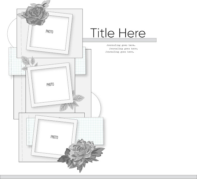
It's Lory here today to share the new Sunday sketch to start the day with stories and creativity! Everytime I have this kind of assignment I tell you that sketches are perfect to have an idea and to place everything you love in a page.

This is this Sunday sketch


I wanted to create a page on a white background and use the journaling cards in a different size, the size I decide,  the digitals perfectly fit your own ideas.

So I started creating my page in a digital version to place and think what I would to insert, to be true I have a big difficult to choose what I want to use, I love every single piece of Citrus Twist and it's hard to choose. 

Ok let me show my whole page;)


Tickets, stamps, chipboard stickers, journaling cards, every single piece is amazing! I could stay hours to look through the embellishments and stamps and digitals.

So I mixed up the journaling cards and the patterned papers from January, February and March kits.

At the end I added tickets and little phrases stickers.

Here some close up pictures:)


Hope you like it and you will be inspired to create your sketch :)
Have a wonderful week.

Love, Lory


Saturday, March 26, 2022

3-to-Inspire with Nathalie


Hi there!

Nathalie with you today bringing you a new idea using this week's 3-to-Inspire prompts.   Here are this week's prompts:

  1. Use multiple photos
  2. Create a List
  3. Stamp your Title

And here is what I have created with the Back-to-Basics release, digital files, and the soon to be release This Month 6x8 Stamp set.


I started by using one of the TN papers from this month's digital collection to create the background of the page.   


I sized my photos to Instax size ones, and set them on a grid patterned in the right side of the spread. Here I have added a few embellishments from the Back-to-Basics Floral Ephemera.  IN addition, I added  the small puffy circle numbers to the corner of each photo.


I matched the numbers in the photos with the ones in the Digital Elements cut apart  page.  I set them on the left of the page, and then added my journaling to the right of each number.  

For the title, I am using the soon to be released (April 1st) This Month Stamp set to create my title on top of the list


I hope this inspires you to check the prompts and used them to create a project of your own.  Remember to share your projects with us;  we love to see what you create!


XO


Friday, March 25, 2022

LIFE CRAFTED INSPIRATION WITH KATARINA


Hey CTK friends!


Today I'm back with another Life Crafted inspiration and this time I used the March Back to Basics release together with a little kit that I curated from my CTK shop favorites. In early March we spent a couple of days in the mountains. The boys enjoyed some skiing, and since I am shortly after foot injury, I used a cable car to get up there (and down too) and enjoyed some winter sun. As a good memory keeper I took a couple of selfies and documented these happy moments in my Life Crafted album.


For my background I used two sheets of a subtle patterned paper from the Back to Basics digital TN papers. I also used the papers together with the Back to Basics Digital Journal Cards for the big word SUN which is a part of my title. I sketched the letters on the papers and fussy cut them out. Then I used another darker paper from the Hustle & Heart Patterned Papers as a second layer to make my title pop off the white background. To add more interest, I hand stitched through the centers of my letters with embroidery thread of corresponding color. I used the Back to Basics White Puffy Alphabet to finish my title.


When I design my layouts I like to use repetition to make both sides of the spread look coherent. This time I used the same background paper, I backed my photos with the same grey patterned paper, with each of my photos I used one of the pretty Best Day Tiny Word Cardstock Stickters, and I also repeated the colorful leaves from the Back to Basic Florals and those super cute clouds from the Back to Basics Chipboard Stickers. 


There is also a perfect travel themed Daytripping stamp set in my kit this month and I just had to use it to add some more details.


As a finishing touch, I added a bunch of embellishments and enamel dots.


I hope I inspired you to spend some fun time with your Back to Basic goodies or search the CTK shop to maybe create your own kit from your shop favorites. It was so much fun and I really love how my Life Crafted spread turned out!

Thanks for stopping by today and see you next month!


Saturday, March 19, 2022

Sunday Sketch with Diane


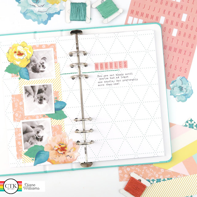
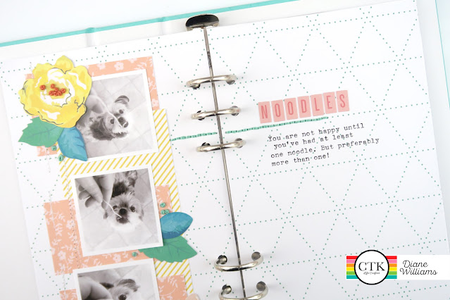
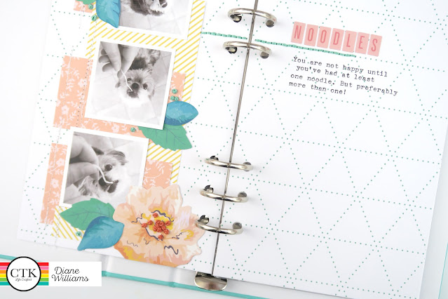
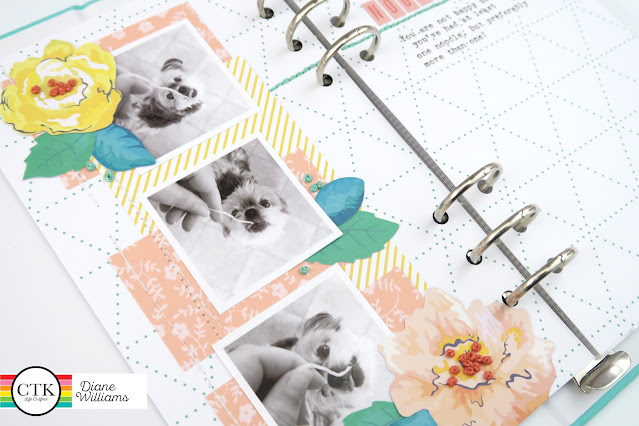
Hi everyone, Diane here with your Sunday Sketch challenge! I cracked open a brand new Life Crafted album today and I thought I would start my album with a nice and easy page. And when I want something easy, I always start with a sketch!

So here is today's sketch:


And here is how my spread turned out:


For today's spread, I used digital TN papers from the Citrus Twist store. I used Photoshop to resize my base pages to 5 x 8.25 inches and printed them on textured card stock. Then I printed off a few other patterns as smaller pieces I could use for layering.


When I have used most of a die cut pack, I usually split the remaining pieces into categories such as florals, tiny words, hearts etc. Which is exactly how I managed to find all the pretty florals for this page without pulling out multiple packs of die cuts!


I added a bunch of french knots and stitching to this page to add a real handmade feel, this is my biggest tip when working with digitals. Adding some sort of texture other than paper helps to stop it feeling too flat.


Here's a look at the process this spread took ...


Thanks for stopping by today and I'd love to see any page you create using this challenge so don't forget to tag me and share over on the Citrus Twist Facebook Fan page!

3-to-INSPIRE with AMY


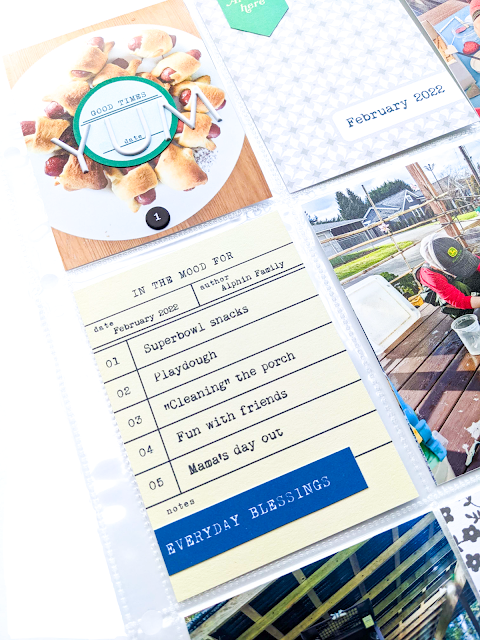
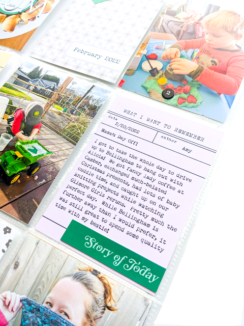
Hi everyone!  I'm excited to share this week's 3-to-Inspire using the March Back-to-Basics kit to create a February highlights layout in my 9x12 Monthly Project Life album.  Each month, I create a layout showcasing what is going on in our family.  I look through my photos from the month and decide what stories I want to tell.  Some stories warrant their own dedicated layout, but I always make sure to include at least one page that highlights some of the smaller stories in our lives as well. 

For this page, I used:

1.  Digital Journal Cards and Digital Elements

2.  Back to Basics Puffy Word, Phrase & Number Stickers

3.  Back to Basics White Alphabet Puffy Stickers


This month, I used two of the Digital Journal Cards to hold my journaling for the month.  The yellow one was my jumping-off point for this layout, because it is numbered 1-5, so I knew I would use 5 pictures to tell 5 stories.   I used the pink one to tell a slightly longer story about one of the 5 I mentioned in the previous card about a solo Mama trip I took to visit a dear friend.  I added the Digital Elements to three of the cards to have the repeated rectangle shape throughout the layout and added the circular embellishment over the plate of Super Bowl snacks to have a repeated circular shape.  


I used the numbers 1-5 from the Back to Basics Puffy Word, Phrase & Number Stickers set to label the 5 pictures that corresponded to the 5 highlights from the yellow journaling card.  This helps to give the page a cohesive flow, and allows the photos to be labeled, without taking away from the photos themselves.  Finally, I used the Back to Basics White Alphabet Puffy Stickers to add the word YUM to the photo of our snacks, because snacks are yummy.  


I really enjoy the versatility of this kit, and how it can be used to tell a multitude of stories.  I hope you enjoying playing and creating with it.   Please be sure to tag me in your Instagram stories when you do so I can see your pages!  

Have a great weekend!