Hello everyone!
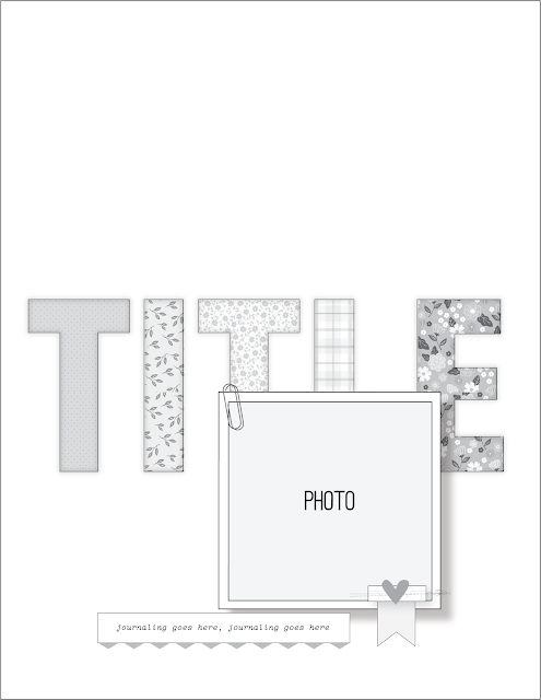
Nathalie with you today to share a bit of inspiration featuring this week's sketch and a mix of the latest releases. We always love sketches around here, as they are a great starting point for your projects, especially when you have little time. Let's take a look at this week's sketch
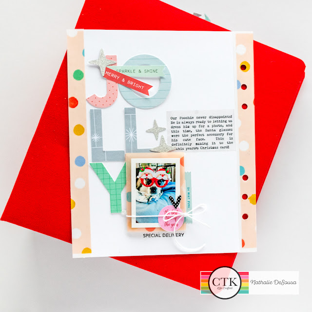
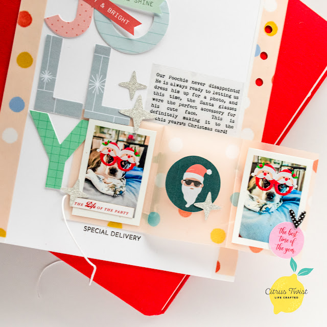
I love the large title and negative space in this spread. So, it gave me the perfect idea to create a 6x8 Life Crafted layout with a bit of an interactive twist.
I used a bit of each of the new collections for this spread, as I wanted a colorful title. But, let's take a closer look at the page.
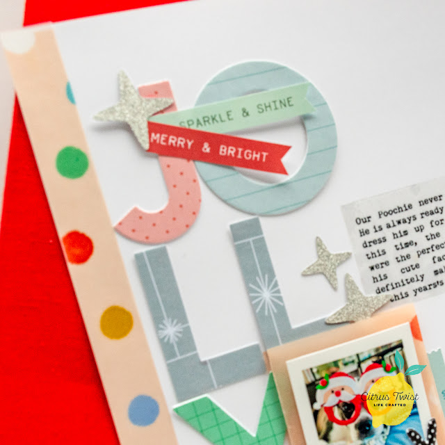
I love the large title, but needed the extra space to fit it horizontally on my page. So, I flipped it 90 degrees so the title sits vertically on my page. Using an alpha die from We R Makers, I cut patterned papers from Oh What Fun kit, Year in Review Digital kit. Once I set them in place, then it was time to add my photo,
I decided to move my photo to the bottom of the page, as it fit the title work better. However, I am "overlapping it over some of the alphas" as in the sketch. I tried to keep the embellishments location closer to the ones shown in the sketch. However here is where the fun on this page takes place!



No comments:
Post a Comment