Thursday, June 30, 2016

July kits sneaky sneaks

Hello everyone!

It's Mira here again to share a few close-ups of projects made by Citrus Twist Kits talented DTs with July Kits! I am amazed by the Girls' works, what about You? Let us know what YOU think in the comments!

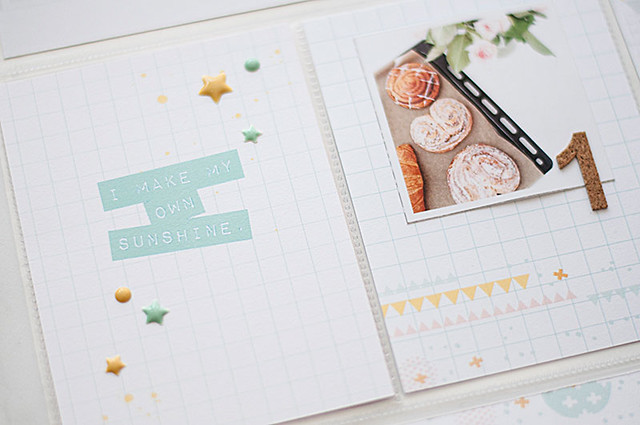
Here are some very nice sneaky pics from Emma who used elements from Add-on, Sprinkles Embellishment and GraceBox Kits to create this scrapbook layout:


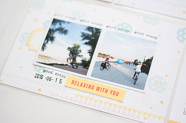
And another shot from Emma. This project was made with Main and Sprinkles Kits:


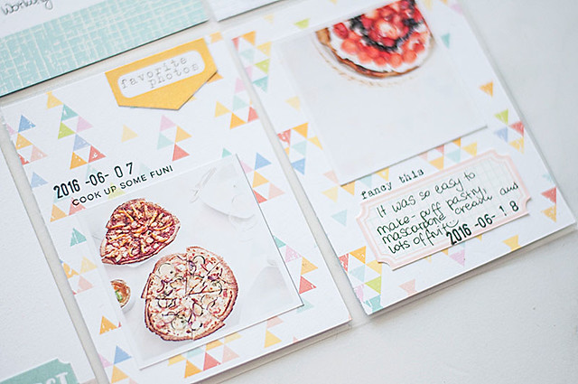
Here are some details of one of the lovely pocket pages created by Diane with Pocket Life Kit:


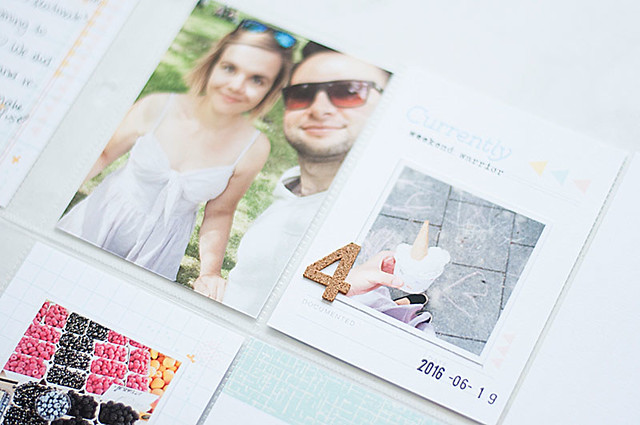
Another Pocket Life Kit sneaks with some bits from Embellishment Kit from me myself:


And another sneak is coming from Bonita Rose, who was working with Grace Box. Just take a peek:


I hope You like this selection! We really can't wait to share it all with You!
Have a great day!

Mira

Wednesday, June 29, 2016

Titles in Your Pocket Albums

Hello Citrus Twist Kits fans!

It's Mira here today with a few of my Pocket Page Scrapbooks that I created with June "Capri" Pocket Life Kit together with some bits and pieces from July Sprinkles Kit!

In today's post I'd like You to focus on exactly ONE element of a pocket page which is: TITLE!

Do You add titles to Your pages? I mean, some of us work with PL in a weekly manner, and probably week numbers are treated as a title in such approaches... but I mean something else here. I mean title like we do in a standard scrapbook layouts. I mean key words describing Your page to draw attention in a specific direction. Do You add them to Your pages?

Please, let me show You how fun this can be!

In the past I was completely Layout-oriented person and when I discovered Pocket Page Scrapbooking I suddenly stopped creating regular pages. And stopped adding titles to my works. But I am huge fan of alphabets (Just look at the one from June PL Kit!!! Isn't it gorgeous!? I love it!!!) and I missed huge titles very much!

So I started adding them to my Pocket Pages!

Just look at my June spreads to see a few ways how You can add this fun effect to Your pocket pages:
In this first page I used Pink Paislee chipboard alphabet from PL kit to say: This is my Best Best Best Best Friend! And look, now we have another generation of soon to be friends, growing up :)

In my second page I created two titles. The first one is the word SLOW from the picture on the left. It's a cover of a magazine that I recently discovered and it resonates with me a lot, so I used it as a first title in this page. Then I have another one on the right - the collage of words made with various elements - by this I wanted to extend the first title and say what changes have been happening in our life lately.


Another page was featuring our friends and their visit. The word "visitors" is too long to put into one pocket, but I managed to add it anyway. I simply placed some letters in another pocket.

And here two more examples of my PL pages where I added a title:


I often add titles on top of a single PL card which is simple in design - it makes them easy to be found on the page, and they attract my attention easily, but You know what?
You can go crazy! Put the titles on top of Your pictures, place each letter in a separate pocket or use a colorful pattern paper as a background for Your titles! Sky is the limit!

If You happen to add titles to Your pocket pages, please share them with me! I'd love to see what You created and I'll be happy to try some new ideas!

Thanks for stopping by,
MJ

Tuesday, June 28, 2016

Tuesday Tutorial – Try brush script to create your own filler cards

It really is quite simple to create your own filler cards and tags using the gorgeous pattern paper and journalling cards from the Pocket Life kits and your own brush script lettering.

First decide on a phrase or word you'd like to use (or a few) and write them out on paper so you can check your spelling. There’s nothing worse than scripting something beautiful and then realising it is spelt wrong!


Then grab your brush and take out some scratch paper to practise on. You’ll want to write out your phrase a few times before starting on your final card. I usually try 2-3 different versions (or more) before I find one I’m happy with. You can use water-colour paint, mists, inks – any liquid medium should work just fine. You could even use a brush marker and skip all the mess (but where's the fun in that!).


Once you’re happy with your scripting style, you can start on your final card. Take your time and enjoy the process. You'll need to let go of perfection and embrace the messiness that can sometimes occur. But, thats what life’s all about, isn’t it?!


Or, if you REALLY can’t embrace the mess, you can take a less risky route and scan or photograph your practise sheet and print them onto your card. Viola, perfect!


Tips for beautiful brush script:

  1. Practise, practise, practise! This is my number one tip for a reason. Like any new skill, the more you practise the better you will get.
  2. Try a variety of different mediums and brushes until you find something you feel comfortable and confident with.
  3. Find and embrace your own style. Classes and inspiration from Instagram and Pinterest can be helpful for finding styles you like but embracing your own style will always give you the best results.
  4. Just give it a go, there really is no right or wrong!

I hope you'll give this a go and I'd really love to see what you come up!

Monday, June 27, 2016

Creating with the "Away" Add-On Kit

This month I got to create with the fun "Away" add-on, and as the name suggest, it's the perfect choice for scrapping those travel pics! I've used it on this Kraft base layout, documenting my daughter's 4 day walk through the Tasmanian west coast wilderness. 

I've started with a mixed media background of gesso, mists, ink and graphite..


and added some hand drawn leaves and script in white gel pen


On this page, I've opted for a more simple design, added sections of woodgrain card stock and the patterned papers in the kit, along with part of the packaging from the Cocoa Vanilla paper ephemera


I'm loving the texture in the fabric tag!


To finish, just a few splats of the mustard colorshine..


My final project is a fairly similar design on a 8.5 x 11" scale, once again featuring the beautiful nickel woodgrain card stock, along with a few embellishments, alpha and journaling tag (from previous CTK printables)

Utilising the packaging here again, I've incorporated part of a glassine bag, which I coloured with distress stain, and embellished with a couple of hand-cut leaves and a barcode..


Did you manage to get your hands on the Away Add-on before it sold out? I'd love to see how you used your kit if you did, please share your creations in our gallery and Facebook group!

Gina x
SaveSaveSaveSave
SaveSaveSaveSave
SaveSave

Sunday, June 26, 2016

Sunday Sketch

Happy Sunday Sketch Day!!

Brooke here to share some sketch inspiration to hopefully get you making something today!  Here's a look at this week's sketch...


Immediately, I'm intrigued by the grid column behind the photo and know I'll use this inspiration as my main design element.  Here's what I came up with...


I thought it would be fun to incorporate collage paper art into this project.  I went with random, hand-cut shapes in a loose grid column to create a playful and carefree feeling...perfect for these photos of my 6-months old niece, Riley.


Originally, this was a 9x12 layout.  But, I went a little overboard and the column ended up being so wide that it almost took up the whole page.  Not wanting to cover any of the elements up with a photo, I decided to add on a 3-inch piece of patterned paper to make this a 12x12 layout again.  This allowed additional space for photo placement and journaling.


Once I had the photos placed, I added in the journaling, silver hearts and the chipboard title to complete the page. 


***Now it's your turn!*** 


To play along with this week's Sunday Sketch Challenge, create a layout based off of today's sketch, upload it to the gallery with today's date (6/26) in the title, and you will be eligible to win a $5 gift certificate to be used in the CTK Store!

Happy crafting!

Saturday, June 25, 2016

3 to Inspire


Hello! Michelle here with this week's "3 to Inspire" challenge!

Your take on this challenge can be a layout or a PL spread and you must include all 3 prompts on your project. This is what I have for you today:

1. Document a road trip or adventure.
2. Incorporate paper strips.
3. Add some mist or paint.

Here is my take using the June "Away" Add-On Kit:


This was such a fun challenge for me! First off, I had been saving this fun picture that I took on our way home from picking up our new truck and the colors in this kit were just perfect for it. Using paper strips in my project were actually a really great solution to incorporating several of the pattern papers that were pretty bold and busy. The bottle of Heidi Swapp Color Shine that is included in the Add-on Kit was the final touch.


Now it's your turn! Use the three prompts to create your own project, share it with us here in the gallery , and you will be eligible to win a small prize from the CTK StoreMake sure to include the date of the challenge in the title of your gallery submission!  Can't wait to see what you create!

Michelle

Friday, June 24, 2016

Pocket Life Friday - Use some numbers as your composition base!

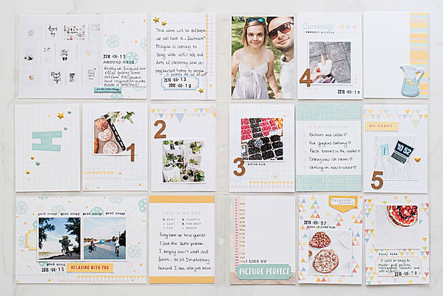
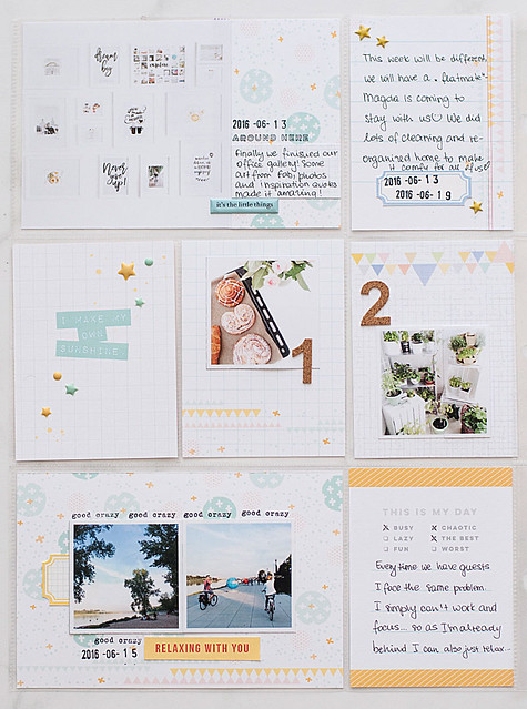
Hello on Friday! It's Kasia here with another pocket pages inspiration (and a sketch of course!) made with the gorgeous June Capri PL kit and some bits and pieces from sprinkles and embellishments kits!

PL-week24-main
Probably you know by now that I love when my pocket pages are light, happy and cheerful - I always start with building a base of whatever white elements I can find - luckily there were plenty of them inside Capri Pocket Life kit! Wohoa!

When I looked through my photographs from that week I noticed I only have pictures taken with my iPhone camera - it's ok though, I don't strive to use only camera taken photos for my albums. All the pictures I picked have been already edited for instagram with A Color Story app - it's my go to editing app these days! 


PL-week24-left

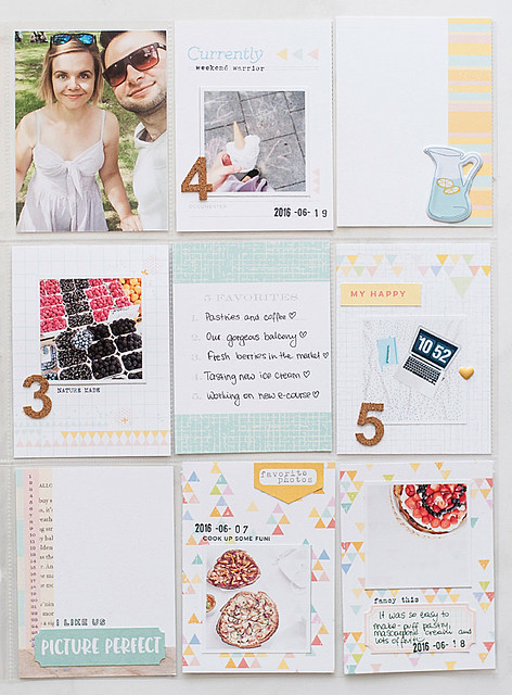
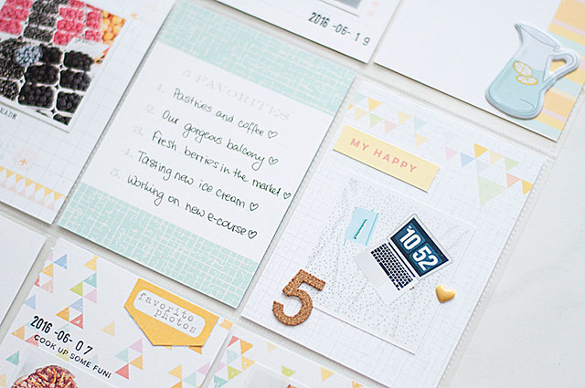
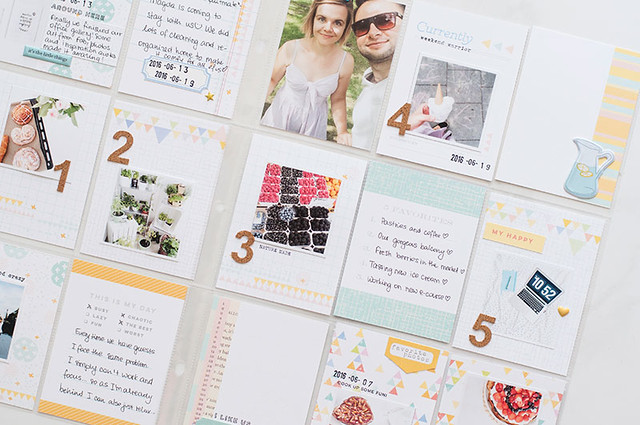
When I started working on my pages layout I got totally inspired by a 3x4 card from the PL kit  which says "5 favorites" - I decided to build my composition around this card's theme. 

PL-week24-right

I numbered my photos from 1 to 5 and wrote the corresponding journaling on the card. It's a fun way to change things a bit and higlight some favorites from here and now! I'll definitely repeat this trick some time soon!

mapka-czerwiec-CTK

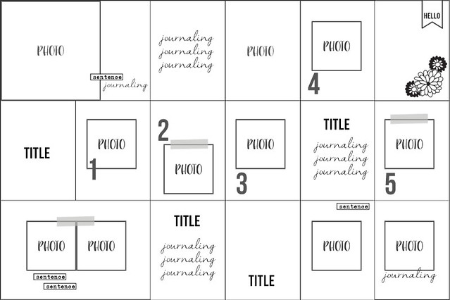
I prepared a simple sketch for you showing the bones of my spread. It's made with 9x12 album in mind but you can easily recreate it for another format. The sketch will allow you to create a well balanced and airy entry to your album - just follow it, especially if you also love to use your square, instagram pictures!


Below are some juicy details for you for further inspiration how to play with this month's kits.

PL-week24-det6


PL-week24-det5


PL-week24-det4


PL-week24-det1


PL-week24-det2

And here you can see once again my list inspired pages. Using the numbers helps to guide the eye through the page and keeps everything nice and organized. I challenge you to try this technique in summer!


PL-week24-det3

I hope you enjoyed today's post! Have a wonderful and creative weekend!

Thursday, June 23, 2016

Fast Scrap: Summer Layout With Evelyn


This time I (evelyn) wanna share how to create fast scrap summer layout using alpha sticker and some pattern as a background. It's easy and fun. I will share step by step so you guys here can scraplift it.

Step1: Place the alpha sticker right in the middle of the paste. You can cut the banner of the alpha if you don't like it.


Step 2: Place some pattern papers which has same color combo with the alpha sticker. You can do simple layering with pattern paper.


Step 3: Paste the summer photo that you have right in the middle of the patter papers.


Step 4: Cut a label and paste it to the right side of the page. You can do stamping technique this time using the stamp set that you will get in the main kit.


Step 5: Decorate the photo using some embellishments that you like around the photo.


Step 6: Last but not least don't forget to do hand journaling and write down your memory.


Easy right?! Don't forget to print out your summer photos and scrap it.