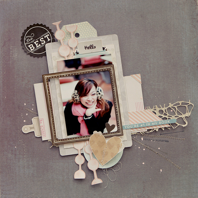
Hi it's Sandy with my favourite layout created using this month's Main kit, Pattern Paper Add-On kit and Embellie Kit. The only thing not from the kits is the background cardstock.

This is one of the rare occasions when I didn't plan or sketch out my design, instead I just gather all the grey papers and start layering beneath the photo. Then I use pops of soft colour to create a series of visual triangles around the framed rectangle of the photo. There's a pale blue triangle that leads the eye from the title (The Best) down to the subtitle (You're #1).

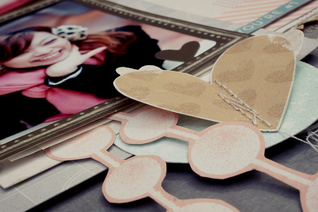
Another less obvious triangle is formed by repeating the heart-shaped motif. By placing a fussy cut brown heart right under the chocolate frame, I extend it's boxy shape into an upside down triangle, an illusion helped along by the diagonal line of my cousin's elbow in the framed photo.

A more obvious design element is the use of lines that converge on the photo. I start with these fussy-cut polka dot garlands radiating out vertically from the framed photo. Then I add zig-zag machine stitching along the horizontal axis. A length of Prima mesh trim (using the reverse side as gold on the front is too glittery against this matt colour palette) reinforce this line and lend a bit more texture to the page.
I hope you are enjoying working with your September kits and look forward to seeing your pages in our Gallery.
I hope you are enjoying working with your September kits and look forward to seeing your pages in our Gallery.


Gorgeous layout and gorgeous girl in the picture Sandy! :)
ReplyDeleteThanks April, it's always fun scrapping about my best friend
ReplyDelete