Sunday, June 26, 2022
SUNDAY SKETCH with Suzanne
Saturday, June 25, 2022
3-to-Inspire with Patricia
Hello CTK Friends! I'm super excited to share a 3-to-Inspire with you today using the new 49 and Market Kit! I had my eye on this kit as soon as it was in the shop, and it doesn't disappoint! This kit is filled with so much 49 and Market as well as exclusive papers from CTK to complement. This is a great one to have in your stash as you will find yourself reaching for the colors and the texture for all of your scrapbook project.
- Use a cut file and back only part of it with pattern paper, then use the positive solid cut outs to re-insert. Before reinserting them, add stamping to them.
- Create motion by using the transparent leaves, butterflies, chipboard, and die cuts from the kit.
- Fussy cut images from the CTK exclusives papers that complement the kit.
Friday, June 24, 2022
LIFE-CRAFTED FRIDAY WITH NOLANA
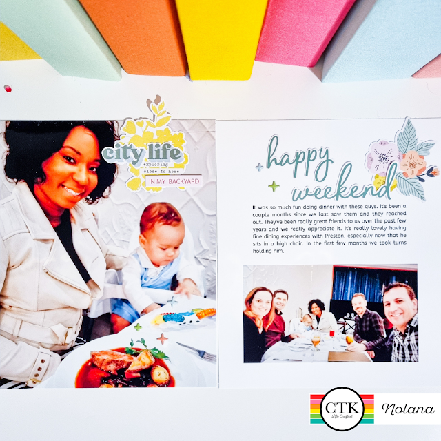
So happy to be on the blog today for Life-Crafted Friday. I do hope that you're looking forward to the weekend as much as I am.
I am so enjoying working in my 6x8 Life-Crafted album. The original size holds a very special place in my heart but the 6 x 8 size has always been my first love.
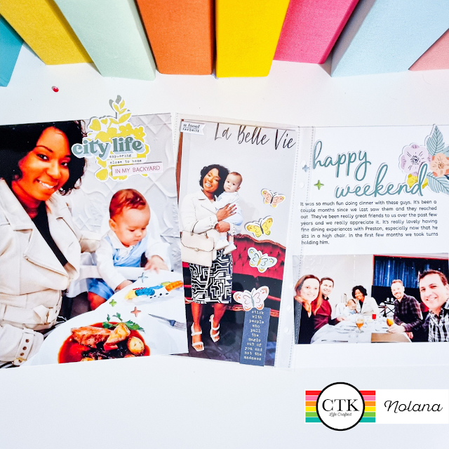
I was so excited to create this spread using the June Explore kit - I am sure most of us love exploring and for this spread I documented our recent trip to our favourite French restaurant. It's a local favourite so of course I had to use that puffy sticker in my spread.
Sunday, June 19, 2022
Sunday Sketch with Lory
Saturday, June 18, 2022
3-to-Inspire with AMY
Hello weekend crafty warriors! Today I am sharing the latest layout in my New Zealand travel album. This is a double 6x8 layout with a 3-Pocket 4x3 plus Journal Spot page protector in between to hold even more photos. I wanted to challenge myself to use my stamps in a different way in this layout, and I hope you try it too!
Today's 3-to-Inspire Challenge:
1. 4x6 Tiny Words Explore Stamp
2. Life Crafted Explore Die-Cut Ephemera
3. Citrus Twist Explore Puffy Stickers by Elif Sahin
I used the 4x6 Tiny Words Explore Stamp to create a brick-like background pattern to go in the middle, narrow pocket of the 3-Pocket 4x3 plus Journal Spot page protector on both sides of the cardstock, and embellished them in different ways. On the front, I stamped the word "wander" multiple times, then stamped "wonder" once and embossed it in a contrasting color. I picked the colors based on the colors I saw in the larger photo. On the back, I stamped the word "wander" again in a brick-like pattern, and embellished it with a floral piece of die-cut ephemera. I then added a few stars from the Citrus Twist Explore Puffy Stickers by Elif Sahin pack to link with the star photo below.
The left 6x8 image is embellished simply with part of a journal card from the April Travelogue kit. It mirrors a similar embellishment on the prior page to create continuity between layouts. The right 6x8 holds the journaling for this layout, and used one the digital journal cards from the Explore kit to tell the story. I elongated the card a bit in Photoshop to tell my longer story, and cut the top off the card and popped it up using foam dots to give a bit of digital texture to the page. Finally, I tucked one of the Life Crafted Explore Die-Cut Ephemera under the side to note the location and date.
I had fun playing with stamps, die-cut ephemera and stickers in this layout, and I'm exited to see how you use them in your layouts! Be sure to tag me @alphins_little_corner on Instagram, and have a great weekend!
Friday, June 17, 2022
LIFE CRAFTED INSPIRATION WITH ASHLEY
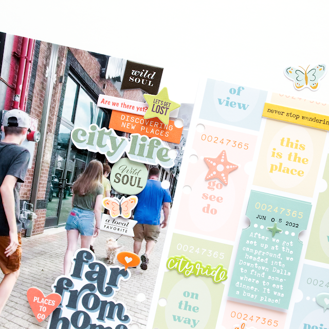
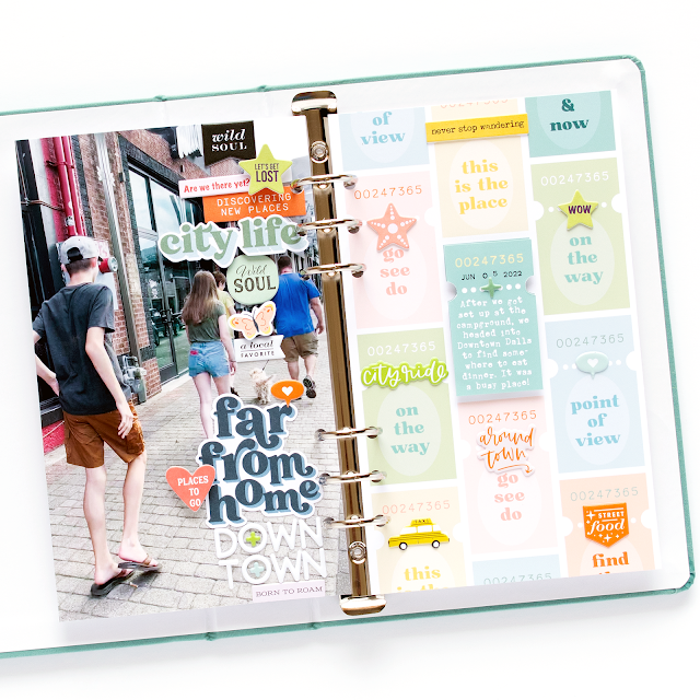
Hi friends! It's Ashley, and I'm here today with a layout in my NEW Teal Life Crafted Album, using the June Explore Mini Kit. The Teal LC album is available in the CTK Shop in the Life Crafted size and the new 6x8 size.
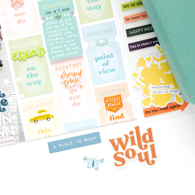
Because of my photo composition, I was able to create a stacked embellishment cluster, using a mix of ephemera, chipboard and puffy stickers from the June Explore Kit. To add interest to the design, I added pop dots behind some of my pieces to give them dimension on the page.
I kept the patterned paper side fairly simple and just added a few puffy stickers and chipboard pieces to some of the ticket shapes. I also included my journaling on this side, and I covered the design on the center ticket in Adobe Illustrator so I could type my journaling in its place and then printed it out. I used some pop dots under the journaling spot to balance out the dimension from the left hand side of the page.
I hope you've found some inspiration from my layout today! And don't forget to stop by the CTK Shop to check out all of the products I used!
Sunday, June 12, 2022
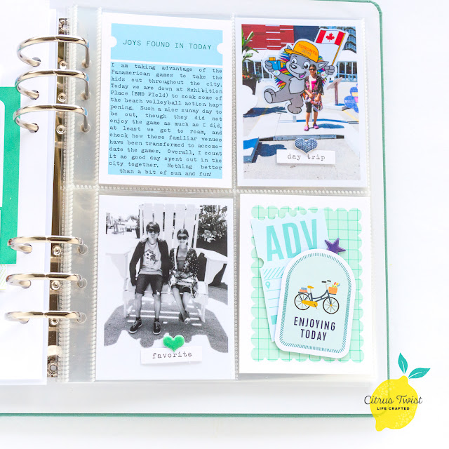
SUNDAY SKETCH with Nathalie
Hello crafty friends!
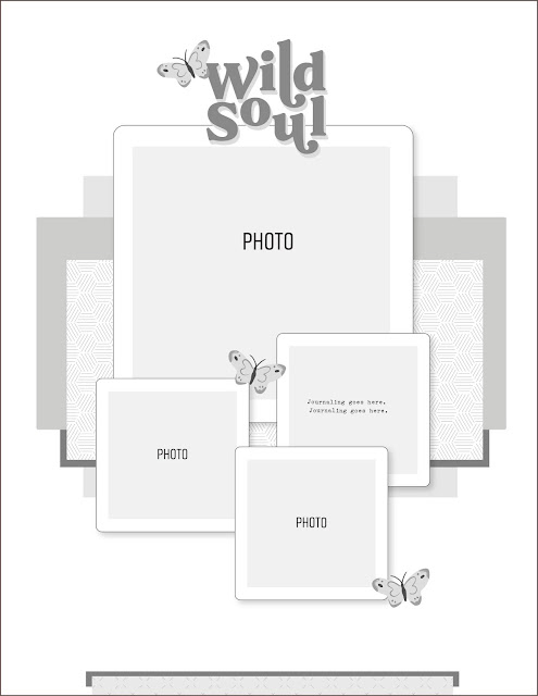
Nathalie with you today to share this week's Sketch challenge. I think it is no secret that sketches make it so much easier to get your projects finished in a flash. Think of them as the blueprint for your page.
Let's take a look at this week's sketch:
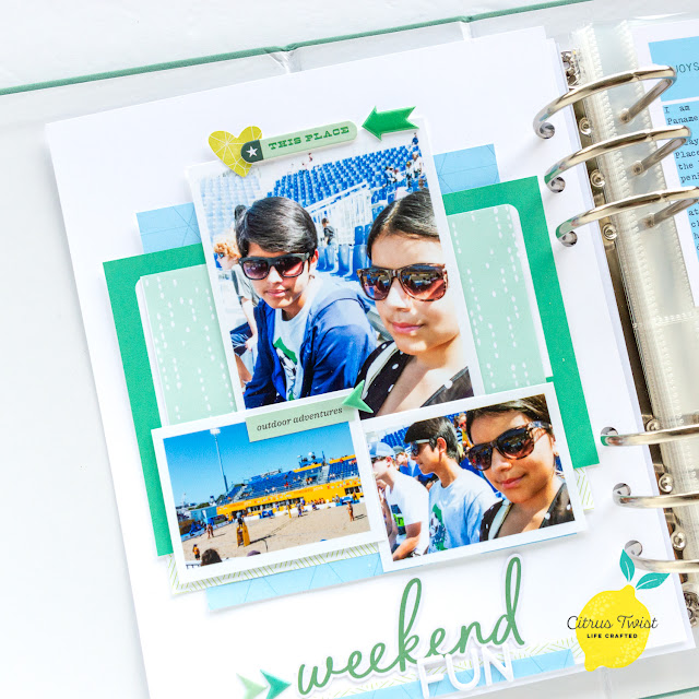
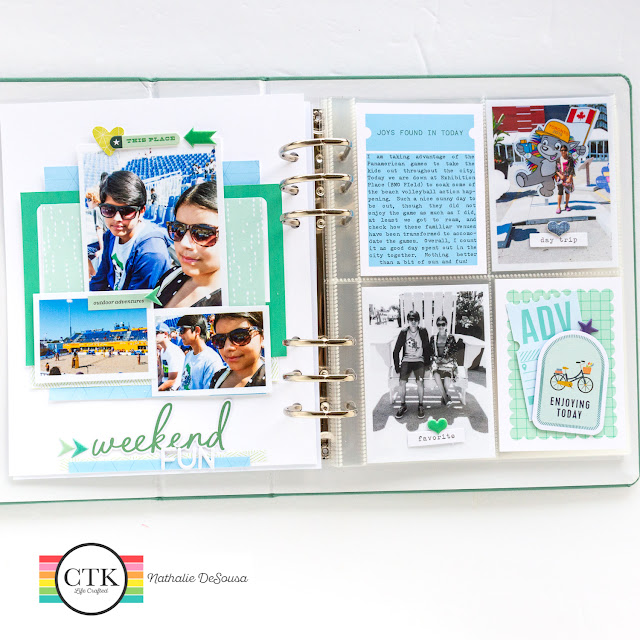
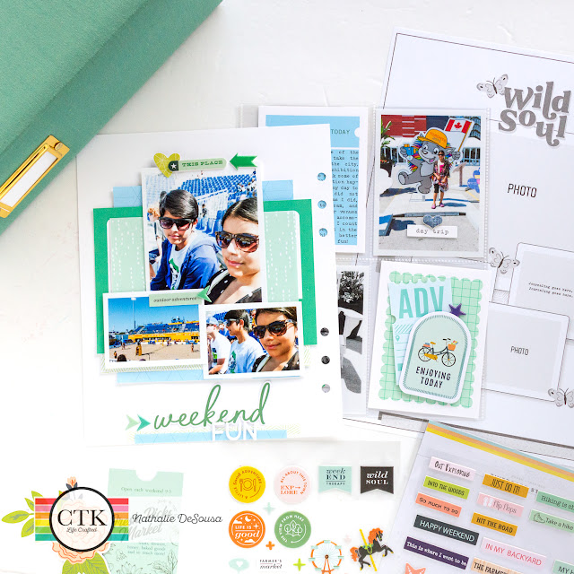
I used the sketch as inspiration to create a new 6x8 layout for my Summer 2015 vacation album ( 6x8 Teal Life Crafted Album) using the EXPLORE kit and Digital files from the shop.
I loved the layered look of the sketch, and used Digital Patterned papers from the June Explore Digital File collection, and May Crave Digital File collection.
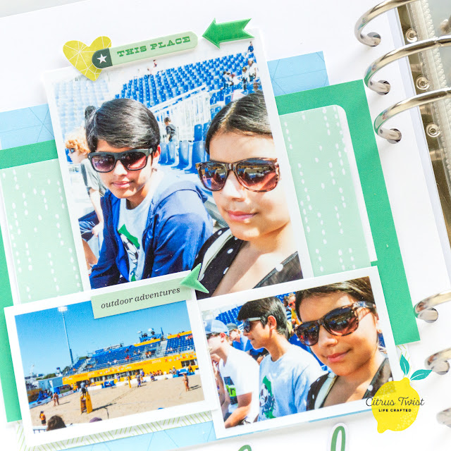
I drew inspiration from the sketch to layer the photos. However, I decided to omit the journaling spot, and use larger photos. To balance the size of the photos. I decided to move my title to the bottom of the page. The EXPLORE kit ephemera and White Puffy alphas created the perfect title for the page. I chose to use the location of the butterflies in the sketch to place repetitive embellishments in my page.
I decided to create a companion pocket page for this spread. This helps me to add more photos of the day, and unclutter the spread a bit.
I am sticking with the color palette for the pocket cards. I added my journal to a Digital card from June's EXPLORE Digital Journal Card collection, and printed the second card from the May 2022 Digital Collection. I added some ephemera pieces from the EXPLORE and TRAVELOGUE kit to to the photos and cards.
I hope this inspires you to use the sketch for a project of your own. Cannot wait to see what you create with the sketch
XO
Saturday, June 11, 2022
3-To-Inspire with Traci
Your 3-To-Inspire challenge, should you choose to accept it, is:
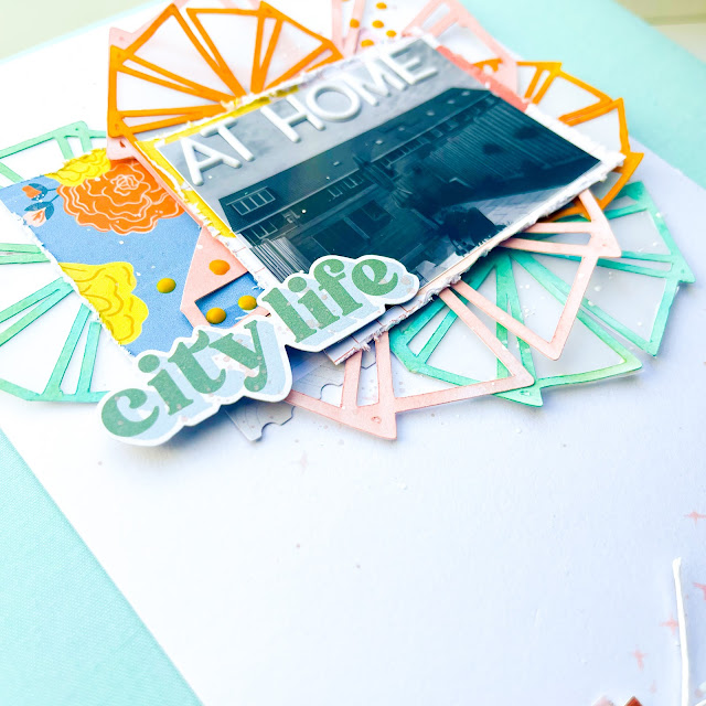
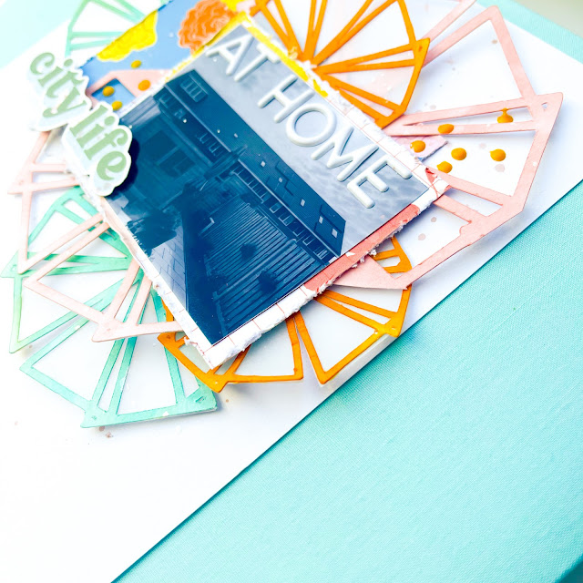
- Use a cut file or be inspired by one if you don't have a cutting machine
- Use a white background
- Use less than 10 embellishments






%20-June.jpg)




%20-June.jpg)

