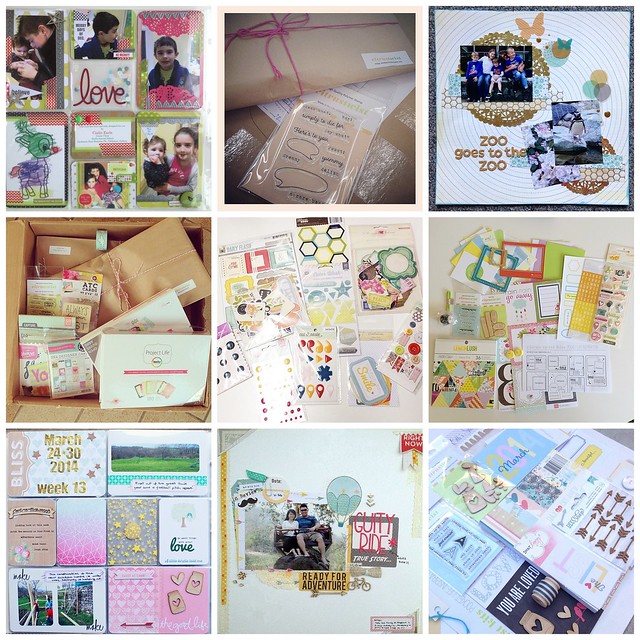
We're always so inspired to see your photos and projects using Citrus Twist Kits on Instagram! Here are just a few of our favorites that have been shared in the past couple of months:
Images posted by: sineadearlshealy (Sinead Healy) | goftgoftgoft | mamakven (Rebecca K.) | charlene30lm (Charlene Lorenzo-Mulphin) | vivo17 (vivs) | alaemmelistyle (Emmeli) | sarahboirin | piyo97017 (Chee) | callelillycafe (Julie)
We want to see your photos, too! Simply use the hashtag #citrustwistkits next time you post a project or picture using our products. You can also follow the Citrus Twist account on Instagram for sneak peeks, announcements, and the occasional giveaway.
Saturday, May 31, 2014
Friday, May 30, 2014
Pocket life with Sam
Hello there! This is Sam today to share my Poclet Life pages together with a process video on how I put all my pages together. The video is almost 9 minutes but I fast forward 4 times, how I wish I could make a page under 10 minutes. Lol. Enjoy the video!
And here's the close up of the page. I do only monthly pages nowadays, which is way less stressful for me. I don't squeezing all the photos in 2 pages, but i will just group photos in the same month together. And I am loving the Maggie Holmes die cut that came in the May kit, small packaging that packed with a lot of yummy vellum die cuts!
More close-ups here:
I have also added some Project Life cards from Becky Higgins to stretch my kit. I have a tonnes of PL cards that I barely use them, so I decided to combined the PL cards with CTK kits when I am working on my spreads.
This 3x4 cards is one ofmy CTK exclusive card this month. Love such simple prompts for journalling.
Thanks for looking!
XoXo,
Sam
Thursday, May 29, 2014
Be Inspired: blackboard trend!
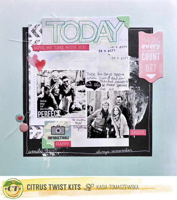
Hello and happy Thursday! Don't you think that some trends seem not to finish? They change and continue from season to season and every time look good. I have this feeling about the blackboard trend. We used to see it on Pinterest a lot and I feel like new inspirations and images representing it continue to showing up. Today I want to focus on it mixed with a pop of color- which is a great way to incorporate blackboard trend to summer creations!
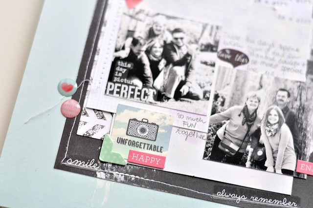
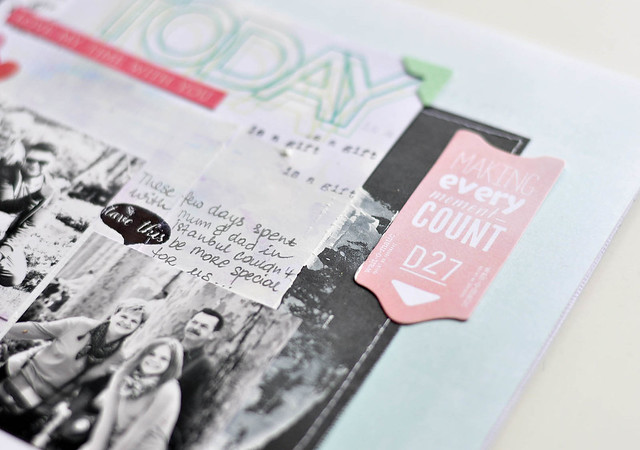
The blackboard mixed with some colors was my main inspiration for this layout made with a mix of May CitrusTwist Kits. I used here bits and pieces from "Sparkle and Shine" "Happy Horizons" and "Happy Girl" kits and instead of using a black paint I cheated a bit and created background of my composition with a blackboard paper.
How do you like a blackboard look? Do you like mixing it with colors and use on your layouts or you would rather choose softer color combinations?
Wednesday, May 28, 2014
6x6 Paper Play With Sam
Hello there! This is Sam to share another project of me using the 6x6 paper pad that came with our Pocket Life kit this week. Instead of making a 12x12 traditional layout, I opted for making mini layouts for my Japan trip. Before I start, I just want to say how awesome is Internet and this online community! Most of you may know I came from Malaysia, far far away from US, and what a coincidence that I got to meet one of Citrus Twist DT girl - April Joy in Tokyo! And of course, we has to meet up in one of the largest craft store in Shibuya, Tokyo — Tokyu Hands. It was really a quick and fun meeting-up session with her and another Japanese girl that we got to know form Instagram ;)
So I decided to scrap two mini layouts of our photo and also for the crafty goodness that I lugged all the way back from Tokyo. I decided to use Basic Grey Capture album (yellow and kraft cover) that I got from Citrus Twist Store a while ago (that I have been hoarding and did nothing to it). I didn't like the kraft cover so I started with painting the cover with layers and layers of mint acrylic paint. I only painted twice and the Martha Stewart Satin acrylic paint gives such a great coverage and smooth finishing.
To make my layout, I trim down a piece of white card stock to be fir into the album and also want to make background with Tim Holtz Distress Paints.
I started adding paint strokes to the background (which is my current favourite technique), then add some stickers and embellishment and I am done with a layout within 10 minutes. I didn't want my layout to have a lot of dimension as I worry that the whole album might ends up too bulky when I am done scrapping my 7 days trip. Since I have printed an extra photo of the craft goodies from Japanese dollar store, so I made another layouts using scraps and pieces that I have leftover from making PL pages. And so, I made 2 layouts using all the scrap bits & pieces from the PL kit to make these two mini layouts. I am loving how it looks in my album now!
The blue glitter Thickers are to die for. LoL
And more close-ups for the 2 mini layouts:
Thanks for looking!
XoXo,
Sam
Tuesday, May 27, 2014
Tuesday Tutorial with Nina
Hey everyone it´s Nina again here on this fantastic Tuesday. Today I’m going to share a layout tutorial using the Citrus Twist Kit May Main "Sparkle and Shine" and Embellishment Kit "Happy Girl". Lets get started:
To begin the page you need a picture in the size of the golden chipboard frame. You can use some 3D pads to add photos layers with a little bit more of dimension.
In the next step cut a strip and card out of the Webster´s pages paper for the use in your background.To make the layer more fluffy use a piece of silk paper (this one is from my stash), fold a bit bigger than the frame, and fix it with a tiny attacher.
It´s a great detail to use a paper straw also on a layout. You can cut it lenghtwise with a sharp knife, add some liquid glue and press it down careful onto the cardstock...
Add some pink ink splashes onto the background.
To get a great feeling for the measuring of the page cut out the rub-on words with the back foil. So you can easily find the final place for it. Do the same procedure with the embellishments you want to use. If everything looks great you can flip up the edges to add some glue behind.
And this is the final result....
Thanks for visiting today the CTK blog.
Nina
Labels:
12x12 Layout,
layering,
Layout,
May 2014 Kits,
Nina,
Tutorial
Monday, May 26, 2014
Simple Strategies - Creative Titlework
Hello and welcome on Monday with a "Simple Strategies" post. Mostly journaling is a huge part on our layouts and it´s great to capture all things happened, but I also love doing simple pages. On the day I received the kit I had a MONSTER ear worm with the song "It´s a beautiful life" from Michael Buble. So it´s a kind of "scrapping the music" with a special title work.....
This American Crafts chipboard kork thickers are simply adorable but I like to mix up different fonts. It makes simple pages a little bit more interesting, I think. The word "beautiful" is made with the Silhouette Cameo and white cardstock. To complete the title work I add a piece of the paper straw and those golden heart rub-ons.Thank you so much for visiting today. See you tomorrow for a layout tutorial...
Nina
Labels:
12x12 Layout,
May 2014 Kits,
Nina,
Simple Strategies
Sunday, May 25, 2014
SUNDAY SKETCH WITH Tanya
Hi!! It's Tanya and today it's my turn to share with you our new sketch! I made two layouts using May 2014 Sparkle and Shine Main Kit May 2014 Happy Girl Embellishment Kit.
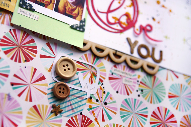
I love May main kit! It's so vivid and bright. So I decided to make another layout with the photos of my little nephew. I combined four pictures in one and framed them with Hello World photo corners (Websters Pages).
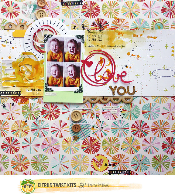
I used a lot of shapes cut out on my Silhouette machine: big camera, speech bubbles and love circle.

Here are the Daydreamer wood buttons (Dear Lizzy) which you will find in the May Happy Girl Embellishment Kit. I peeled of the stickers from them and use as usual buttons.
And here is my second take on the sketch. I flipped it horizontally. I didn't used fours photographs, instead I cut my big photograph in four smaller rectangles and highlighted the part with me with the gold photo frame.
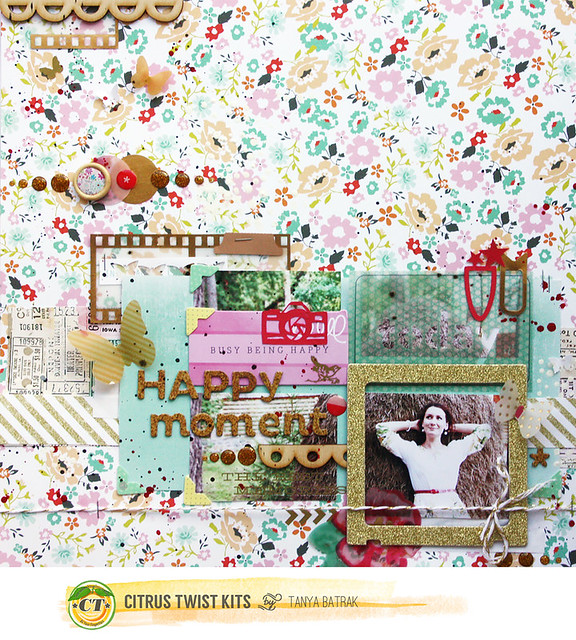
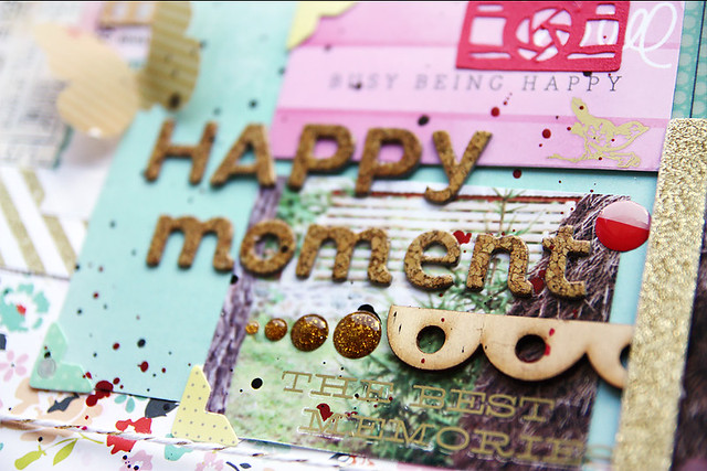
DIY Shop Scene cork Thickers (American Crafts) looks amazing on all projects!
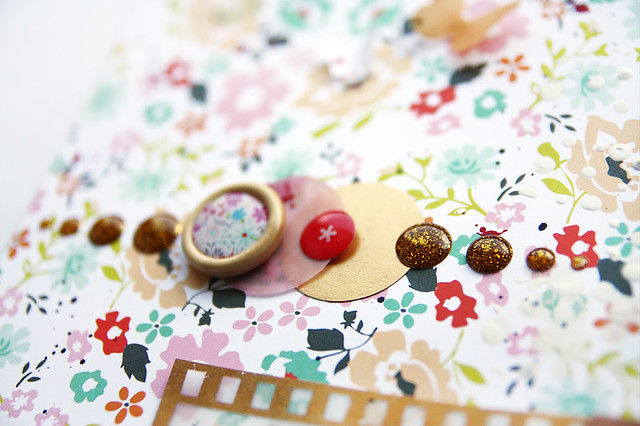
And those little Gold enamel Dots (Studio Calico), aren't they splendid?
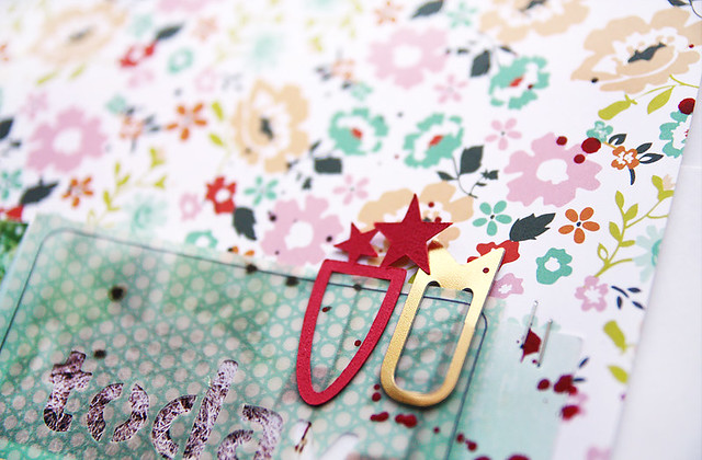
The gold photo clip is from the main kit and red star clip I cut out on my Silhouette.
And remember, to play along with our sketch challenge, upload your layouts to the gallery by June 1st to get your name in a drawing to win a $5 GC to the store. When uploading to the gallery you can name it as you would normally but please include "Sketch 4/25".
Tanya
Subscribe to:
Comments (Atom)

