Hey guys! Today I wanted to show you a few different ways to use the June Scrapbooking Add-on Kit and June digital files. I have two layouts in my Life Crafted album of activities I enjoyed during lockdown. And I ended up with two very different colour schemes!
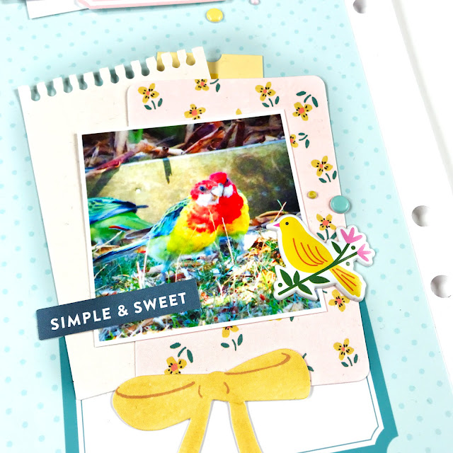
I had lots of fun bird watching at home and trying to photograph these beauties before they flew away. Thankfully, they set up camp for a few minutes across the fence so I could snap a couple of pictures!

I started off with this amazing bird paper from the add-on kit and knew it was too perfect not to use. I toned it down a bit with a grid paper from the digital TN Basics papers, and backed my photo with a few more papers from the kit. I dug into the Maggie Holmes ephemera pack and created a cluster in the bottom right leaving some space for jounaling on the left.

The alphas in this kit from Pinkfresh Studio are adorable and have so many colours to choose from! I stuck to the colours found in my spread for the title, and it really highlights the greens and yellows in the papers. I also used the centers of the '0's and 'Q's as enamel dots to sprinkle around.

On the opposite page I created two clusters- one for fun and one for a photo. I used another digital TN Basics paper for my background. In my first cluster I used a bunch of scraps to layer and a square element from the digital Journal Cards with a label and a puffy sticker. I finished it off with a few more alphas and puffy dots.

On my second cluster, I layered a few pieces from the ephemera pack and a ticket from the Cravings Digital Tags and topped it off with a cute bird puffy sticker.

For my second layout I wanted to focus on the cooler tones in the kit. Namely the pinks, purples and blues- since this was early evening and my photos were quite dark. I had the idea to create a long title with the puffy alphas and was inspired by the adorable couch icon in the puffy stickers. Luckily there was also a bicycle!

On the left hand side of my spread I used a strip of patterned paper from the kit and layered two large photos with embellishments from the sticker sheets and digital Cutapart Elements.

I popped the lower photo up on foam to make it pop, and layered one of the acetate frames over the top.

Thanks for stopping by today and I hope this have given you some ideas on how to get multiple colour schemes out of your kit this month!


No comments:
Post a Comment