Hey everyone! This is Krystal, and I'm here today with this week's Sunday Sketch. I had so much fun working with this sketch and this month's kits, and I know you will too! Let's get started.
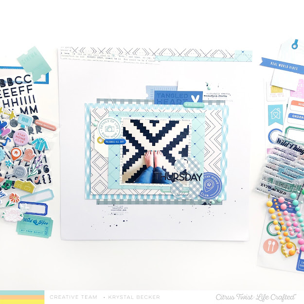
This week's sketch has a large central photo cluster, a large title element, a paper strip at the top, and some splatters. I decided to follow the sketch pretty closely this time, but I took a few liberties to make it work for me. Here's my interpretation.
I was inspired by the number in the title to use a photo from a recent Thursday Three post on Instagram. Then I took my color scheme from my photo, meaning I stuck to tone of blue and neutrals (black, white, and grey).
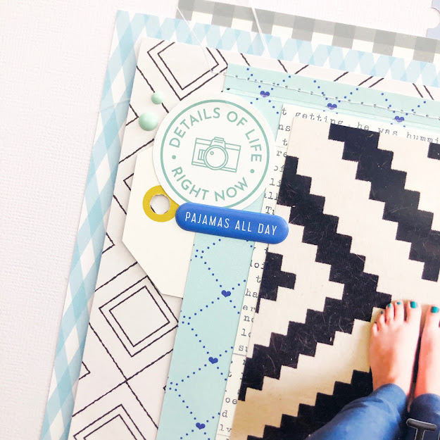
I started by choosing papers from both the "Wild at Heart" Life Crafted Kit and this month's Scrapbook Add-On to match my photo. Working from the photo down, I determined the order I wanted the patterns to go in. I knew I wanted my journaling to be hidden, so I made sure to create a layer that could flip up to reveal my printed words. I did this by scoring the top of one of the layers, then stitching it to the layer beneath it. It's a super easy way to add a large block of journaling when the design of the page wouldn't otherwise have room for it.
Once I had all of the paper layers in place, I started pulling embellishments from both kits. I choose elements that would work with both the color scheme and topic of my layout. I was careful not to over-embellish this layout. I knew that all of the different patterned papers would feel too busy if I added a lot of embellishments on top of them, so I only added a couple pieces to each of my three clusters.
For my title, I used one of the large numbers from the ephemera pack and the puffy alphas from the Life Crafted Kit. I moved them slightly from where they were on the original sketch in order to work with my photo and paper choices.
I finished off the layout by adding a bit of stamping where the original sketch had suggested adding the journaling. Then I added some enamel dots to each of my clusters and some black splatters to match the black in my photo and title.
And there's the page all done! You can take a more detailed look at how this page came together by watching the video below.
Thanks so much for stopping by! I hope to see you back here again soon!


No comments:
Post a Comment