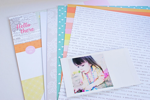
When I set out to make a new layout, I always start with my photo and patterned paper. As I pick and choose my papers, my photo is always in my field of vision, guiding me on my color choices. For this photo, I really wanted to pick up on the yellow in my daughter's jacket as well as the pink and turquoise beads she is wearing. You can see here that I settled on four papers, the cut apart journaling card paper, and white cardstock which all came from both the June "Sweet Thing" Main kit and the Patterned Paper Play Add-ons.
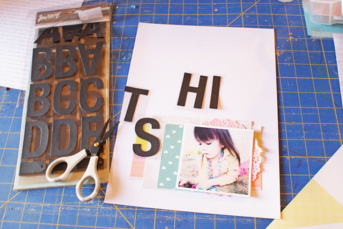
Whenever I am working with a bigger element, such as these large letters from the June "Whole Lot of Love" Embellishment kit, I like to work them into the design very early on. At this point I hadn't adhered anything down, but I wanted to start playing around with the position of my title. Usually my title placement comes way later, but since it was going to require so much space, I needed to get the title into the design early on. To do this, I cut the individual letters out while they were still on the plastic that way I could easily move them around.
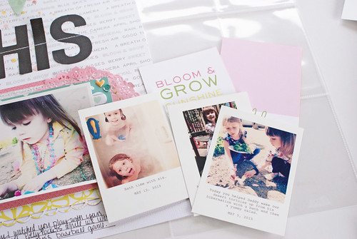
After completing the layout, I immediately moved on to the accompanying pocket style page. I cut apart the journaling card sheet from the Main Kit, grabbed my photos, all edited with the Collect App, and a few small embellishments.
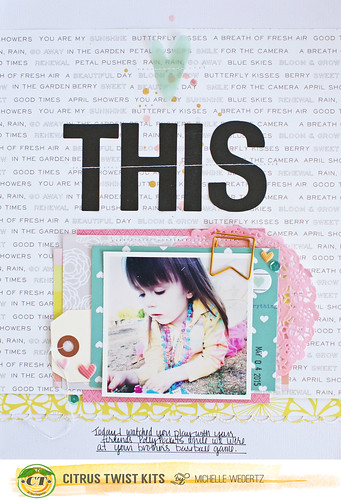
As I mentioned before, I used a variety of products from several of June's Kits, but I also added a white tag from own stash and a copper banner clip that I had leftover from May's kits.
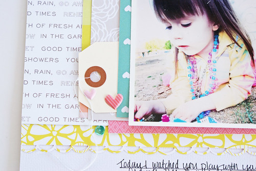
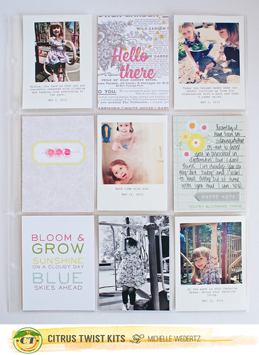
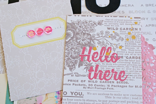
If you hadn't already noticed, I do like to keep my pocket pages simple and pretty flat, but this doesn't mean that I don't embellish my cards. Here I made them my own by adding mist droplets and stitching.
Wishing you a great week!

This layout made me stop and go, "woah." There are just no words for how beautiful it is!
ReplyDeleteI love what you did Michelle and your layout is just beautiful.
ReplyDelete