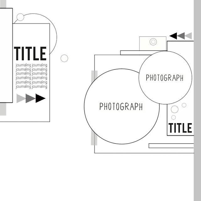
Here's your new and exclusive sketch designed by DT member Kasia:
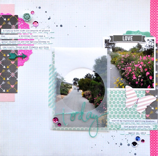
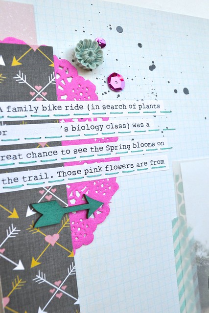
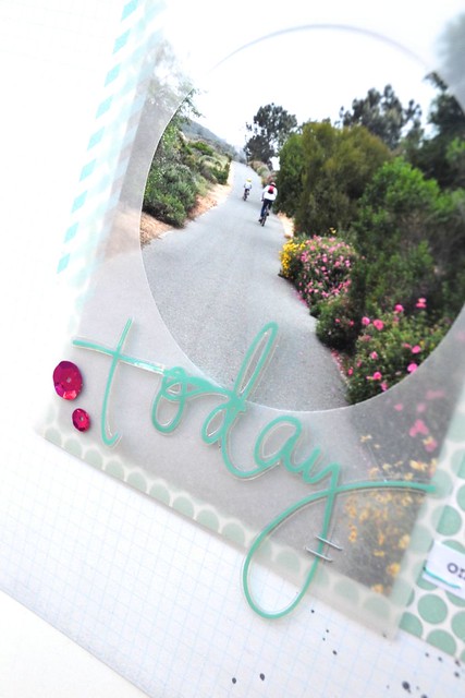
I am always so inspired by Kasia's sketches that I stay pretty close to the original designs... but this time I was hesitant to cut photos into circles (would love to see your page if you do!) and I came up with the idea of adding vellum with a round window on top of my 4x6 photo instead. I really do like the end result:
KIT USED: November "Darling" main kit
NON-KIT ITEMS: Tim Holtz tiny attacher and Ranger mini mister (available in the Citrus Twist store), DMC thread, Prima ink, acrylic paint
This kit is so pretty and versatile, I can't wait to show you the rest of my pages with it!
Now to play along with this sketch challenge, upload your layouts to the
gallery by Saturday, November 9th to get your name in a drawing to win a $5 GC to the
store. When uploading to the gallery you can name it as you would
normally but please include "Sketch 11/3".


I see a Heidi Swapp plastic word! Love it. Wish they would do duplicates of things like that in their packages! Gorgeous layout! I love how you used the doily and the vellum circle in place of circle photos. Clever idea!
ReplyDeleteSuch a beautiful layout! That vellum window is a wonderful idea.
ReplyDeleteLove the vellum - great idea!
ReplyDeleteOmg, this is a gorgeous layout Nathalie! I love the colors and seeing how you used it, I'm so sad that I didn't end up getting this kit!
ReplyDeleteLove this sketch, hoping to play with it shortly...
ReplyDelete