Happy Friday! This is Sam today to blog about my Pocket Life spread using Citrus Twist November kits. I only used November PL kit + PL embellies kit, along with some of the dies, embossing folders and gelatos from my own stash to add some texture to my PL spread.
Does adding textures and paints to your PL spreads sound intimidating (or super messy) to you? Here's my PL Week 43 with a lot of texture without making my fingers inky.
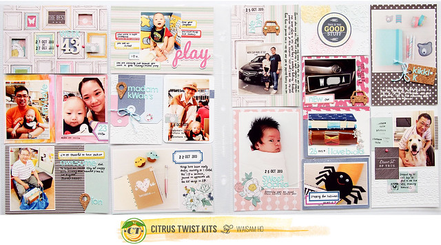
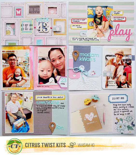
Here's my left spread:
Here's my right spread:
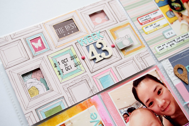
I am loving the photo frame paper that came in the Dear Lizzy 6x6 pad. I wanted to dress up some of the frames with different patterned papers. Some I cut out the centre with my X-acto knife and some I simply add some colours with my Zebra Mildliner (pastel colour highlighter).
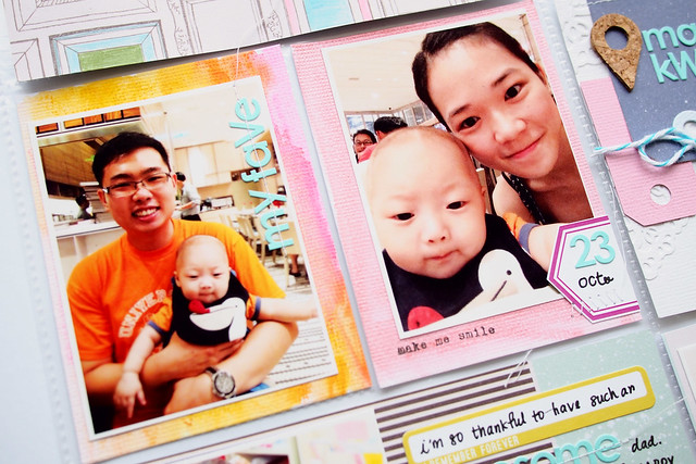
I wanted to add more pink & orange to my left spread so I painted some 3x4 white card stocks with Gelatos.
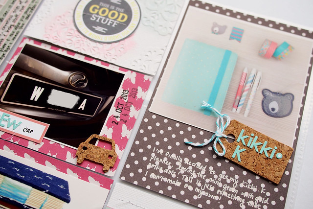
I emboss one of the 3x4 white card stock with my embossing folders from Lifestyle Crafts. I love adding subtle texture to my journalling cards with embossing nowadays. The tags are die cut using Avery Elle's dies with coloured card stocks and Dear Lizzy papers. Can't bare to throw away the pretty twine that came with the kit so I upcycled it and tied it to one of my tags.
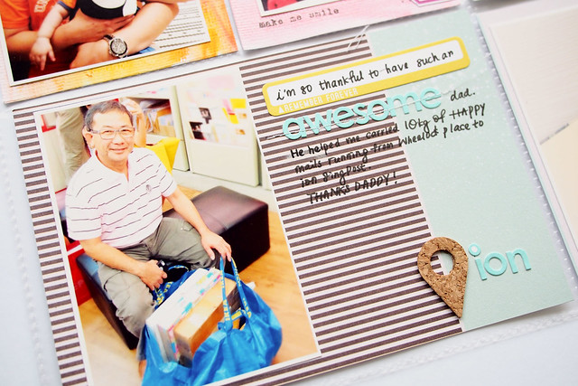
Keeping my embellishments and layering pretty minimal for my recent PL spreads. Die Cut geotag is from my own stash.
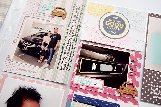
This spread showing the day we sold our old car in Singapore and gotten a new car in Malaysia. the die cut cars and tags are from my own stash too.
I love the 'Good Stuff' but it was in vertical 3x4 journalling card. So I cut it out and adhere to my 4x3 card stock.
I know some of you love using sketch when making PL spreads. And I am kinda hook to follow Kasia's sketches that came with the kits too! Here's my PL sketches for this week:
Thanks for looking! I hope this spread would inspire you to think out of the box and add some fun texture to your weekly spread.





Love the peekaboo for the photo frame title card! What a cute idea :D & the embossing is really so pretty <3
ReplyDeleteDefinitely lots of texture! Awesome.
ReplyDeleteYou're going to convert me to doing Project Life! I love all the details and the texture you've added to your pockets! My favorite is the photo frames in the first pocket! That is just so much fun! TFS!
ReplyDelete