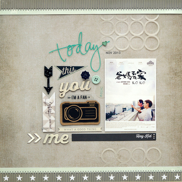
Hi it's Sandy with a layout that's a departure from my normally layered scrapping style. There are so many wonderful embellishments in this month's Main and Embellie Kit, I had to make a page featuring them. So I decide on where to place the photo and then designate an area next to it to lay out my embellishments in a block. It's fun technique, like piecing together a jigsaw puzzle, and the embellishments receive extra impact when showcased this way.
Here are some tips on how to arrange your one-layer embellishment block :
- pick a variety of shapes and sizes to provide an interesting display
- allow for a clean margin of breathing space around each piece
- place shapes so their edges form interlocking patterns e.g. arrow head and flag tail
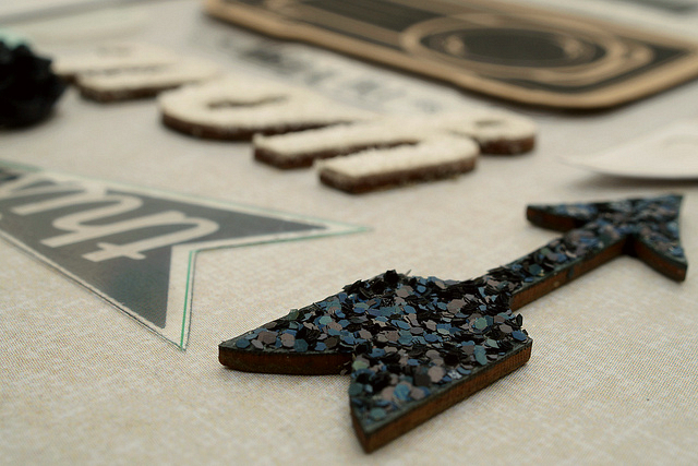
I like grouping pieces of the same colour close together for greater impact, starting from turquoise on the top, black in the middle and then white at the bottom. Items like the Star & Bee chipboards are great to use as you can customise them with ink or mist. Here I've also added texture by applying white flock (to the You and Me words) and black glitter (to the arrow). The only things from my stash are the white arrows from a previous kit and the background cardstock.
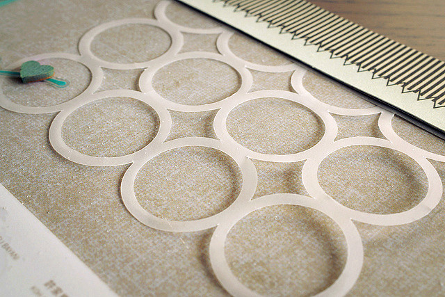
I also have a tip regarding this Heidi Swapp Mixed Company vellum embellishment. Simply pop out the circles and diamonds and use the negative space die-cut that's left over. Here I cut it into two pieces and placed them to create the illusion of a subtle column of circles running down behind the photo.
Hope you enjoy scrapping with your November kits and playing with all the embellishments as much as I have. I'll be on vacation until December so this will be my final CTK layout and blog post of 2013. Wishing everyone happy holidays and see you back here in the new year.


Love how you let the embellishments shine!
ReplyDeletebeautfiul arrangement Sandy!
ReplyDeleteTotally love the little details on this, great job...♥
ReplyDeleteI love that loose grid of embellishments!
ReplyDeleteI love this layout! The colors, textures and the vellum!
ReplyDeleteThanks everyone !
ReplyDeleteI love the feel of this page! The subtle tones and of course the arrangement of embellishments are very appealing. LOVE what you did with the negative circles too!
ReplyDelete