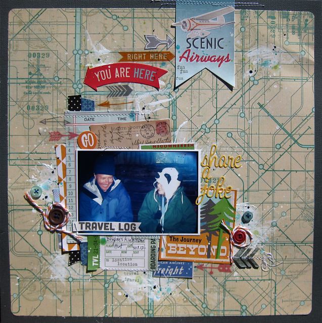
Hi, Gina here today, sharing a few ideas I've played with when creating this layout. I've used the main "On the Go" kit, "Orange Crush" Embellie kit and the August stamp add-on, along with a few buttons from my stash.
To start with I've added contrast by cutting an even amount off each side of the 12x12 background paper and placing a dark cardstock behind. This also helps to "pick up" the greys in the layout.

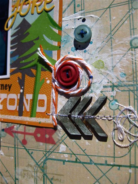
I've also inked up these exclusive arrow wood veneers with a couple of Prima chalk inks to give them a weathered timber look to match my photo. I've covered the veneers completely with "Old Road" from an earlier kit and then dabbed a little "Pastel Green" ink from this month's kit. I love how these veneers are soft and thin enough to machine stitch through.

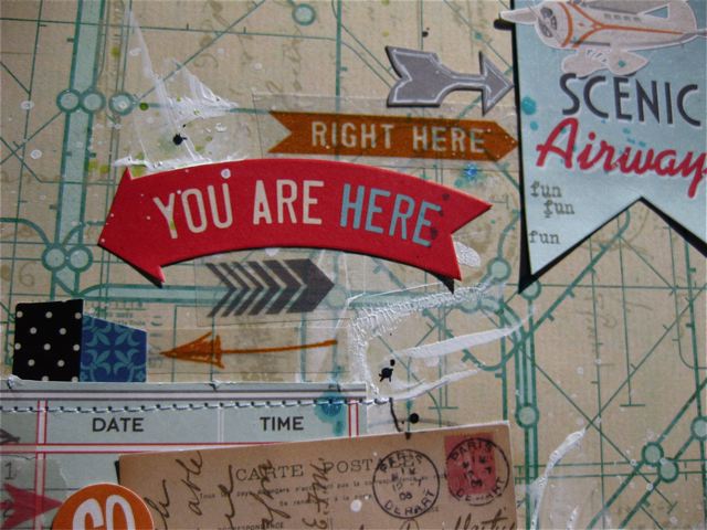
Another tip is to adapt a sticker, like the one on the right hand side, so that you can turn the ends up slightly to add dimension. To do this I backed the sticker with some plain copy paper first, then attached with some double sided tape, gently curly the points upwards to sit slightly off the page.


No comments:
Post a Comment