Monday, January 18, 2016

Adventure-Michelle Wedertz

Surely I'm not alone on this, but I REALLY like anything wood veneer and I was super happy to find the package of wood words from Heidi Swapp in January's Main "Verona" Kit. Heidi's script writing is quite beautiful and the big words make for a great ready-made title.

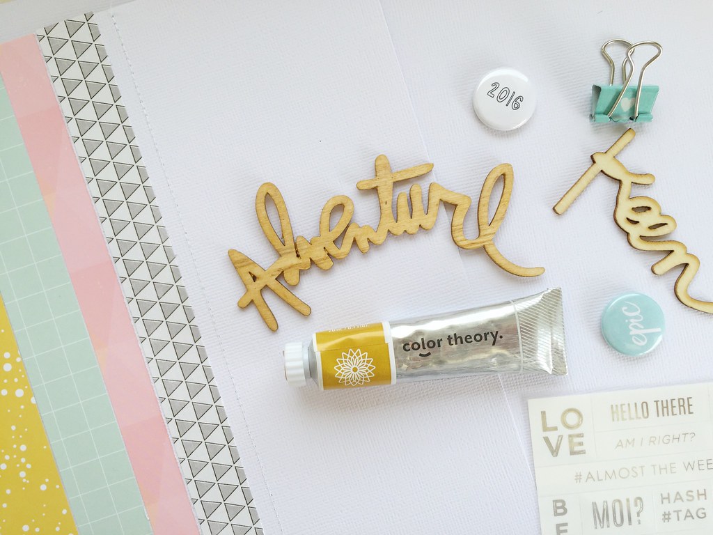
Part of what I like about wood veneers, is the added natural texture they bring to a project. I rarely mess with them because of this, usually opting to add just a spray of gold Color Shine  to make the wood sparkle a bit without hiding the wood finish. This month though, I went outside my usual box and gave them a light coat of gold paint.
Jan CT Blog Post

My goal with the paint was to try to come close to the beautiful yellow-gold color that is featured in the kit without sacrificing the wood finish. I started super slowly and added thin layers of paint to the wood word keeping in mind that "less is more" because I didn't want to go too far and completely mask the wood. I ended up going over the word three times and was happy to have gotten the color just as I wanted.


As you can see, I got pretty close to the yellow in the patterned paper, plus the paint gave a little added sheen that I like.


How about you-do you alter plain wood veneers or do you leave them as is?  With the smaller wood pieces I never go any further than a light spritz of Color Shine, but the larger ones seem to invite a little bit more alteration. Would love to hear what you think!

Wishing you a great day.

Michelle


Sunday, January 17, 2016

Sunday Sketch with Missy Whidden

Hey there, Citrus Twist fans!  Missy here with you today, and I'm so excited to bring you this week's Sunday Sketch.  It's an awesome sketch, and this month's kits are just perfect to use for it.  I love the square photo, the layering, and those fun corner pieces.  Sketches are such a fun jumping off point to get your scrappy juices flowing!


Here is what I created based on this sketch.  I stayed pretty true to it.  I started with one of the Seven Paper sheets for my background.  I added a bit of white gesso and then some bright blue acrylic paint.  I used my Silhouette Cameo to cut some messy rectangular frames out of the Basic Grey paper and built my layers on top of that.  I used a lot of the Maggie Holmes papers for this as well as the fun printable cut-apart sheet.


I love all of these bright colors together!  I love layering bits and pieces around my photo.  I used one of the fun flair buttons, one of the Heidi Swapp scripty puffy stickers, one of the sentiments from the branding strip of the exclusive CTK papers, exclusive wood veneer...so many little details!  I used a foam brush to apply the acrylic paint.  I wanted a messy brush stroke effect.


I added some cord to the cut-apart tag here and layered it behind the photo.  I also added in some pink tangled thread behind the flair button.  That is a great way to add a pop of color and some fun texture to your page.


I fussy cut more pieces here and did lots of machine stitching.  I also used some of the exclusive CTK stamps on my layout.  They are super fun and can be used in so many ways!


Here's my process video if you'd like to see how this layout came together.  Thanks for watching!


Okie dokie...that is my layout!  I hope it has inspired you in some way.  I hope you use it to create something amazing!  If you do use the sketch, make sure you upload it to the Citrus Twist Gallery by next Saturday to be eligible for a $5 coupon to the store!  Be sure to add "1/17" to the title line so we know what sketch you're using.  I can't wait to see what everyone makes!

Have a fabulous day!

Missy :) 

Saturday, January 16, 2016

3 to Inspire with Brenda

Good morning and welcome to this weeks 3 to inspire.

(Don't forget that your take on this challenge can be a layout or a PL spread and you must include all 3 prompts on your project.)

For this week I decided to keep it kinda simple.
1. 1 photo
2. handcut paper shapes
3. a large title using multiple alphas or words

Here is my layout with those 3 prompts.
All of my triangles were cut by hand with no template. I used a wood veneer word, puffy stickers, letters cut from a word sticker and an alpha to make my title.


I LOVE simple pages with large catchy titles and wonky cut papers. I cannot wait to see what you all make!


Now it is your turn. Use my three prompts to create a project. Then share it with us in the CTK Gallery and/or the fan page.


Have a fantabulous day!


Brenda

Friday, January 15, 2016

Pocket Life sketch Friday with Kasia

ProjectLife_album_na_zdjecia7


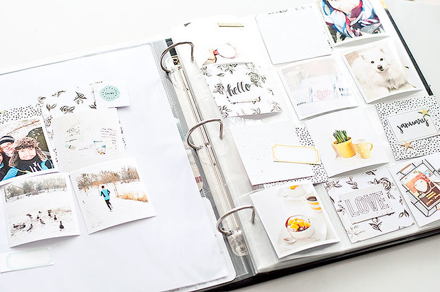
Hello and welcome in 2016! It's Kasia here with some Project Life inspiration (and brand new sketches!) for you!

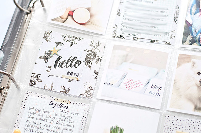
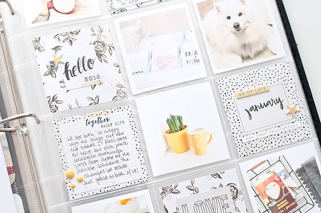
Start of the year makes me very excited- finally I could play with my new album from Citrus Twist Kits store- I immediately fell in love with the 9x12 size, it's not too big, practical and ideal for my weekly spreads. Before I show you my pages, let me share with you my approach to this year's album:

- I'll be making spreads few times a month-without numbering the weeks,
- I want to keep my album fairly simple and minimalistic - less is more,
- I'm going to use lots of instagram photos (therefore I'm in love with the square pockets page design!)
- I'll keep adding handwritten journaling,
- My goal is to work on the album consistently through the year.

I believe that setting some goals and having an overal idea how we are going to approach PL album is a key to success and staying commited through the months to come :)


ProjectLife_album_na_zdjecia3

Ok! Now time to show you how I made this weeks entry with CTK January kit! I will also share with you few easy steps on how to make bright and light spreads in PL album, so... stay tuned!

odbitki_instagram

STEP 1- PHOTOS

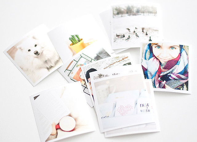
To keep the album bright and airy your photos should be... light! Aim for taking photos during the day, use the daylight whenever you can. Edit pictures before printing- increase the brightness, play with contrast, decrease the shadows and let the highlights pop a bit. You can also add a little white frame around your pictures- this way even the darker photograph will appear lighter in the album.

CTK_styczniowe_kity_do_Project_Life

STEP 2 - MATERIALS

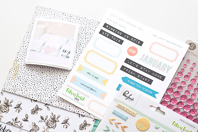
I love to use lots of neutrals to build a base of my pages and than add some happy, bright pops of color. I try to limit these to 2-3 shades per spread to avoid visual chaos. I found that these tricks help me achieve the look of pages that I love- balanced and bright, with photographs in focal point.

ProjectLife_album_na_zdjecia

STEP 3 - COMPOSITION

Before I glue anything down I like to play with composition of my page. I move the things around until I'm satisfied with the final arrangment, than I stick the elements together. At the end I write my journaling and add some stamping here and there.

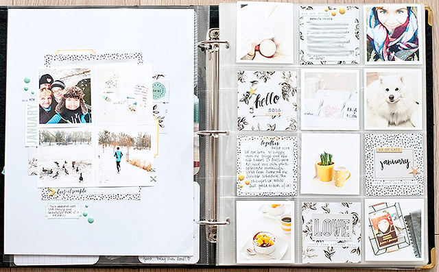
Here is the final look of my pages. If you like it, you can easily recreate it using the sketches I attached below for you.

ProjectLife_album


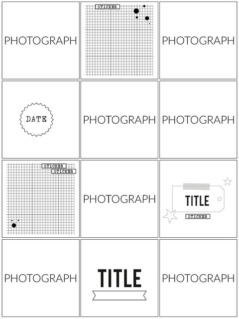
And a sketch for you... do you know my favourite trick regarding sketches? Rotate or flip them! This way one sketch can provide you lots of beautiful (and different!) layouts each time you work with it!

SKETCH CTK

Have a lovely Friday and even better weekend! I'm looking forward to seeing your spreads in 2016 :)

Thursday, January 14, 2016

Let's get digital with Mira

Hey Guys!
It's Mira here with new edition of Let's get digital!
I prepared a cutting file for You to download from Citrus Twist Kits Facebook Fan Page! And I used it as a title for my layout. This page is also a part of my 2016 Pocket Life Album opening chapter (I call it opening chapter because it's much more than one title page :P)

Here's what You can download this month:


And here's the Layout that I made with "family" file:
This is a picture of my Family that I took on January 1st, right after I jumped out of the bed at 11 AM :D Real life (I am in the PJs) documented in my newest PL album! I really love how our daughter is looking at us when we are kissing. I feel like this is going to be my favorite picture of us in 2016 :D Great beginning of the year! Great!

Here are more details:


It was made mostly with goodies coming from January "Verona" PL kit. And I took those lovely pink sequins from "So Lovely" embellishment kit to spice things up a little bit :) (they are absolutely gorgeous since You don't need any glue to adhere them to Your work - perfect idea!) I hope You like today's inspiration!

I am waiting for Your creative use of the freebies! Have fun playing with them!
Hugs,
Mira

Wednesday, January 13, 2016

Awesome adventure with Christin

Christin here today with a layout with the January 2016 Main "Verona" and Sprinkles Kits.

It's more or less been snowing here for the last week, but this picture were taken with the very first snow a few days after Christmas - just powedered snow - but enough to take the new sleds. My six year was was first a little scared but after a few tries she got as tough as her older brother.


When I make backgrounds for my backgrounds I choose a few colors from the papers and either do what I can to focus more on those colors, maybe even use stronger hues, or pick colors to soften the page.  Both I do to smoothen the edges between the cardstock and the layers of paper.


I hope you wiill create your own projects with the kits and share them with us here in the gallery and/or our Facebook Forum. I can't wait to see your pages!

Tuesday, January 12, 2016

Tuesday Tutorial with Gina

Hi everyone, it's wonderful to be back on the CTK team and creating with these gorgeous kits once again. I'm sharing a step-by-step process of my first layout using the January Main and Sprinkles kits


Initially I was planning on a misted background, but even though I applied a clear gesso primer before misting,  the card stock still buckled a bit, so I grabbed a piece of deli (sheer) paper and placed it over the misted section. Where the colour showed through the deli paper, I used a paint brush to go over with some (slightly watered down) mists. once dry I added some subtle graphite scribbles


and started layering pieces, placing some under the sheer paper. The twine was kit packaging, a lovely touch Trina adds to the kits and perfect for adding in some colour and texture


the next step was to adhere the sheer paper with a light application of acid free glue stick, machine stitching and a few embellishments


to finish I've added some journaling, title alphabet stickers and a wood veneer arrow


Thanks for stopping by..I hope you'll consider including an extra layer like this, it adds a lovely softness to the overall page and handles the watercolour/mists well too (and of course it can also help to cover up a false start!)

Gina Rodgers