Hello and welcome in 2016! It's Kasia here with some Project Life inspiration (and brand new sketches!) for you!
Start of the year makes me very excited- finally I could play with my new album from Citrus Twist Kits store- I immediately fell in love with the 9x12 size, it's not too big, practical and ideal for my weekly spreads. Before I show you my pages, let me share with you my approach to this year's album:
- I'll be making spreads few times a month-without numbering the weeks,
- I want to keep my album fairly simple and minimalistic - less is more,
- I'm going to use lots of instagram photos (therefore I'm in love with the square pockets page design!)
- I'll keep adding handwritten journaling,
- My goal is to work on the album consistently through the year.
I believe that setting some goals and having an overal idea how we are going to approach PL album is a key to success and staying commited through the months to come :)
Ok! Now time to show you how I made this weeks entry with CTK January kit! I will also share with you few easy steps on how to make bright and light spreads in PL album, so... stay tuned!
STEP 1- PHOTOS
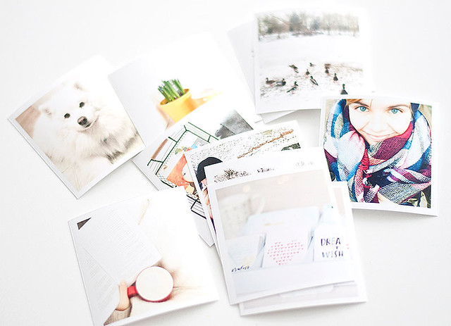
To keep the album bright and airy your photos should be... light! Aim for taking photos during the day, use the daylight whenever you can. Edit pictures before printing- increase the brightness, play with contrast, decrease the shadows and let the highlights pop a bit. You can also add a little white frame around your pictures- this way even the darker photograph will appear lighter in the album.
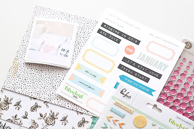
STEP 2 - MATERIALS
I love to use lots of neutrals to build a base of my pages and than add some happy, bright pops of color. I try to limit these to 2-3 shades per spread to avoid visual chaos. I found that these tricks help me achieve the look of pages that I love- balanced and bright, with photographs in focal point.
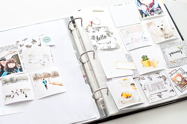
STEP 3 - COMPOSITION
Before I glue anything down I like to play with composition of my page. I move the things around until I'm satisfied with the final arrangment, than I stick the elements together. At the end I write my journaling and add some stamping here and there.
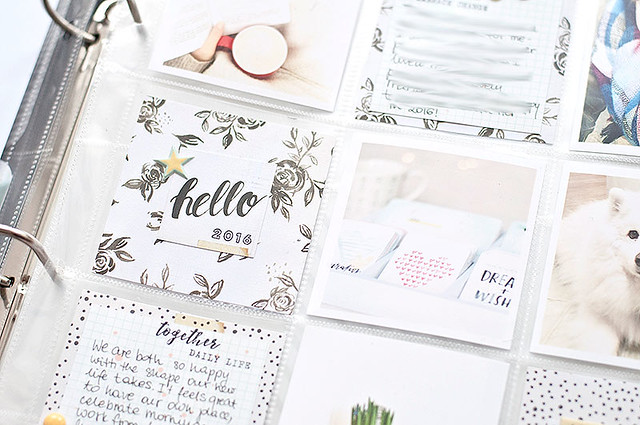
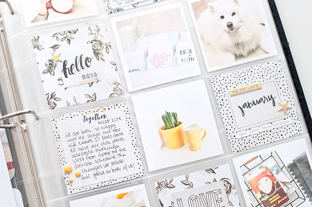
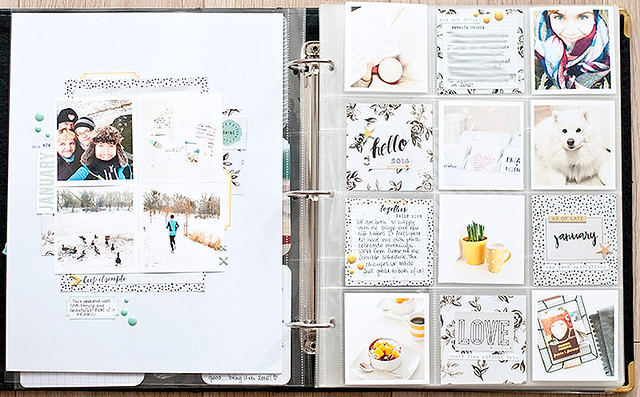
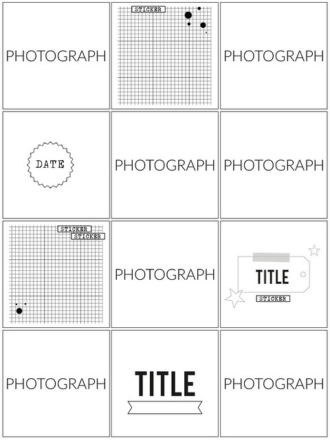
Here is the final look of my pages. If you like it, you can easily recreate it using the sketches I attached below for you.
And a sketch for you... do you know my favourite trick regarding sketches? Rotate or flip them! This way one sketch can provide you lots of beautiful (and different!) layouts each time you work with it!

Inspiring! Love that brightness!
ReplyDelete