Showing posts with label Double Page Layout. Show all posts

Monday, March 5, 2018

Kit Love with Anna

Hi dear friends! It's Anna and I'm here today with an unboxing video for you! And I've also made a layout with the absolutely FAB kits for March. I know I'm not alone to have been blown away with the kits this month, ask the rest of the dt's, lol!

Well here's the Lemon Drop Main Scrapbook kit, the Pretty Things Add On kit and the Embellishment kit.


I hope you'll love these kits as much as we do. I have so many favorites that it would be hard for me to choose one but if I have to, I'll choose the lovely flairs from the Crate Paper Here+There collection and the puffy stars from Pinkfresh  and... oops already more than one, lol!
Did you find some favorites? Please share with us in the comments below.

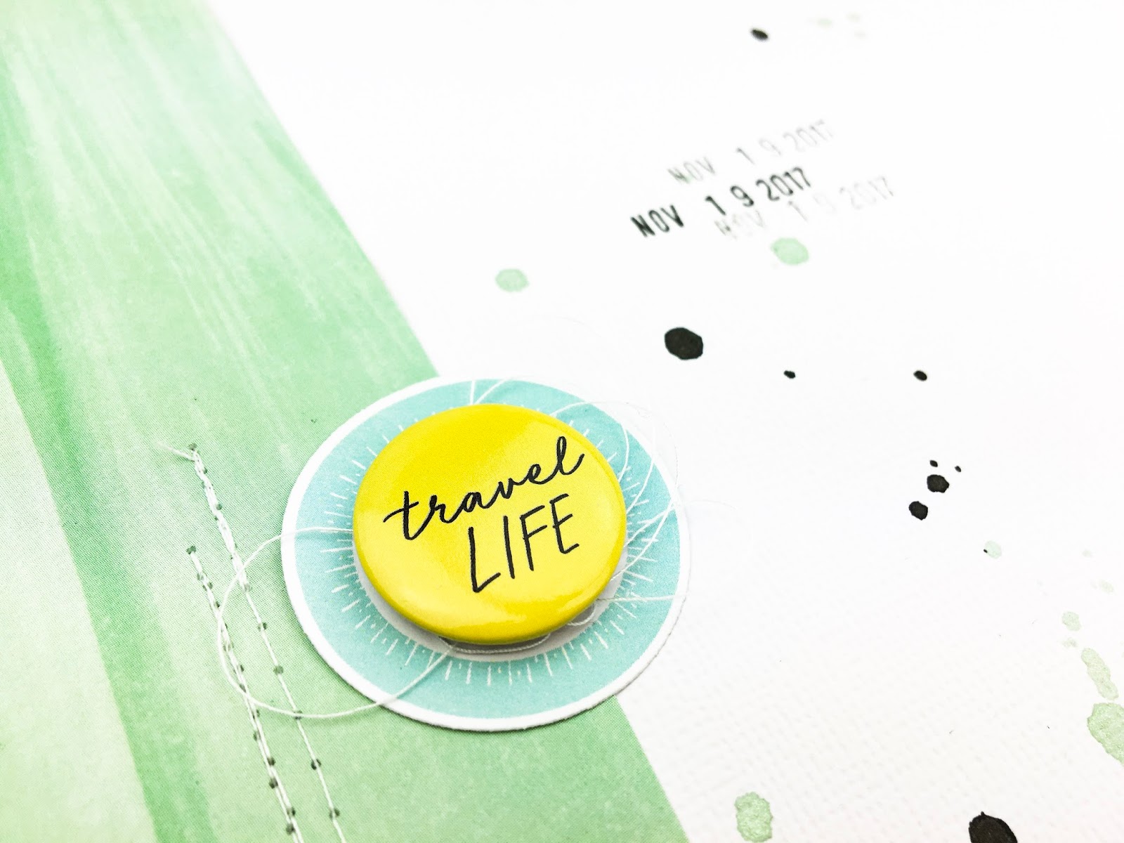
Anyway, here's my layout made with the Lemon Drop Main Scrapbook kit.


Do I have to tell you my favorite color no1 is GREEN?!  
And I love how the yellow and black complements so well.


Thanks for stopping by!

You will find more information and details about the prescritions and shipping of the kits here.
And be sure to join us at our Facebook forum as well!

I can't wait to see what all of you come up with, please share with us at the Facebook forum.

 Hugs Anna xo


Tuesday, March 28, 2017

Tuesday Tutorial | Double Page Layout Process

Hello everyone!

Marie here today with you to show you how I made a double page layout and incorporated 7 photos and a lot of text to record your story.

When I started scrapbooking, the worse part of the process for me was the start. I was looking at the canvas and didn't know where to go from there. It's only after many years of practice that I could easily start a layout. If you are like me and get intimidated by the beginning of the layout, or if you want to know how to incorporate many photos and words on a layout, just keep reading. I'll give you some of my tips and tricks and try to let you see inside my head. :)

Here's the layout I created:


The first thing I did when I received the kit was to look at the colors and motives and ask me what I could document with it. I immediately saw all the oranges and blues and decided it would be perfect to go with my trip I made to Dubai, a week ago.

I then printed photos I wanted to use. I print my pictures randomly in different sizes: 4x4, 4x6 or 3x4 (I then fit 2 of them on a 4x6 piece of photo paper). I print at home but you can easily resize your photos with any photo editing program and make them fit a 4x6 canvas and then send them to the place you normally get your photos printed.

Here I played my photos on some pieces of the kit and I was trying to select what I would use, making the colors and the theme fit my story.


I then trimmed my photos (got rid of the white borders) and that gave me a better look. I played around a little bit more.


I then selected 2 pieces of paper/cardstock which would be my base of the layout. I chose the yellow and white piece of paper which reminded me of the sand dunes (the triangles in the pattern) and I tried to go with the white yardstick for the right page but my very dark photos were not looking good on the crisp white, so I decided to go with the cream cardstock which gave to whole layout a softer look. I really like to use 2 different papers for a double page layout. I find that it brings more interest and it makes me also use more colors.


Once I had my 2 backgrounds selected, I started laying my photos down and that's also when I cut apart that large 12x12 piece of paper with all the small squares I wanted to use. I formed some kind of a loose grid.

When placing my elements and photos down, I was careful to group together what was going together: the silly pictures of us with the camel had to go next to the "just being me is fun" quote, and the adventure square was ment to be next to the dunes and the car pictures and finally, the blu square saying "here with you always" had to go next to the picture of me with my husband. It almost was a no brainer. :)

I added the "Go see the world" square to balance the orange square on the left page.

And I started adding some embellishments, forming a visual triangle that would bring the left and right page together. I thought of the visual triangle too when placing my blue elements. Look at the 2 blue squares. They form a triangle with the large photo on the right page. Also, we were wearing navy blue on that day so, although it's a little more subtle, you can see two diagonal lines of navy lue on the layout, right? Those triangles and lines are responsible for guiding the eye of the viewer on the layout. When you put a layout together, always think of these two elements. You can build a triangle with colors, or even with the kind of embellishment. For example here the cork elements which I placed also in a triangle. Do you see that?


Once my loose grid was there, I added a title. I looked at the place where it would make sense to add it. There was this fairly big whole right there so I thought of a title that would be the good size to fill the space but not over fill it. With the size of the letters in the kit, sand dunes seemed like the perfect title for my layout. If I have had smaller letters, I could have made a longer title like a day in the desert, for example. Since I wasn't done with my layout, I just gently placed the letters there, without adhering them completely.

At that moment, I decided that this picture of the sand dunes was blending too much with the yellow background, so I used a navy blue paper to make a small frame around it. When working with a kit, it's really easy to do so because all the papers are working together. Use a softer colored paper to calm your photo down or like me, a stronger paper to make the photo stand out.


I also wanted the orange square to stand out. Instead of framing it with more paper, I decided to stitch a gold frame around it. The gold thread is very subtle but sparkly so it creates a really nice visual effect. I have my sewing machine right on my table, which makes it so easy to just sew on almost every layout I make. Also, I always have either gold thread or white thread ready to stitch. It's so practical and easy!


Now is the time I started thinking about the journaling. I had placed my pictures in a random order, just thinking of the colors and shapes of them to make sense, and I hadn't,t payed attention to the time of the events presented in the photos. So I thought that the sticker labels would be perfect to add that element of time on my layout. It would also be another way of attaching my left and right page together. The eye reads the numbers 1 to 3 and then naturally looks for the number 4 which is on the right page.


Here is the number 4:


When i started thinking of the time, I decided that I had to swap the large photo of the Burj Al Arab, which we visited in another day during the trip to Dubai, with two photos of more things we did in the desert. Hence the two small 3x4 photos that just appeared on my layout. :) The quality of that one of us together in the dark is really poor, but it fits better with the story so overall, I'm happy with that choice.


I wrote some details on the sticker labels and added a second title on the right page which would add detail to the first title and which would, once again, tie the two pages together.


I added more small embellishments to add color and texture to my layout.


At that point I decided to add more details in my journaling than just the "what" that was already on the sticker labels. When you make a layout and add details, think of the story the viewer will not know when only looking at the pictures. Tell the small anecdotes and funny stories, or small details you don't want to forget. I think that journaling and details like this are what make a scrapbook more interesting than just a simple photo book so use the space you have to write. Just a little bit more at least. :)


When adding small embellishment, add them close to your basic elements that form the page. Here you see that I overlapped the camera on the orange paper. Same thing with the cork embellishments on that next photo:


Also, when using embellishments with a whole in it, like the heart and the arrow here on the right page, pay attention to what will show through that whole. It would have been awkward if the arrow would have been placed a little more down, letting show and amplifying the gap between the blue paper and the photo under it for example.


I finally looked at where there were enough space available to write my journaling. I thought of what I wanted to say and planed it according to the space I had. I also decided to write and stamp with navy blue ink instead of using a black pen. I really like how it makes all the navy blue in the layout pop out and make sense.


Here's the finished layout:


VoilĂ , I hope you like it and I hope you feel inspired and energize to go create something yourself! :)

Marie

SaveSave

Wednesday, September 28, 2016

Almost a double page layout with Veera

Hi, it’s Veera and today I’m sharing two layouts I did with September Add-On Kit and Pattern Paper Play #1. I used the same striped pattern Paper from Crate Paper as my background.


I really loved the diagonal stripes on the paper and used it as a guide where to place the pictures. Both of the layouts have similar elements like doilies, mist splatters and gold accents.


After I finished the layouts and looked at them side by side I realized that these would actually make a great double page layout too if just the stories and pictures would have matched. So I almost made a double page layout, right?
-Veera

Monday, July 13, 2015

The big 26 and a layout, Dear Lizzy - Fine & Dandy

Each month I'm always getting something extra from the store and this month I picked up a couple of the new Dear Lizzy Fine & Dandy items; the shaped paper clips and accent stickers! I thought it might be fun to create a traditional layout and something different (for me).

I went with a card for my "different" this month - which isn't really different at all, but given I'm not much of a card maker I figured I'd be daring and make it a shaker-card! ;)  I never realised just how easy shaker cards were to make. For my base I used the Fine and Dandy "Stripey Straws" paper (from the July Pattern Paper Play 2 kit) then added foam tape around the edges to give me depth.  Then I just popped a piece of clear acetate on top, cut a white border out of cardstock and stuck it on top (to hide the foam tape). It’s that easy! Who knew ;)

A co-worker is turning the big 26 (and when I say the big 26 I should point out she is the "junior" in our office… I wish it was me turning 26..) so I made this with her in mind.


To make sure the accent stickers actually move around (and not just stick to the back paper) I popped them onto a scrap piece of vellum then just cut them to shape.  The shaped paper clips are clipped onto the circle paper but I also added a bit of washi tape at the back to stop them falling out should she decide to really shake that card.


For my traditional layout I went with a double-page spread.  We have just finished up with school holidays over here so we've had both kids (my son & niece) home all day and I love them both dearly but they sure are “funny”.  Thought it would be fun to jot down a few of my niece’s seemingly daily demands these school holidays ;)


This one has a little from the July kits – I tried to stick with the Fine & Dandy collection to keep the colours consistent but also brought in some pinks and golds to match. I love using different alpha’s for the titles and I just popped the “5” shaped paper clip at the top (it’s her age).


I think this is my favourite 2-page layout that I've made so far. I really love the colours!


Did you happen to pick up any of the new Fine & Dandy line from the shop this month?  Would love to see how you've used it if so!

Thursday, February 19, 2015

Inspired by Pinterest

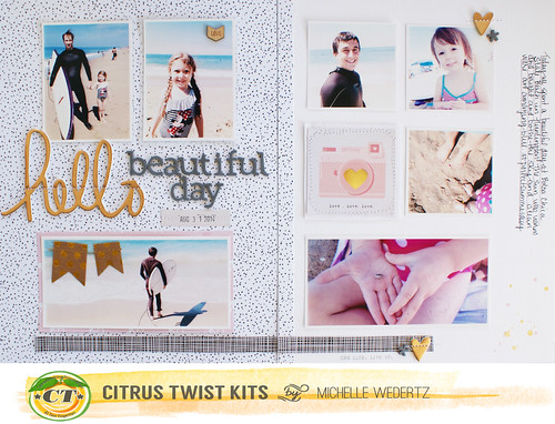
Hi! Michelle here to share with you how a Pinterest pin became the design inspiration for a double page layout.

A lot of the time when I am stumped for an idea, need a little extra inspiration, or when I just want to try something new, I turn to my Pinterest board that contains non-scrappy design related images. When I begain to work on this project with the February "Love Letters" Main kit, I knew I wanted a design that allow for me to use several pictures.  Looking through my board, I found this image which reminded me of a magazine type layout complete with several pictures and lots of room for text. With this in mind, I came up with this double page layout:


Hello Beautiful Day 3
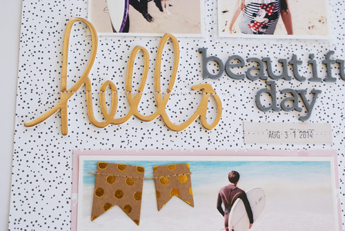
I really stuck pretty close to the pin, keeping the photo arrangement very similar and using the column on the right for my journaling. I varied from the image by adding a place for my title as well as adding in embelllishments and patterned paper.
Hello Beautiful Day 4
Hello Beautiful Day 5
Thanks for stopping by today!
Michelle

Monday, February 9, 2015

Using your February 2015 Pocket Life Kit with Janine

Hallo everyone, I hope you're all fine!

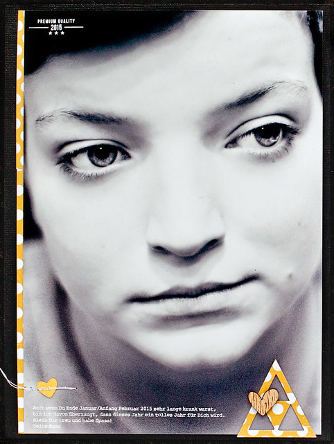
The end of January/the beginning of February has been quite hard for us, especially for my little boy. He's been sick for almost three weeks, with so much fever and he felt really bad. When I saw the card that says 'Be. Breathe. Do' I had to think of my son. That's what I told him, when he was so sick and when he was scared that he wouldn't be better ever. I told him to just be and accept it for now. That he is not well, but that he will be better and will be able to smile again. And I am so so glad and happy that he is feeling better now! That was so hard to see.

So I decided to capture this (I took the photo when he was feeling much better tho, because I didn't want to bother him too much, of course) and to let him know that it is going to be better. Just be and believe in it.

janinelanger-ctk-februar2015-banner-001

As I wanted the layout to be bright, sunny and positive and I also am in love with the color yellow right now, I just went with the flow. I knew I wanted to create a double pager and so I decided to make each page a 6x8 inch size.


I printed the photo slightly smaller than 6x8, because I wanted to frame it and added the journaling beforehand. Before I printed it though I went through this month's PL kit and saw the 'Premium Quality 2015' saying.

It sounds weird at first to incorporate this stamp into a layout that captures my son's bad health at the beginning of the year. But I wanted the meaning of the layout to be positive, I wrote in my journaling that I am sure the year will be much better from now on. So I thought the stamp would fit though.

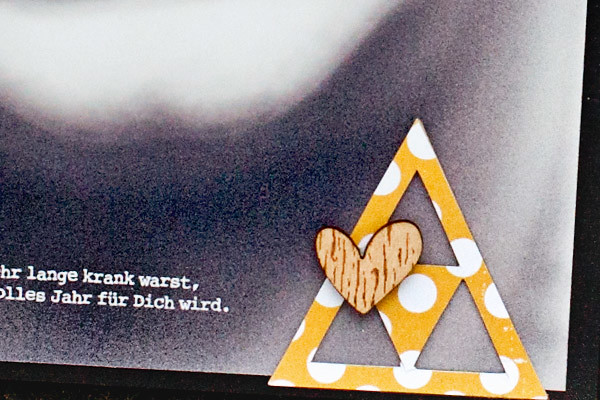
But I wanted to have the stamp itself a tiny bit smaller, because the layout's size is only about 6x8 inch and I didn't want to cover up too much of the photo. So instead of stamping it on the picture, I scanned the words in and turned the saying into a digital stamp that I added on the photo before I printed it. I also wanted to use those adorable kraft triangles, but they were a bit to dark for what I had in mind. So I covered two of them with one of the papers from the paper pad in the kit and cut it out. I then adhered one triangle on the bottom of the photo.

janinelanger-ctk-februar2015-003

I also added one wooden heart, some more patterned paper under the left side of the photo and matted everything on black cardstock from my stash. As I already knew there would be a lot going on on the other page of the double layout, I just added one more heart I punched from the yellow cardstock and stitched over it. So the left page was finished quite quickly.

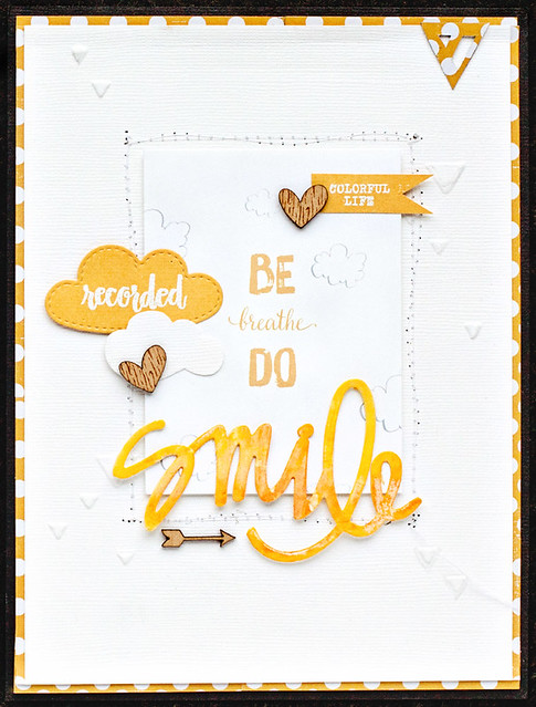
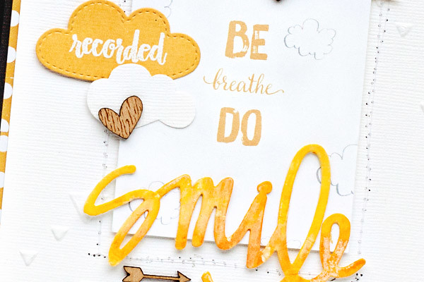
For the second page I knew I wanted to use that beautfiul PL card as well as some different mediums, to create different surfaces and textures that kind of resemble life. Life is complicated, changes a lot. It is not always happy, sometimes it is rough. But eventually you are going to smile again. Normally after each deep follows a high. I hope you can understand what I mean, sometimes it is hard to tell what I mean when I can't use my mother language. :)

Anyway, here is a closer look at the second page:

janinelanger-ctk-februar2015-004

I cut a white cardstock from my stash slightly smaller than 6x8 inches, adhered the PL card with thin foam tape on it and stitched around it. After that I wanted to give the background a bit more interest and dimension, so I decided to use a triangle embossing folder from my stash and embossed some triangles on the background. That took some time, I did it by hand, because I didn't want to have the whole background covered in triangles.

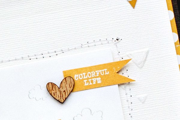
To add another texture and surface I decided then to stamp two sayings from the February 'Colorful Life' stamp set with Versamark embossing ink on yellow cardstock that came with the kit and embossed it with white embossing powder from my stash. I cut one of the sayings into a little banner and the other one into a cloud. As well as another cloud cut out of the white cardstock that I used for my background.

janinelanger-ctk-februar2015-005

When I saw the watercolor paper words in the kit, I knew I wanted to use the smile one also for this layout. So I colored it with two different Gelatos from my stash to add another surface and texture on the layout.

janinelanger-ctk-februar2015-006

Finally I adhered everything, added some more wooden hearts, the other triangle that I covered with patterned paper and adhered some more patterned paper under the white cardstock before I adhered it on another piece of black cardstock from my stash.

I love this layout, I love that it is bright and colorful and I love the meaning behind it. And I am so relieved that my son's feeling better now. :)

Thanks for taking the time to stop by and have a wonderful day everyone!

Thursday, August 14, 2014

Double Page Layout with Michelle Wedertz

Lately I have found that trying new page sizes, techniques, and styles has breathed fresh life into my creativity.  A two page layout seems the perfect next avenue to explore.

When trying something new, I often take inspiration from scrapbooking galleries and pinterest, Double page sightings are rare though. I am certainly seeing more than usual, but there still is not a great deal to pull from.  So when I set out to design a two page layout, I really had to start from scratch.

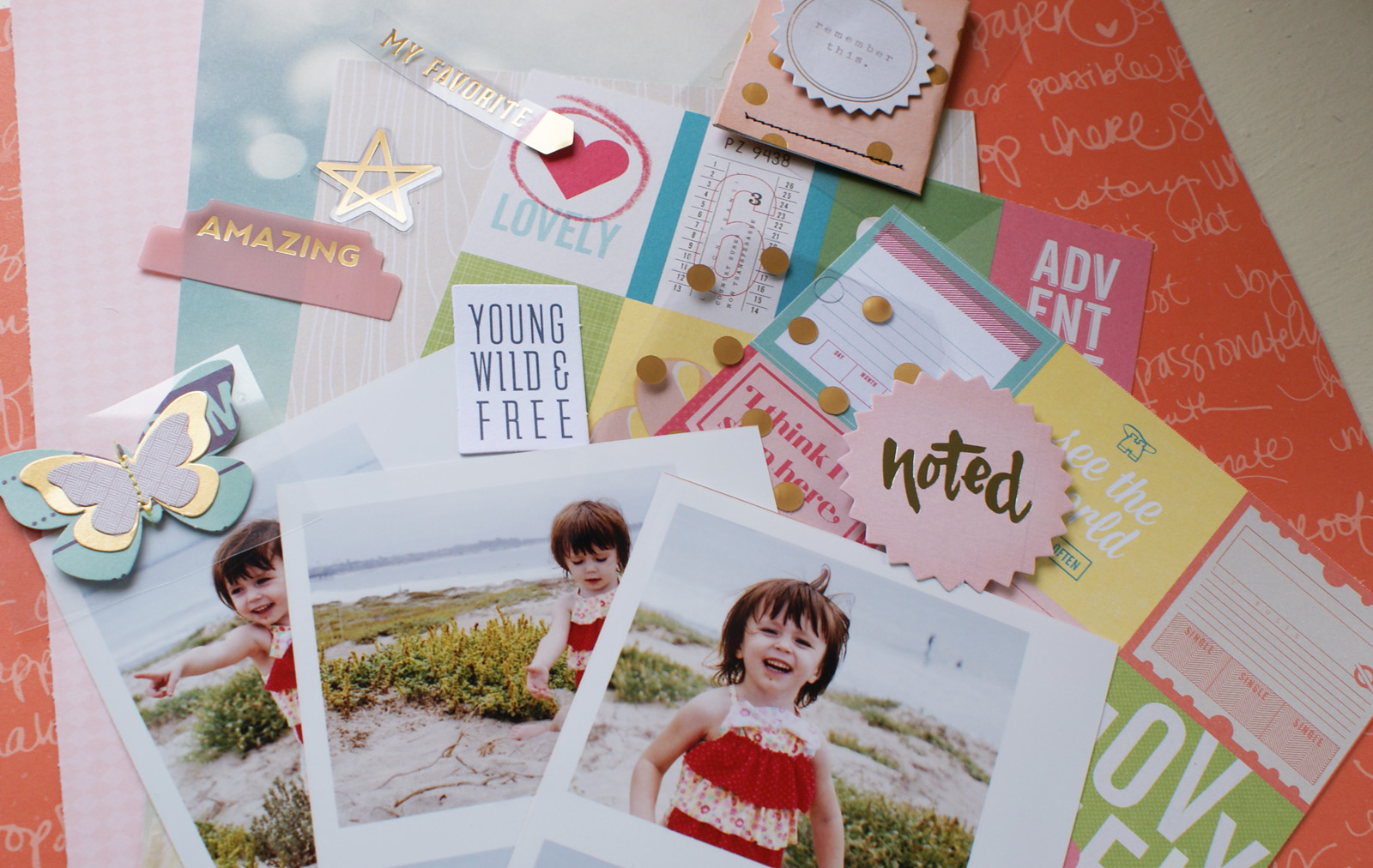
I started first by narrowing down a color scheme.  Beside complimenting or highlighting photos, color can be used to unite multiple pages.  These are the products I pulled from the various August kits.

Double Page 5

From this I narrowed my color scheme down even further to pink, red, gold, and a few neutral pieces in beige and gray.

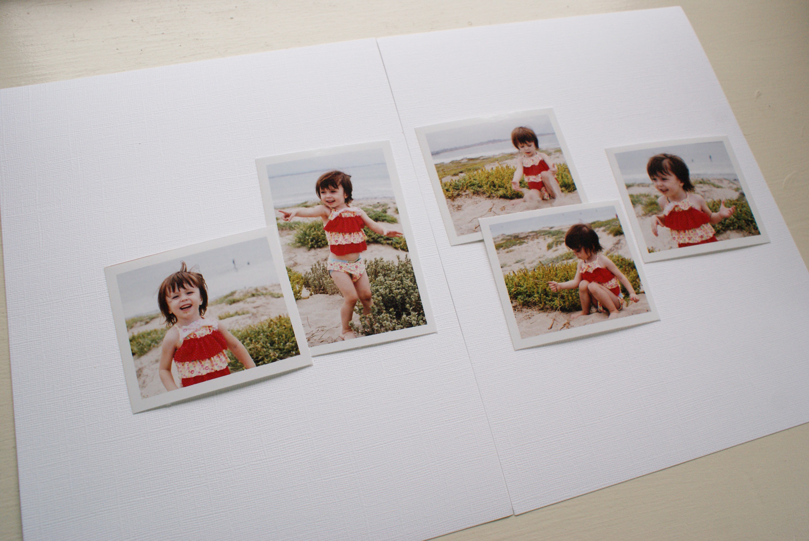
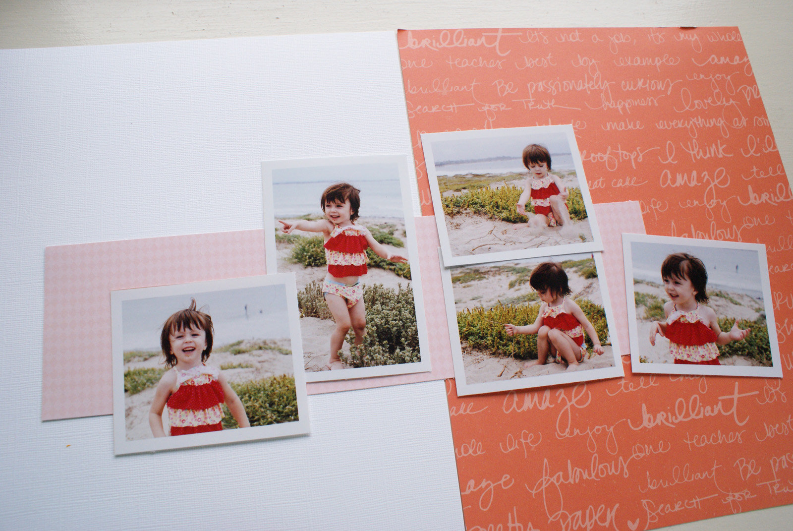
Next, I spread my photos across the two pages and played around with the arrangement.  To keep it simple, I printed all but one of my photos the same size and went for a symetrical design to balance the photos on both sides. Here is what I decided on:

Double Page
 
Now that I knew where I wanted my photos to go, I began to build a background.  Since I absolutely loved the red patterned paper from the August Main Kit, I decided to be bold and use it as one full side of my design.  I then cut a smaller pink rectangle to spread across both pages, bridging the two pages.
 
Double Page 2
 
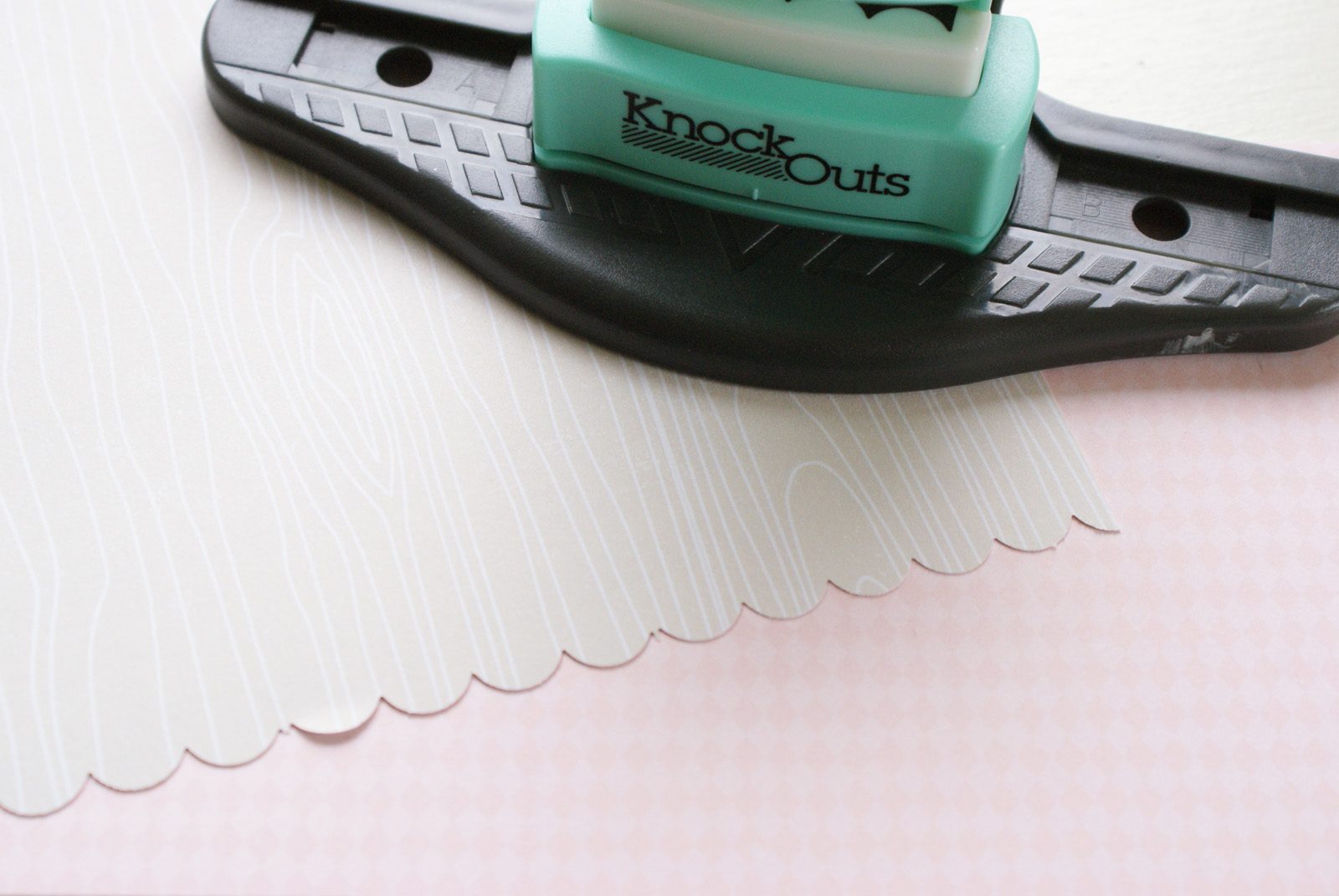
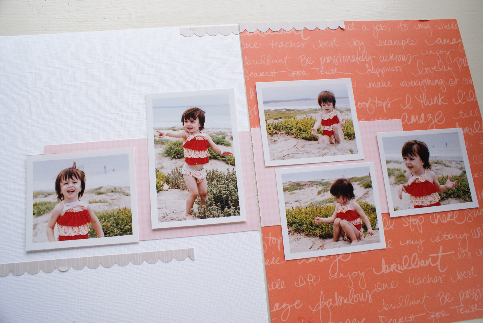
To coninue with the process of unifying my layout, I cut a border strip in a neutral beige from the 6x6 paper pad included in the PL Kit and placed it across the top of both pages, making sure they lined up.
 
Double Page 3
 
Double Page 4
 
With the foundation of the layout completed, I turned next to embellishing. To make sure I balanced them across the two pages, I used the embelllishment to create a visual triangle.  You can see that here in the finished layout.
 
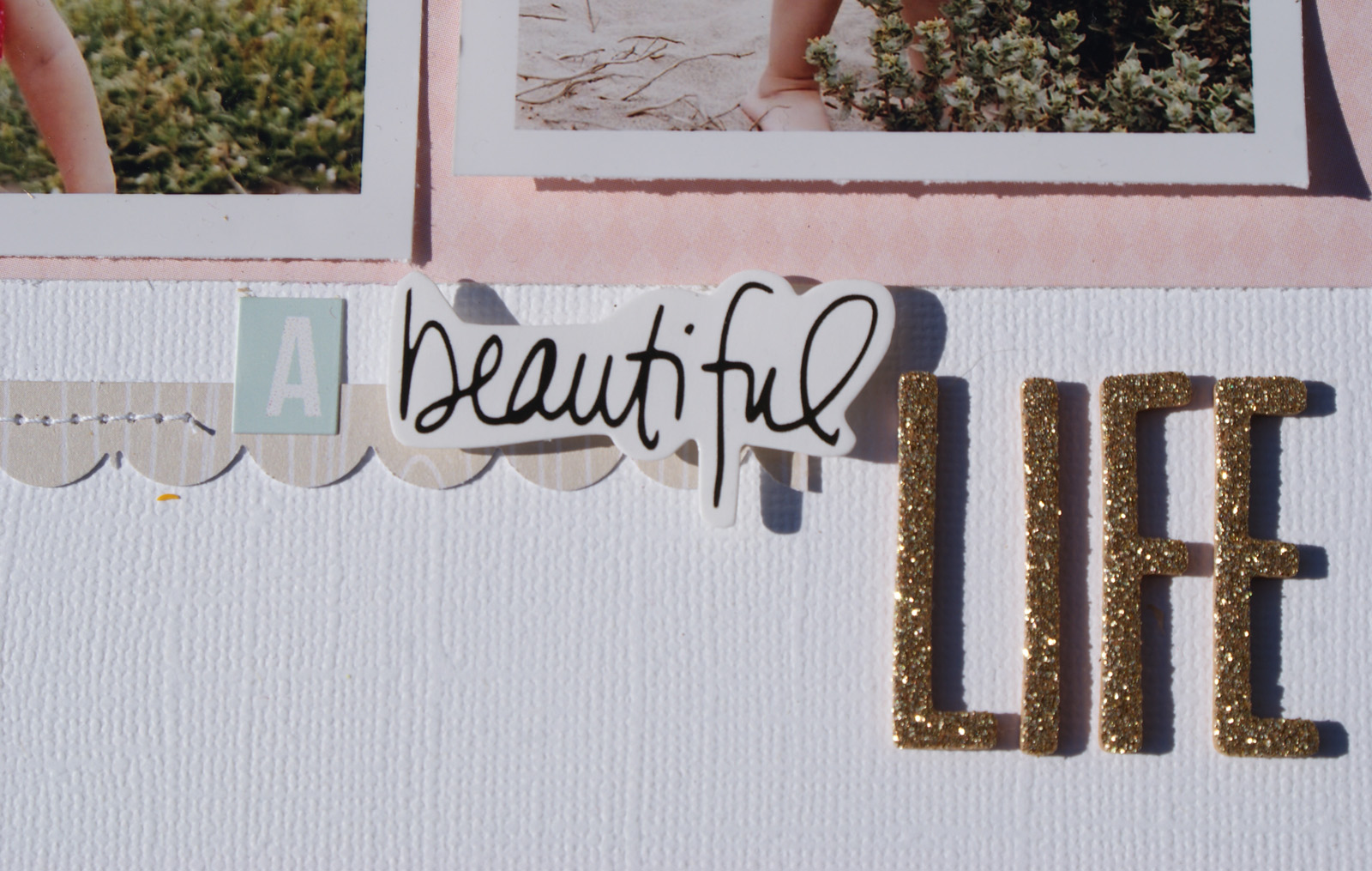
A Beautiful Life
 
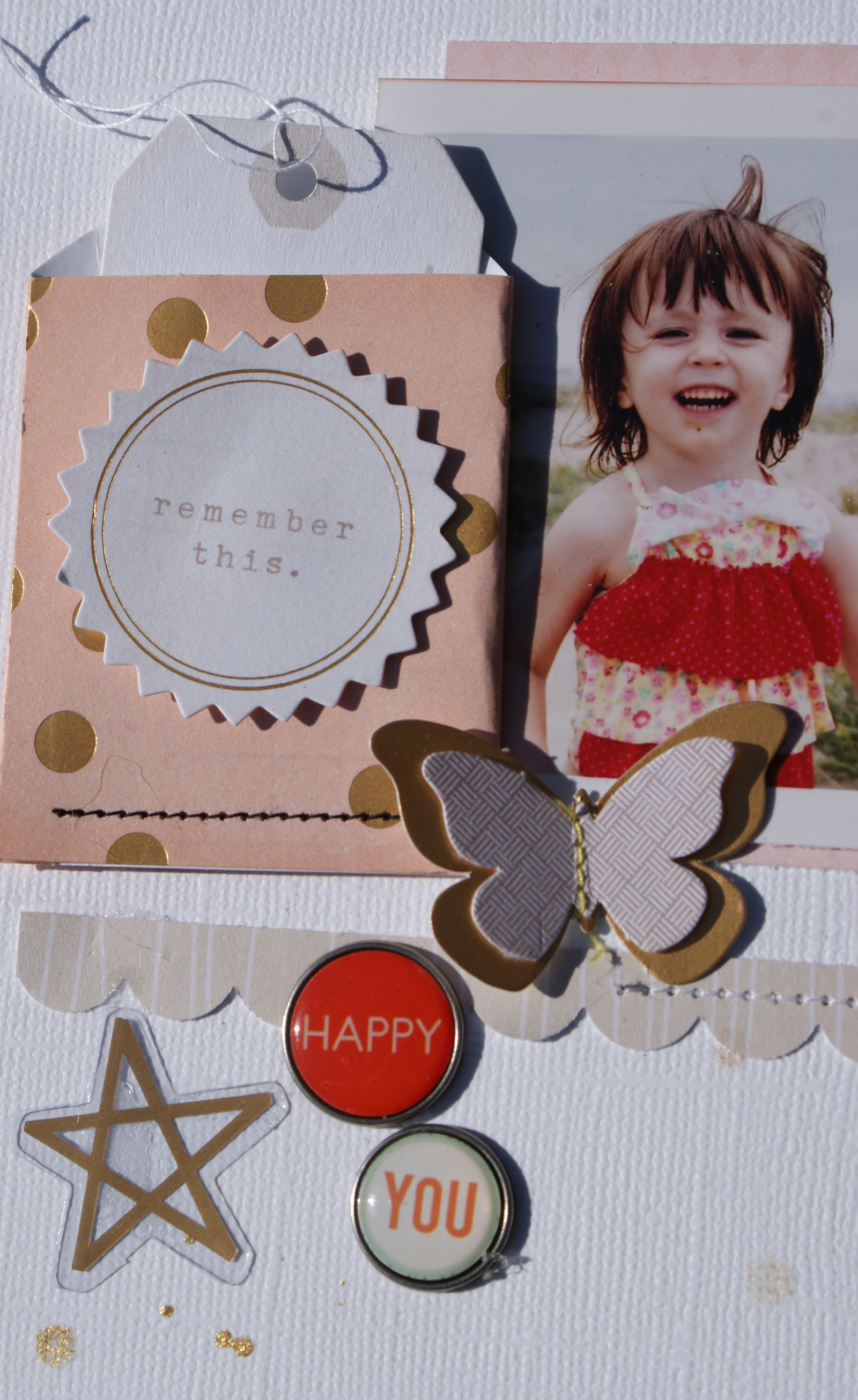
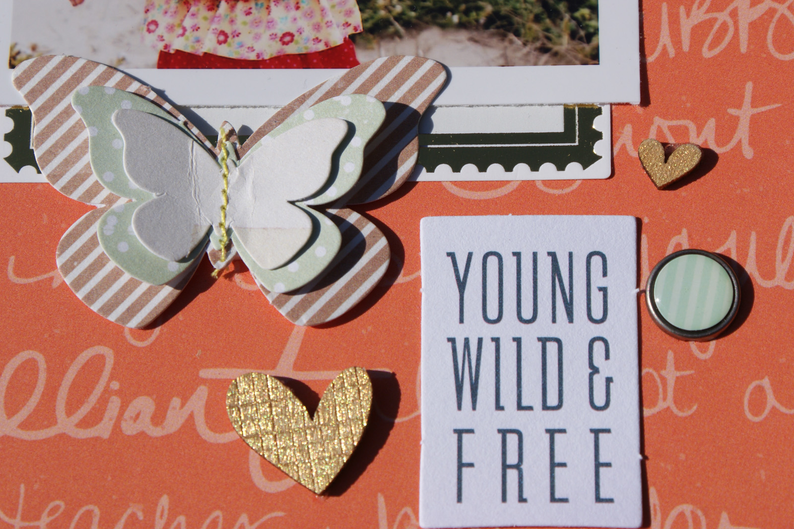
Here are some closeups:
 
A Beautiful Life 4
 
A Beautiful Life 5
 
A Beautiful Life 6
 
Products Used: 
 
Wishing you a great day!