Hi there!
Nathalie with you today to share a bit of inspiration using this week's sketch. We always talk about how versatile sketches can be, as they are the blueprint for your project. Think of sketches as the bones of your project, the rest is up to you. Well, let's start by showing the sketch:
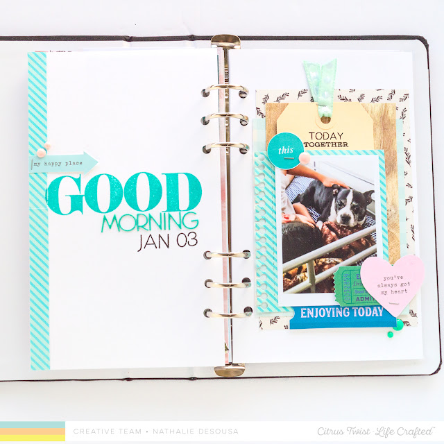
The sketch was designed for a 8.5x11 page with lots of layers. Here is how I interpreted the sketch in my Life Crafted album:
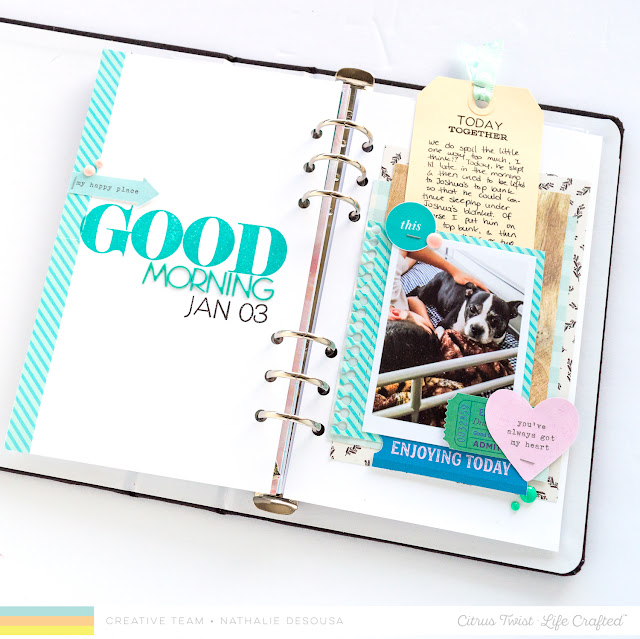
I flipped the sketch 90 degrees counter clock wise and then pulled the New Starts Digital collection, a few of the stamps and lots of embellishments from the shop to create this spread.
The bulk part of the sketch (once flipped) is on the right side of the page. Here, I used papers from the New Starts Digital collection, as well as a few from the December Add-on kit, and tried to follow the layer sizes. I switch the location of the embellishments so that it balanced the page a bit better. In addition, I stayed with a very masculine palette and a hint of pink since the picture is of my two boys.
I followed the sketch and left lots of negative space on the left side of the spread. However, I replaced the "typewriter title" with a mixture of stamps and textures. I used the Madison Alpha stamp set to create a word that will fit across the width of the page. Then added a second word using the teal puffy alphas from the shop. I bulked up the title by adding the date using the Bailey Alpha 4x6 stamp set. A small cut apart element with enamel dots just bring it all together.
The major difference is the location of the journal. In the original sketch the journal sits to the right of the picture (above it once you flip the sketch). I changed the small journal spot for a tag, and created a pocket between the layers behind the picture. A bit of stamping -Currently Stamp set- at the top of the tag just bring the look of the original sketch to the page. Just love how easy this came together in a really short time, so I decided to follow the same idea to document the following day's story, too.
For this layout, I changed things a bit. First of all, I flipped the sketch counter clockwise, and enlarged the picture to fit in the negative part of the sketch.
This time, I used the sketch as inspiration for the paper layering, however used a 4x8 tag as the background. The New Starts Digital collection is amazing, and so easy to combine. I resized some of the TN papers and added a piece of the Marigold paper pad in the layers. Then added pieces of Florals Die Cuts, Tickets and Tags, and New Starts Digital cut apart elements to complete the page.
I really hope these have inspired you to use the sketch to create a project of your own. Remember to share with us what you have created, use the hashtag #citrustwistkits or tag us using @citrustwistkits. I cannot wait to see what you create.
XO


No comments:
Post a Comment