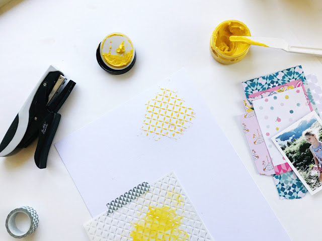
For this 9x12 layout, I knew I wanted to layer on the texture and to do that I had to start from the very bottom layer--my base paper. To create the very first layer of texture, I reached for my Color Shine sprays from Heidi Swapp. These are my go to sprays because the colors are glittery as opposed to being a flat color and I like that extra sparkle. As you can see in the photo, I already had my patterned papers stacked and stapled because I like to know ahead of time where my papers and general design is going to go, so that I know where I want to drop the color on the page. For this instance I was going for a diagonal direction-from the top right corner down to the left corner.
My second application of texture was the addition of a colored paste that I applied using a mask. This particular paste is a flat color which I picked because it contrasts with the glittery mist that I first applied. Contrast is always at the top of my mind when I am choosing products because I want variety. Variety makes it interesting!

You can also consider texture when you're picking out embellishments. For example, after having chosen to use a few pieces of chipboard which has a matte finish, I wan\ted something different so I went for the plastic puffy hearts. To add a final piece of texture I pulled out a few pieces of the ephemera that had a glittery gold finish and tucked it in under my layers. Here's a look at the final project:
- Not into mixed media, consider using a textured cardstock or paper for your background.
- Mix it up--variety is always good.
- Vary the amounts of each type of texture--you don't want a lot of everything.
- Think outside the papercrafting box--things like fabric and ribbon are good options!
Thanks for stopping by today and if you create a project that features some texture, share it with us! You can post t here in our gallery or on our Facebook Fan Page! We love seeing what you all create!
Michelle


No comments:
Post a Comment