Today I'd love to show you what I created with the wonderful Januar PL Kit 'The Sweet Life', the PL Embellishment Kit 'Bits and Pieces' as well as the Patterned Paper Kit.
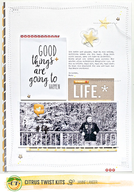
Let's start with the first layout, that I created. But first I have to say that I was really amazed when I got the kit. It is so perfectly balanced and the colors fit together wonderfully. I love to use PL cards on my layout, so I was very happy when I opened the package and saw all the beautiful cards that came with the kit!
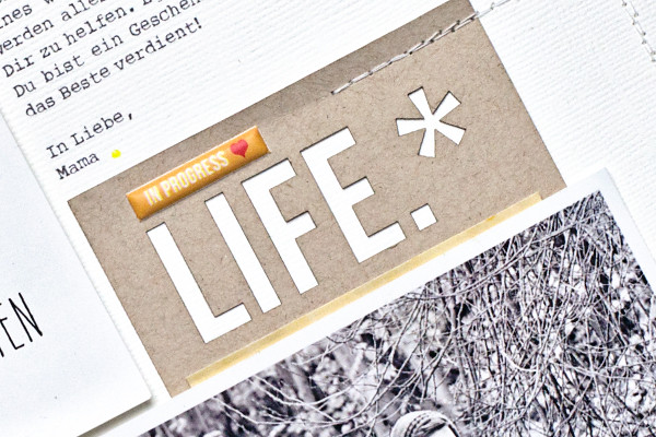
The card I used on this layout immediately caught my attention. It is perfect for what I had in mind. I wanted to write a litte note for my son about life in general. So - perfect fit.
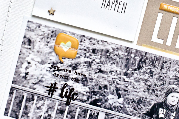
I kept the design quite simple to focus on the journaling and what I had to say. But as always I added some stitching and a bit of twine. Just because I love it. :)
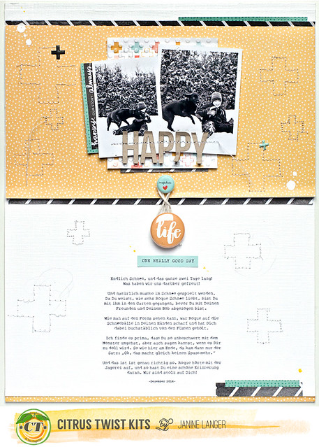
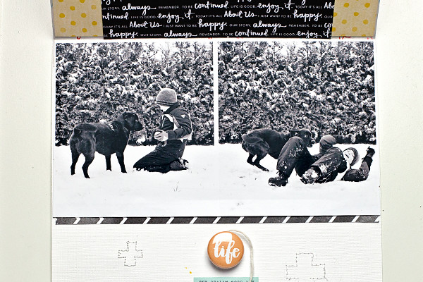
The second layout I made, actually has a tiny interactive twist to it.
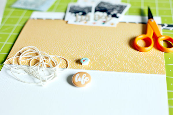
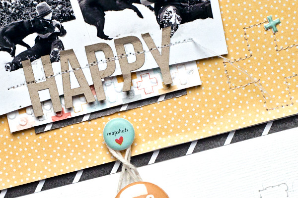
It has a flap with two more photos under it. I loved those photos and I couldn't find another way to put them on the layout without hiding too much of the beautiful paper and the stitching, as well as the journaling. So I went with an interactive element instead. It's the first time for me and it was actually a lot of fun. I should do that more often!
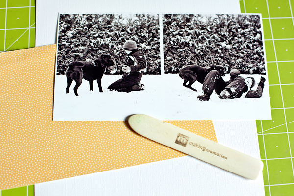
Also it was quick to do, just a few steps. You're going to need some cardstock or patterned paper, photos and a bone folder.
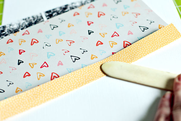
Then you put the patterned paper on your pictures so it covers everything and fold the top behind the photo. To get a nice and clean line, use a bone folder to do so.
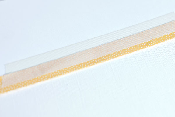
Now you can adhere the folded part on the back of your photo. You can use glue or washi tape, whatever you prefer.
Eventually you adhere everything on your layout and close it with two elements and some twine. I adhered the puffy sticker and the flair button with foam tape, so there would be enough space for the twine. That's it. :)
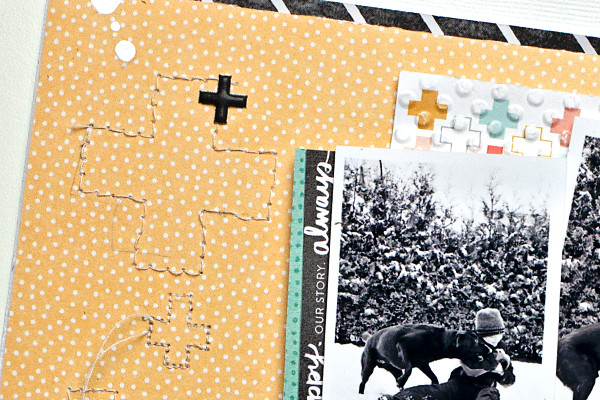
Here are some more close-ups of the finished layout.
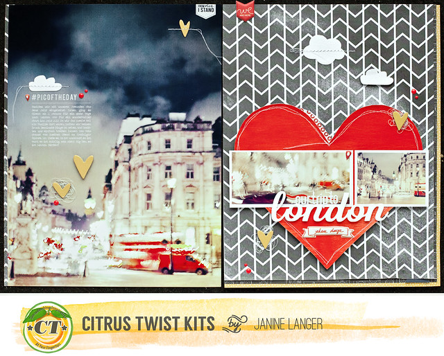
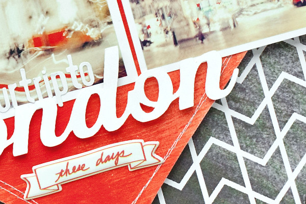
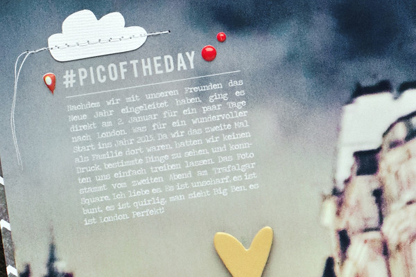
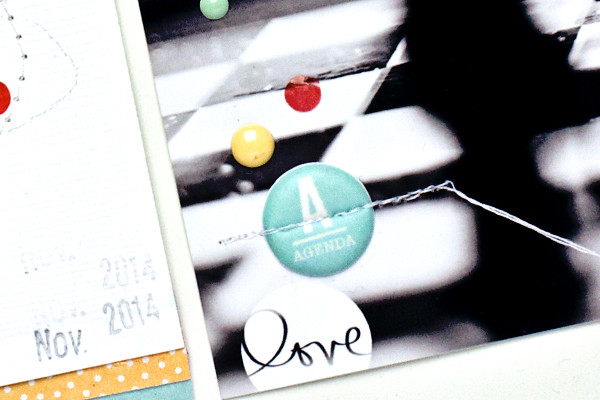
The next one ist probably one of my most favorite layouts I've done for a while! At the beginning of January my husband, our son and I went to London. We try to go there at least once a year. It is an amazing city and we all love it! On the second evening we came across Trafalgar square and I tried to take some photos with my travel camera. It doesn't take very good photos when it is dark, but I had to give it a try. And - I am so in love with the photos that I took that evening.They are blurry, chaotic, busy, imperfect. For me it shows movement, excitement - well, it shows London!
As I wanted to print my favorite photo in 8.5x11 inch, but also wanted to include some other photos and our love for this town, I decided to create a double pager.
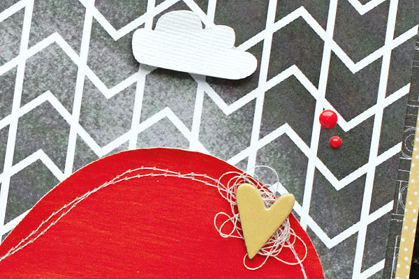
I think red is a perfect color to describe London and so I decided to paint a red heart on watercolor paper, cut it out and adhered it on my background paper. I really like the way it looks.
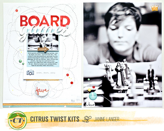
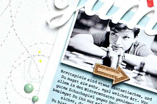
And now, finally, the last layout I did. It is a double pager again, but this time it is 6x8 inches each side. I love that our son likes to play chess from time to time (especially during winter). And since he's got a Star Wars chess board and Star Wars figures, he likes it even more!
On the left side I added a lot of stitching to give a bit more interest to the cardstock background. I also loved that polaroid card where I printed my journaling on. Other than that, it is again quite simple.
And that's it for today. Thanks so much for stopping by and have a wonderful week!

Your layouts are crazy beautiful Janine!
ReplyDelete