Hi everyone, Today I'm sharing my creations using the gorgeous October kits as well as a few little tips you might like to try out on your layouts..
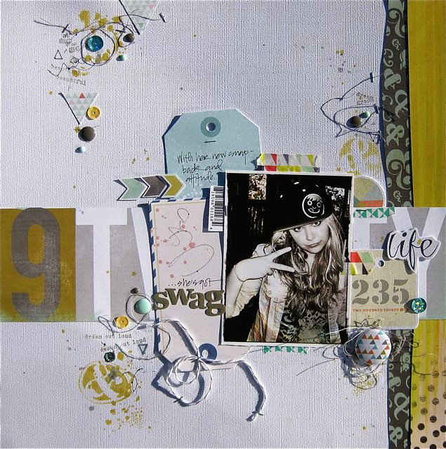

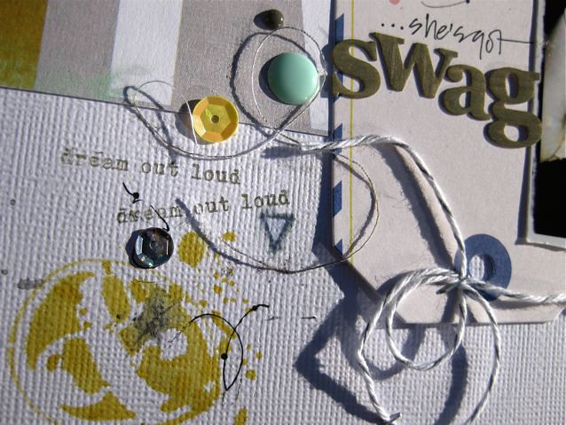
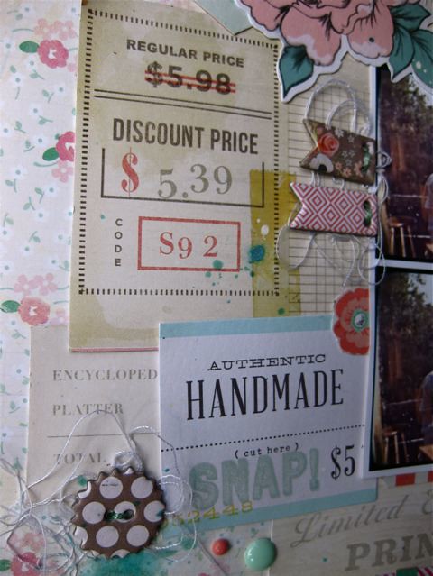
I've used some loose thread around the enamel dots and sequins and 'grunged' it up a bit with some hand drawn doodles and triangles. I've added also lighted touched the ink in places with a just wet fine paint brush. You will need a pen that bleeds a bit to do this
The Prima wood veneer alpha from the Add-On kit have been inked with Prima "Old Road" ink
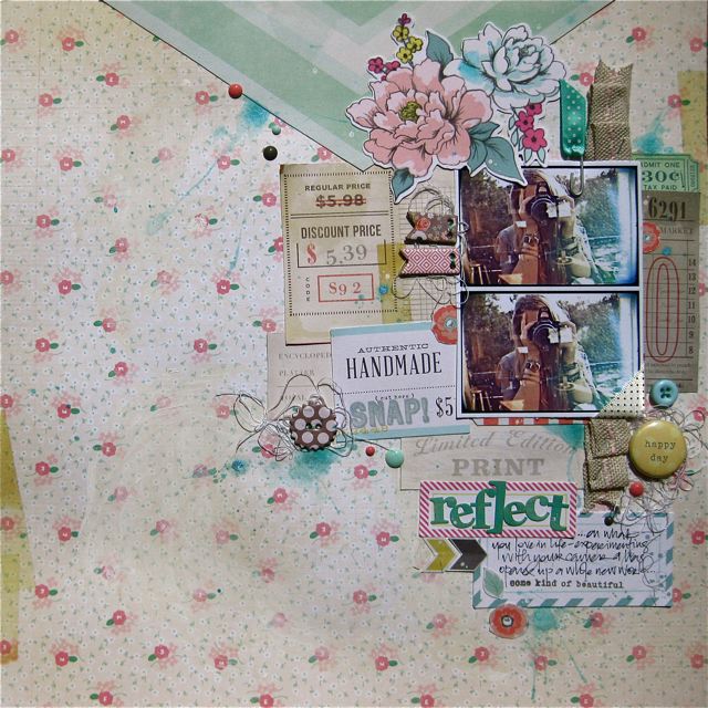
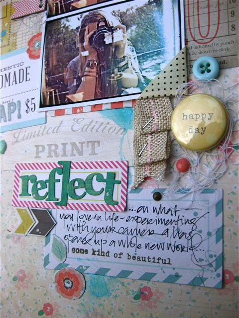
To add texture on this page, I've pleated a section of burlap ribbon and then secured with a Tim Holtz fastener. Once again I've inked up the wood veneer alpha with another chalk ink
I've used some touches of yellow water colour and a splattering of charcoal mist
the extra, non alphabet thickers can also make a great embellishment on pages..such as these plus signs
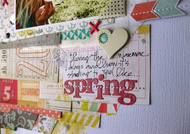
and of course I had to use the wood veneer alpha again for the title!..this time inking in both red and white (I didn't have any pink).. I love how thin these alphabet are, and so easy to machine stitch through
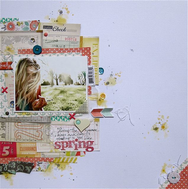
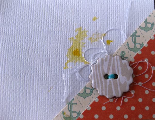
..and finally, I thought I would share a simple way to balance out a left aligned layout by adding a corner piece. Just hand-cut a couple of corners off two left over papers and add an embellishment with a few scrap thread trims behind


Love those layouts! The colors, patterns that were placed together & all the tiny detailed clusters! Did I mention the layers too!?? #love
ReplyDeleteJust gorgeous!!!
ReplyDeleteBeautiful layouts!!
ReplyDeletethank you ladies! xox
ReplyDelete