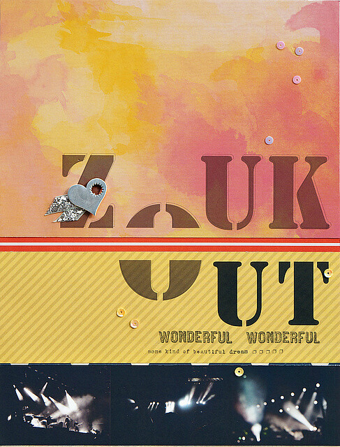
I am always excited and inspired by typography. Playing with different font types and different placements of journaling text often transform a simple design into a truly interesting page for me. These photos, taken at night of Singapore's popular, beach rave party ZoukOut, lack clear details. So I create a design where the photos provide a taste of the party's atmosphere while the eye-catching typography becomes a focal point.
The title treatment come together from a combination of ideas I found on Pinterest. A stencil font to fit in with the urban theme of a dance party. Then I overprint with the same font in outline for a shadow effect which adds the illusion of depth. For some final pizzazz, I split the common alphabet "O" so that it's shared by both words and links them in the title.
I hope you'll be inspired to experiment with typography in your next layout. As with all of our sneak week guessing games, leave a comment with your guess of what's in this month's kits and you'll be entered to win a $5 GC to the CTK shop!


that watercolor paper looks like the B side of Arrows by Glitz Design (wild & free collection)
ReplyDeleteand i am thinking Amy Tan / Cut & Paste for the striped yellow one!
you got both of them right Alinor !
DeleteStencil,and I'm guessing paper by glitz wild and free collection
ReplyDeleteyes that wild and free arrows paper is lovely. no stencils this month i'm afraid.
DeleteI don't know who makes the little heart embellie with the starburst design in it, but it's super cute!
ReplyDeleteThat metal heart is very cute. I actually used the back as I wanted a grungier look, the front is a nice mat white finish.
DeleteBeautiful layout! I always love your geometric designs, Sandy!
ReplyDeleteThanks a bunch Tina ! I love playing with a strong, graphic look whenever I can.
DeleteLove the sequins! Don't know where they're from, but I like them!
ReplyDeletethey are pretty fab.
ReplyDeletethese tiny ones have a matte finish on the back which I used as it's much easier to photograph a layout without pinpoints of light reflection.