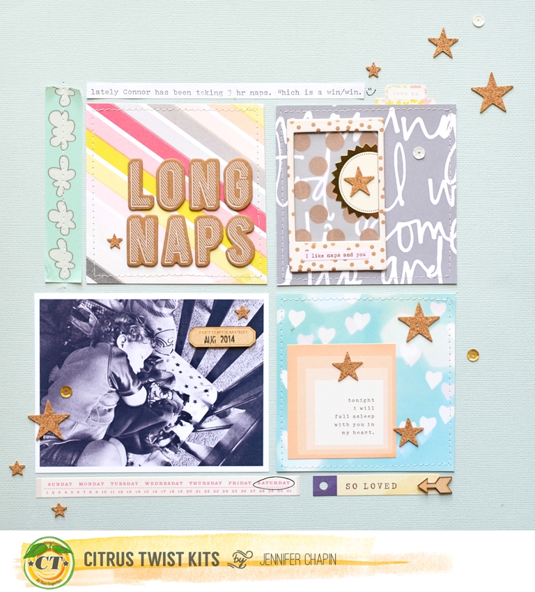
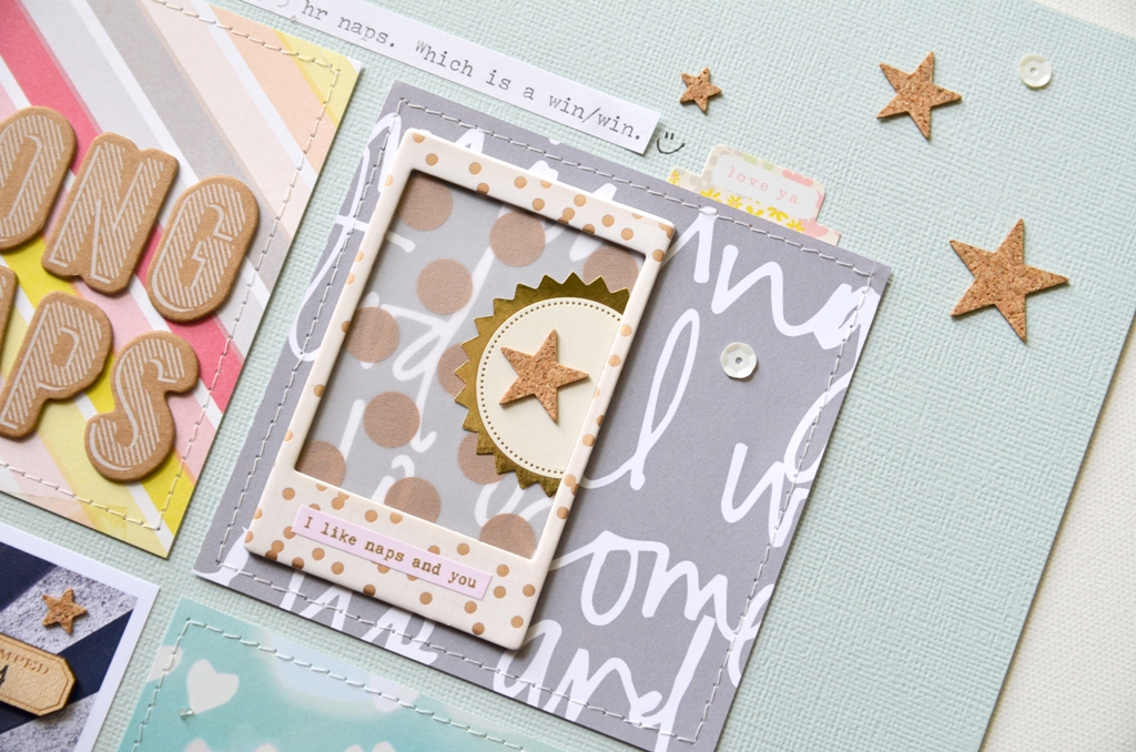
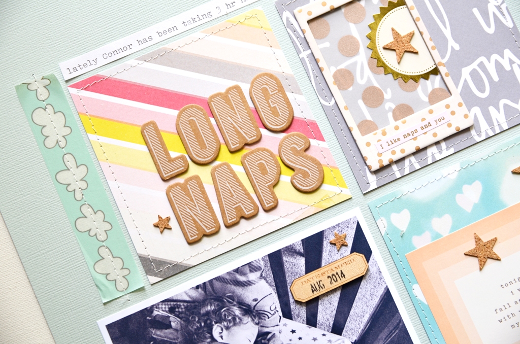
Today we're happy to feature layouts by Cheryl from Scrapstorian. She used our September 2014 I Just Want To Play Add-On kit and created three fabulous pages, taking inspiration from three different challenges. We love her colourful mixing of pattern papers and her creative interpretation of the sketches from the challenges. Thank you Cheryl for sharing your work with us.
Showing posts with label September 2014 Kits. Show all posts
Wednesday, November 26, 2014
Tuesday, September 30, 2014
Tuesday Tutorial with Michelle
Good morning and happy Reveal Eve! Before we turn the calendar and begin the lovely month of October, I want to share a simple technique that was inspired by this image I found on Pinterest.
The image features a starburst radiating out from the top left corner. I thought this would be a fun way to incorporate several pieces of the patterned paper in the September Free Spirit Main Kit.
First, I took a sheet of 8.5 x 11 kraft paper, drew my pattern on it using a ruler. and cut it out with my paper trimmer. I then numbered each piece so that I could remember what went where.
Next, I traced the templates onto my three pieces of patterned paper and cut them out.
And here is the starburst all put together:
Often times when I think of a starburst I picture it radiating out from a focal point and had I not seen the image on Pinterest, I am sure I would never have thought to have used it as I did.
Sunday, September 28, 2014
Sunday Sketch With Evelyn Pratiwi Yusuf
Hey everyone Evelyn Pratiwi Yusuf here, so glad that I can
create and play again with Citrus Twist Kit Sept main and Embellishment kit
after taking a break because of my pregnancy. Here is a layout I created based
on the sketch

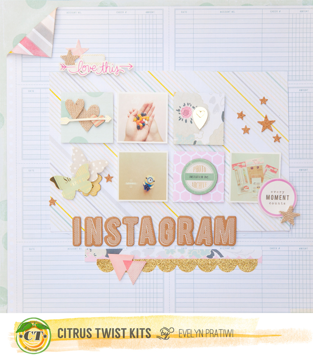
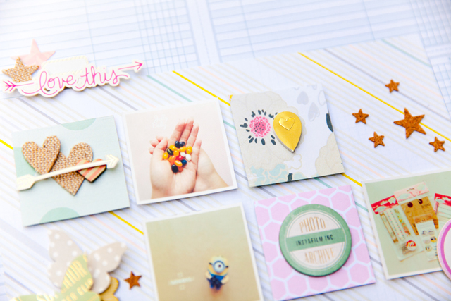
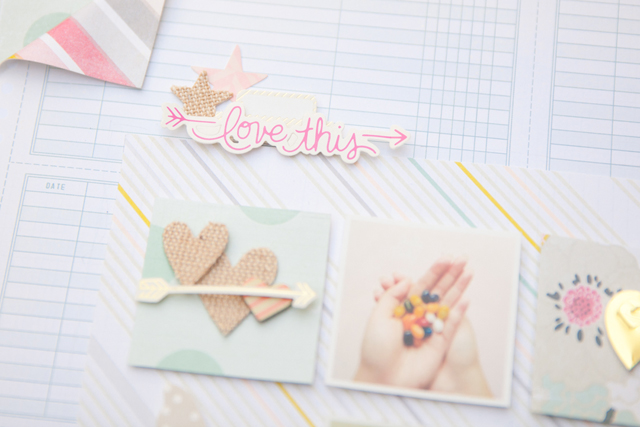
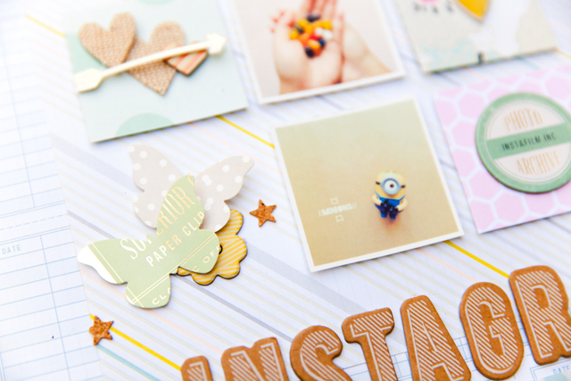
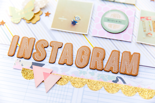
And here my finish layout. I created a layout about my instagram photos.

I change some of the details based on the sketch and I think it's ok. First, I only use three photos here and the rest of it i choosed pretty papers to company my photos. I cuted into square shape and decorate it using pretty embellishments. I pop up all of the photos and square papers to give some dimension.

I also change the tittle, I prefer to paste my tittle in the middle of the page and this time I didn't do the journaling part. The bold tittle using brown thicker is enough to pop up the page it self and also to describe it.
To play along this week and for a chance to win $5 to spend at CTK store, upload your projects based on this week sketch to the CTK gallery.You have time until Oct 5th and please include "Sketch 9/28" in the description.
Saturday, September 27, 2014
Let's get Digital with Jen Chapin
Hi there and happy Saturday! Today I am here to share a free cut file as well as some layout inspiration for you using the September scrapbook kit.
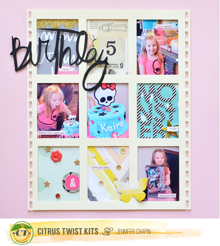
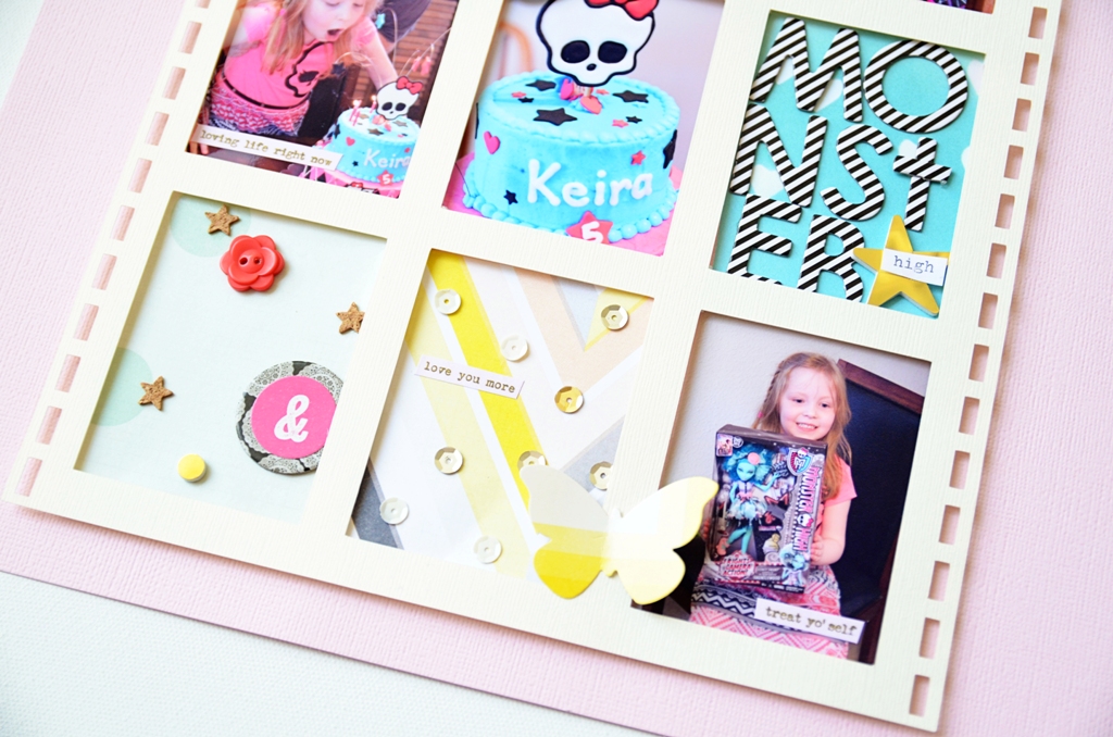
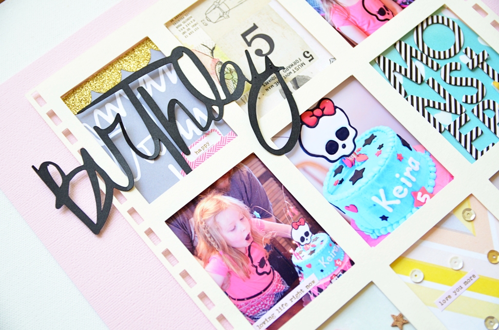
I used foam squares to pop up the frame once I cut it out of vanilla cardstock. Then I printed my photos and added them to the insides of the frame.

I added some embellishments to the insides of theframes that didn't have photos. And since the top corner looked a little bare, I added a silhouette cut in black that says birthday. (you can find this file at Kerri Bradford's website)
Thanks for stopping by today! If you make something with the file, I would love to see it! Post it in our new Facebook group - CTK Fan Page.
Sunday, September 21, 2014
Sunday Sketch with our Guest Designer Elena
I usually use one picture on my layouts but the truth is that narrating a story through a layout is easier if we use two or more photos. And I had those two photos of my daughter playing with her "friends " in bed which were perfect.
I liked the sketch very much and that's why I decided to follow it from the beginning to the end. Two photos with title above and the journaling on the right.
I intended to trim the white space of the photo paper but decided not to, because I like adding embellishments on my photos but those two were rather small. So I scattered the cork stars-one of my favorite elements of the kit- at the bottom.
Then I added the title and I loved how the letters and the stars framed the two colorful photos in the middle.
Then there was the journaling. I don't journal often on my pages and this time I didn't have an important story to tell ,except for a cute, happy moment to capture
So instead of writing something I used the CT sets of stamps, the SC Brighton Pier tiny word stickers(pink and gold is one of my favorite color combos these days) and the wood chip arrows describe the feelings. And they did a great job!
To play along this week and for a chance to win $5 to spend at the CTK Store, upload your projects based off of this week's sketch to the CTK Gallery. You have until September 13th and please include "Sketch 9/7" in the description.
Saturday, September 20, 2014
How to Photograph your Layouts with Jen Chapin
Hi there! Jen Chapin here and today I am going to share a photography post with you. One of the most common questions I get is, "how do you photograph your scrapbook pages?" I'm going to walk you through my process.
You will want to find an area in your home that has nice indirect light. I prefer to photograph my layouts during the daytime as natural light shows colors best and whites at their whitest. For me, this is in my front foyer. I choose a time of day when the light isn't shining directly in the door and place my layout on a white canvas. I stand over the layout and photograph straight down.
For those of you using a DSLR, my settings for this photo were as follows: f4.5, 1/100, ISO 160. I prefer to use my 17-55 2.8 lens as I can zoom in and out, but a fixed 35 or 50mm lens works as well. The key here is not lowering your aperture too far. If you use a lower f-stop, your layout may be in focus in the middle and blurry around the edges. Also try to use a shutter speed fast enough to compensate for camera shake, unless you are going to use a tripod. If you have good light, an ISO of 160-200 is adequate. Remember, the higher you set your ISO, the more grain you will have so try to keep it in the lower range.
Stand straight above the layout and shoot. I take about 5-6 photos so I know that I will have at least one good shot!
Here is the image straight out of the camera. As you can see, it is a little dark, but the main thing I am going for here is that the image is straight and the details are sharp. We will fix the lighting when we edit.
After opening my layout in Photoshop (I am currently using PSE10), I use the crop tool to crop out the white background. You can also take this opportunity to straighten the layout if needed.
Next I adjust the levels. Push CTRL+L and the levels box will pop up. Move the sliders until the desired level of lightness is achieved. You can also click on the little droppers and click on the corresponding color in your photo to correct the color. For example, if I wanted to correct the white balance, I would click on the white dropper then click on the whitest part of my page.
I also use RadLab, which is a plug-in that can be used with Photoshop and Lightroom. I then open the layout here and add a few filters to sharpen, increase the saturation and the lighting.
And here is the finished layout. What a difference, right?
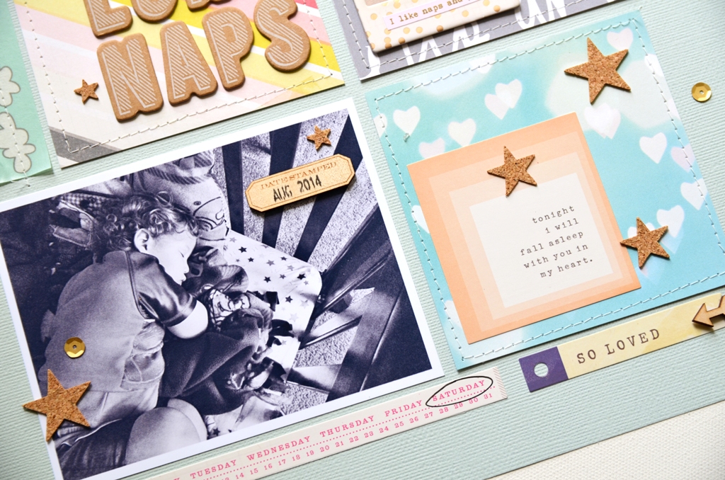
I also like to take a few detail shots. For these I get down right next to the layout and shoot a few pictures with a lower aperture, typically f2.8. I like to do this so you can see the dimension in the embellishments that I've used.
Stitching always shows up beautifully too.
Thanks so much for stopping by today! I hope you have a little more confidence now in taking great pictures of your layouts. If you have any questions, leave them in the comments. Have a great day.
You will want to find an area in your home that has nice indirect light. I prefer to photograph my layouts during the daytime as natural light shows colors best and whites at their whitest. For me, this is in my front foyer. I choose a time of day when the light isn't shining directly in the door and place my layout on a white canvas. I stand over the layout and photograph straight down.
For those of you using a DSLR, my settings for this photo were as follows: f4.5, 1/100, ISO 160. I prefer to use my 17-55 2.8 lens as I can zoom in and out, but a fixed 35 or 50mm lens works as well. The key here is not lowering your aperture too far. If you use a lower f-stop, your layout may be in focus in the middle and blurry around the edges. Also try to use a shutter speed fast enough to compensate for camera shake, unless you are going to use a tripod. If you have good light, an ISO of 160-200 is adequate. Remember, the higher you set your ISO, the more grain you will have so try to keep it in the lower range.
Stand straight above the layout and shoot. I take about 5-6 photos so I know that I will have at least one good shot!
Here is the image straight out of the camera. As you can see, it is a little dark, but the main thing I am going for here is that the image is straight and the details are sharp. We will fix the lighting when we edit.
After opening my layout in Photoshop (I am currently using PSE10), I use the crop tool to crop out the white background. You can also take this opportunity to straighten the layout if needed.
Next I adjust the levels. Push CTRL+L and the levels box will pop up. Move the sliders until the desired level of lightness is achieved. You can also click on the little droppers and click on the corresponding color in your photo to correct the color. For example, if I wanted to correct the white balance, I would click on the white dropper then click on the whitest part of my page.
I also use RadLab, which is a plug-in that can be used with Photoshop and Lightroom. I then open the layout here and add a few filters to sharpen, increase the saturation and the lighting.
And here is the finished layout. What a difference, right?
I also like to take a few detail shots. For these I get down right next to the layout and shoot a few pictures with a lower aperture, typically f2.8. I like to do this so you can see the dimension in the embellishments that I've used.Thanks so much for stopping by today! I hope you have a little more confidence now in taking great pictures of your layouts. If you have any questions, leave them in the comments. Have a great day.
Friday, September 19, 2014
Pocket Life with April
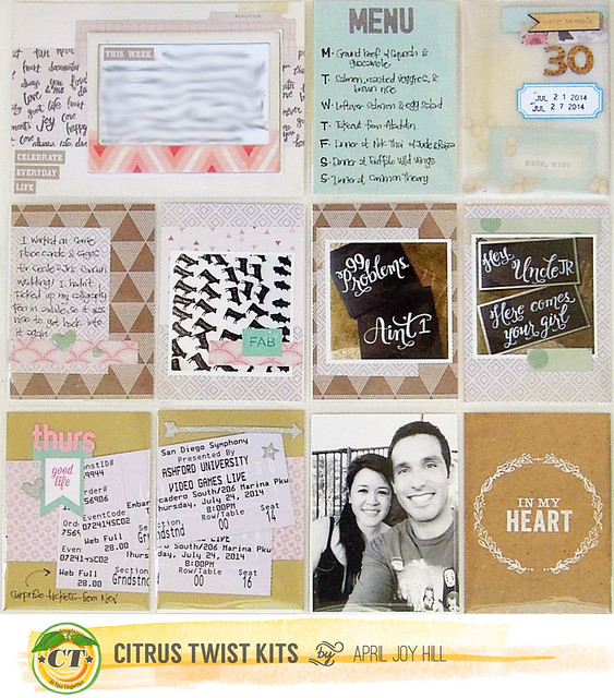
Happy Friday, CTKers! This month we got a glimpse of the new Pocket Life kit packaging and I've got to say, I loooove it! The muslin bag was perfect in holding this month's kit while I was still working with it and it made it so easy to carry my supplies around the house (since I don't have a dedicated workspace).
Anyway, I'm here to share my Pocket Life Week 30! This was a busy week for me, so this ended up being a three page spread.
The first of three pages:
The vellum envelope filled with gold sequins that came in the PL Embellie kit was perfect, so I used it as my weekly title card with the wood veneer from this month's kits plus an alpha from my stash.
The second and third pages:
Left side:
I only use a Canon Selphy to print photos, so the biggest photos I can print are ~6x4, but I wanted to incorporate this panoramic photo of my family. To do this, I took my photo and edited it so that it printed one side to 4x6 and then the other side of the photo to a second 4x6.
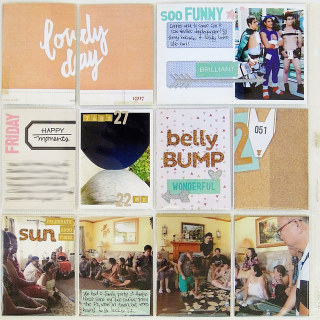
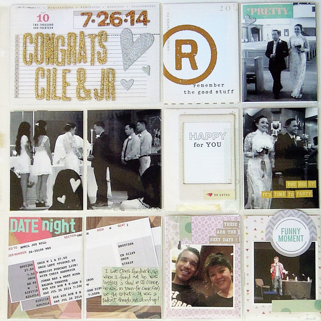
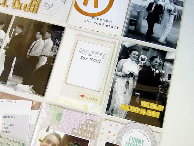
Right side: I used the glitter alphas from the Aug Main Kit to help document my friend's wedding.
I tried something different with how I photographed my spreads this month. I usually take all the cards out of the pockets when I take my photos and then put them back in, but it was just sooo time consuming. I tried Stephanie Bryan's trick on photographing her spreads upside down to avoid a glare and I'm pretty pleased with the results. What do you think?
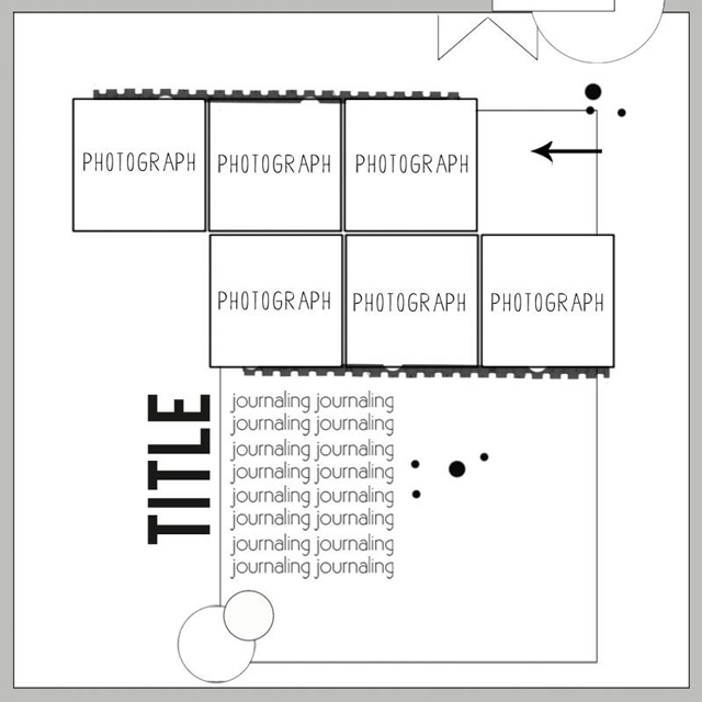
Oh, and of course, here are your sketches:
Anyway, I'm here to share my Pocket Life Week 30! This was a busy week for me, so this ended up being a three page spread.
The first of three pages:
The vellum envelope filled with gold sequins that came in the PL Embellie kit was perfect, so I used it as my weekly title card with the wood veneer from this month's kits plus an alpha from my stash.
The second and third pages:
Left side:
I only use a Canon Selphy to print photos, so the biggest photos I can print are ~6x4, but I wanted to incorporate this panoramic photo of my family. To do this, I took my photo and edited it so that it printed one side to 4x6 and then the other side of the photo to a second 4x6.
Right side: I used the glitter alphas from the Aug Main Kit to help document my friend's wedding.
I tried something different with how I photographed my spreads this month. I usually take all the cards out of the pockets when I take my photos and then put them back in, but it was just sooo time consuming. I tried Stephanie Bryan's trick on photographing her spreads upside down to avoid a glare and I'm pretty pleased with the results. What do you think?
Oh, and of course, here are your sketches:
Tuesday, September 16, 2014
Tuesday tutorial with Nathalie
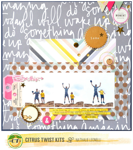
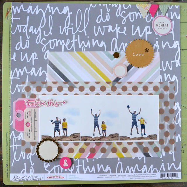
Hi there! I am here today to share one of the pages I created with the September main and embellishment kits as well as a tutorial:
KITS USED: September 2014 "Free Spirit" main kit and "Spread your wings' embellishment kit
NON-KIT ITEMS: yellow paper from a previous kit, navy card stock and DMC thread from my stash
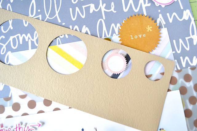
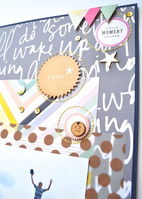
I will share now my low-tech tutorial for stitching perfect circles around circle embellishments. I loved all the different Crate Paper stickers from the embellishment kit and I spread all the circle ones on the diagonal on my page:
The next step consisted in getting all my circle punches out and punching a scrap of card stock in different sizes:
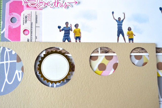
I placed my "template" around each sticker choosing the size I wanted to stitch and then pierced my background as evenly as I could - no need to really stress about it though:
So it looked like this around each sticker:
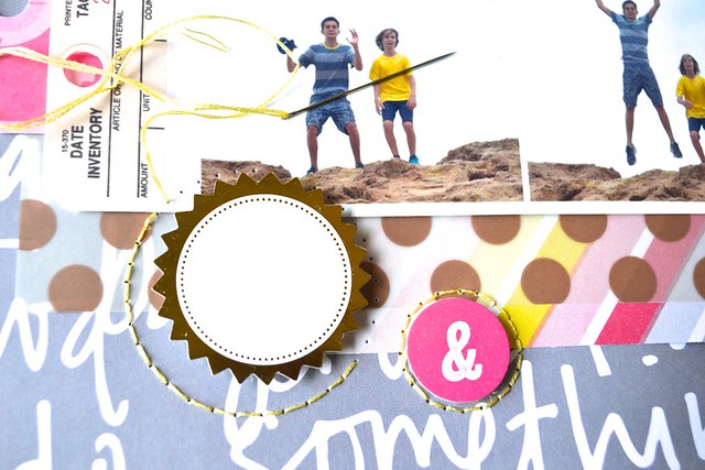
Using a backstitch, I then stitch with two strands of DMC thread:
And here are close-ups of all the finished circles:
...and one last look at the finished page:
I love to stitch on my pages and I hope that this little tutorial will inspire you to get those needles and threads out!
Subscribe to:
Posts (Atom)