Hi everyone, it's
Janine here with this month's edition of 'Let's Get Digital'!
I am always
excited when I am doing a blog post, and this time I am even more so. Because
we are going to show you three possibilities to use the files, I had the
pleasure to create for this feature, as well as some additional journaling card
cut files that Emma created!
I am going to
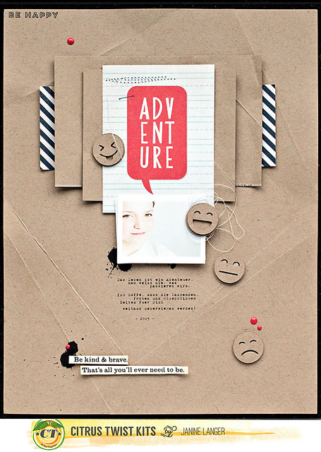
start with the files and the layout that I created using them:
Normally the
planning of my layouts starts with the photo and story I want to tell. This is
one of the few layouts that started with an embellishment. And this embellishment
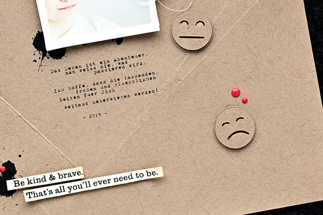
was a sticker from this month's Embellishment Kit 'Little Old You'. Its colors are black and cream and
it says 'Be kind and brave. That's all you'll ever need to be.' That's an
amazing quote, isn't it?
It somehow led me
to the thought that my son is going to go through a lot of moods in his life.
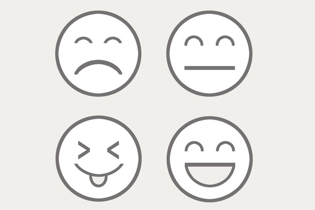
Neutral, happy, sad, cheeky, angry - all these and a lot of more. So I decided
to create a layout, maybe giving him some advice, with this sticker. But I also
wanted to emphasize all the different moods that he will be going through. What
to do? My idea was then to create some different emojis, that could be used as
digital stamp brushes and/or could be easily transformed into cut files ...
Now I had the
sticker and the emojis. But which photo to use?
I already knew
the journaling was going to be an advice and wishes for him and his future life
that says:" Life is an adventure. You will never know what is going to
happen. I hope and pray that the laughter and happy times will outweigh the sad
times."
So I decided to
go with a photo of my son laughing. Well - he is 12 and on most of the recent
photos he is not laughing, not even smiling. He is cool.
But then I found
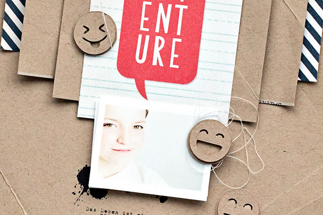
a photo I took about two weeks ago, when he asked me to take a picture of him
sitting on his new couch in his room. And there he was smiling, yeah! I had to
crop the photo, so only his face was showing, because I wanted his smile to be
in focus, and not his room, and I really like the way it turned out. :)
The layout came
together rather quickly, once I had the photo, the sticker and the emojis. The
journaling I wanted to use led me to the journaling card of a cut apart patterned
paper from this month's Main Kit
that says 'Adventure' on it. That's a no brainer, it fit perfectly!
I turned the
emojis into a cut file, cut them out of kraft cardstock and then again backed
them up with another piece of kraft cardstock.
As the layout is quite simple and needed a bit more interest and dimension, I folded the kraft cardstock (that I used for the background and for layering) a few times and then stuck them under a pile of books for an hour to get them really flat again.
As the layout is quite simple and needed a bit more interest and dimension, I folded the kraft cardstock (that I used for the background and for layering) a few times and then stuck them under a pile of books for an hour to get them really flat again.
I added some
splatters, string, stitching and enamel dots … that's it!
But that's not it
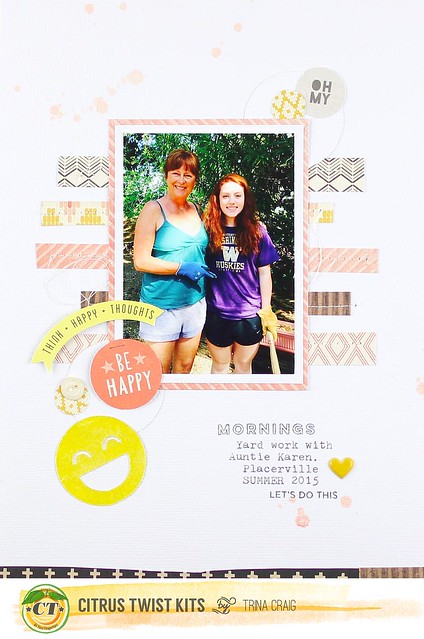
for today, because Trina also created a layout using the emoji files!
She also turned
them into cut files and made a beautiful 6x8 layout, using this month's PL kit.
Isn't it
absolutely gorgeous with its paper strips, stitching, stamping and layering?
Love it!
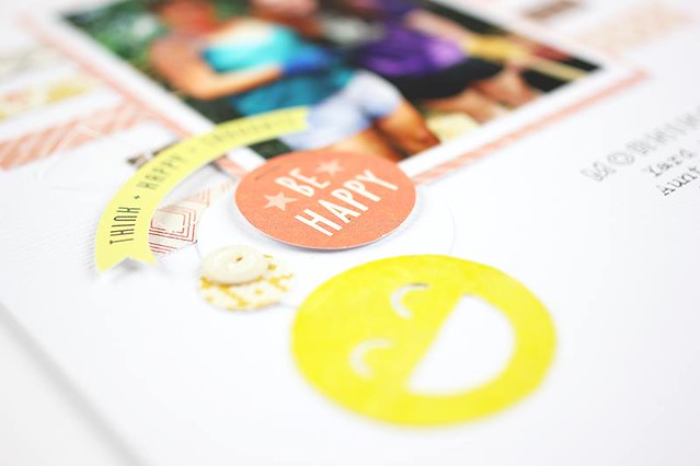
She also painted
the emoji with Aladine iZink ink (yellow) and it really does pop!
And - there's
even more! I'm so excited to show you Emma's layout and the cut-files she
created.
----------------------------------------------------------------------------------------------------------------------
Hi everyone!
Super excited to be joining Janine and Trina for today's blog post and working
with the super cute emoji digital file Janine created! How can you not love them?! :) I thought it would be fun to try these in a
couple ways; the first being the most obvious, a layout and the second, create
some Pocket Life cards!
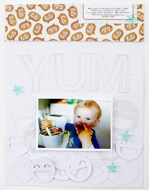
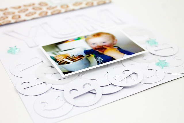
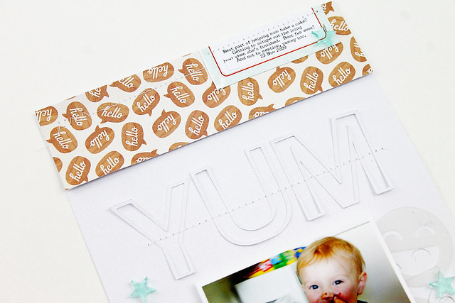
For my layout I
wanted to have a bunch of them layered at the bottom of my page so I cut two of
the faces at different sizes, think I ended up with around 10 of each - mostly
cut out of white cardstock but a few out of vellum too.
The title is also
cut with the Cameo, it's a digital stamp (from Kellie Stamps) and I just traced
it to create the cut file (super easy to do this in the Designer Edition with
any PNG file). For the top of my page I
went with the "hello" talk bubble paper from the Pocket Life kit
because with all those faces down the bottom, it seemed fitting :)
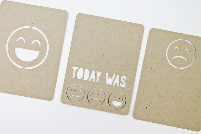
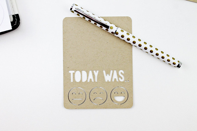
The Pocket Life
cards were simple too - just drew up a couple rectangles (went with rounded
corners but you can easily just draw your own square cornered rectangles if
that's your preference!) - added the faces and set some joins so the faces
didn't fall out of the cards once cut.
There are so many
other options for using these cute little faces on your cards; I can definitely
see myself going back and using them again (and again..).
-----------------------------------------------------------------------------------------------------------------------
Wow, isn't this
great? Thanks so much for joining in with me, Trina and Emma! And I know I'm
definitely going to use those adorable journaling cards on future projects. :)
To get your hands
on the emojis and journaling card cut files, just join us on our Citrus Twist Kits Facebook Fan Page
where you'll be able to find it as a download.
We hope you
enjoy! And we would love to see how you use them, so be sure to link your
project up in the gallery, in the comments or on the Fan FB page!

Awesome work girls!!! :-) love it!!
ReplyDelete