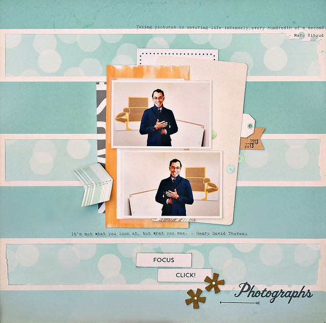
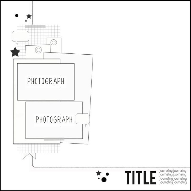
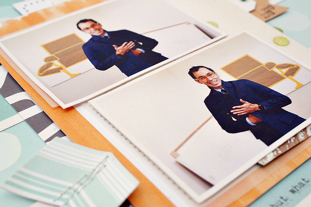
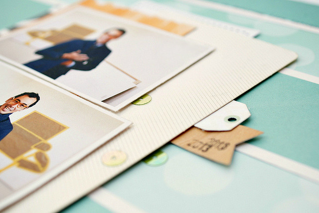
Hi everyone, I'm excited to share another layout based on Kasia's sketch for March. Using two 2.5"x3.5" photos I stuck pretty close to the sketch. What's interesting about this page is the background which is a combination of two October Afternoon pattern papers : Focus and Click! both from this month's Main Kit. To get a tone-on-tone look I cut out rectangle windows in the white panels and matt them with the tiffany blue bokeh paper. Other than the background, everything else I used is from the Add-On Kit.


To play along with our sketch challenge, upload your layouts to the gallery by March 22nd to get your name in a draw to win a $5 GC to the store. When uploading to the gallery you can name it as you would normally but please include "Sketch 03/16".


No comments:
Post a Comment