Hello, and happy Tuesday, everyone! Melissa here with your weekly tutorial, and today I'm going to walk you through my process for putting this two-page layout together, using the February kits from Citrus Twist.
I started off by choosing a background and briefly considered using two different papers- one patterned and one cardstock. I've used this type of design before, and it works quite well as long as you use something- like strips of patterned paper that span both sides- to tie the two pages together.
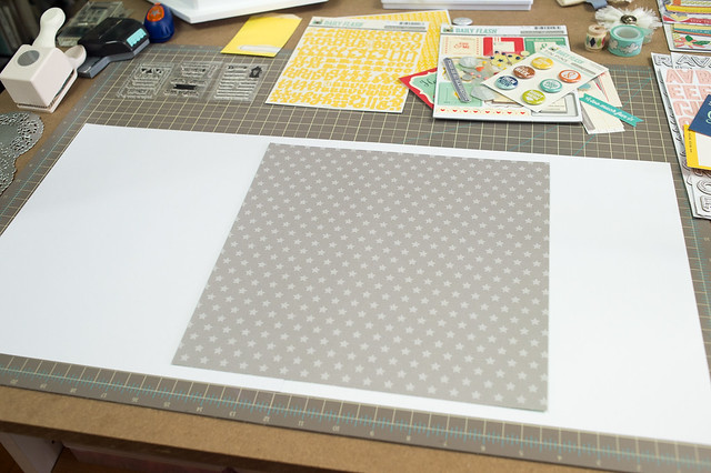
I have another layout with a similar mismatched background in this same album, though, so I opted instead to cut the gray star paper down to 11.5" x 11.5" and have it span two sheets of white cardstock, making it the element that ties the background together.
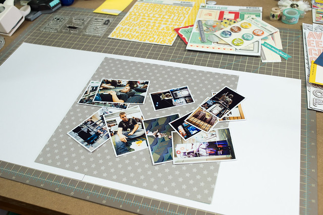
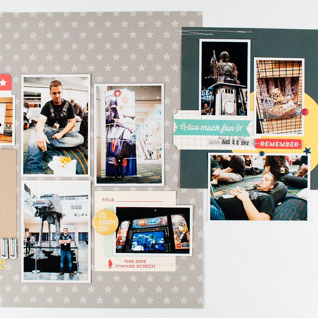
This pile of photos doesn't really have a story behind it- they're just random shots from a day at a Star Wars convention- and I wanted to put them all on one layout to be a wrap-up for the "Day 1" section of the album (I was there for four days!).
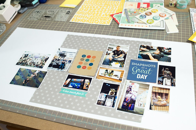
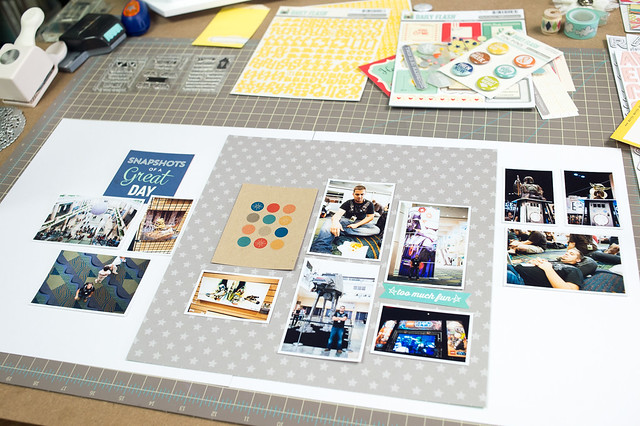
The hardest part of a two-page layout for me is the photo arrangement, and I went through three different ones before landing on one that I liked. I started with a large group of photos off to the right, with fewer on the left so I'd have room for my title and journaling. At this point I also picked up a card from the Pocket Life kit and a piece from one of the cut-apart sheets to work in with my photos.
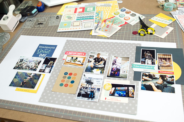
I wasn't entirely happy with the first arrangement, so I tried again, this time going for more of a loose grid that ran in a line across the center of the page. This time I felt like everything was just kind of sitting in the middle with nothing to lead the eye across the page, so I tried one more time...
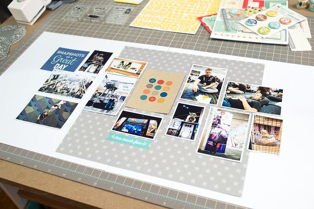
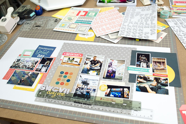
...and came up with this! The photos in my final arrangement are grouped in sections, and the trio of groupings flows in a loose diagonal up from the bottom left to the top right.
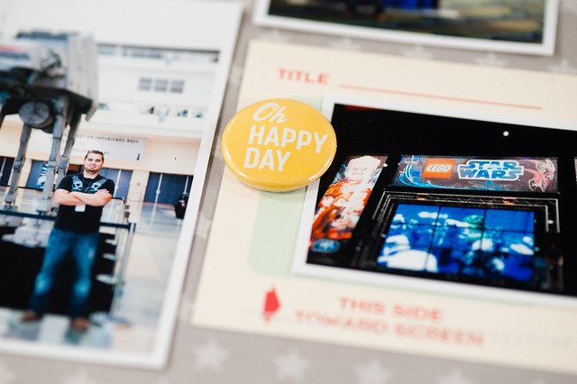
I was finally happy with the photo placement, so I moved on to the next step- adding patterned paper and embellishment layers around and behind the photos. This is the step where you can fill in any awkward gaps in your photo arrangement with little tags, tabs, and more pieces from cut-apart sheets. I also worked a piece of paper from the 6x6 pad in the Pocket Life kit onto the page.
With the basic structure in place, I added my title and a few more embellishments, including the start of a little cluster on the top left. I also worked in one more piece of 6x6 patterned paper under the bottom left cluster of photos.
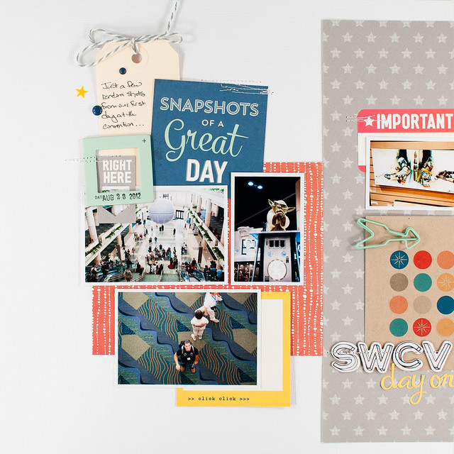
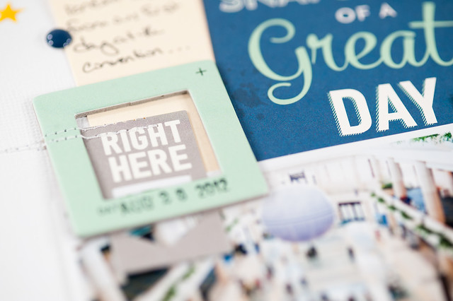
After that, it took just a few more tiny pieces and some journaling to finish the layout off!
I never really start a two-page layout with a plan, and I generally follow these basic steps every time I make one. I've found that once I find a pleasing photo arrangement, the rest of it comes together quickly!



I am a fan of your double page layouts and this one is no exception! You make it look so easy but I could be stuck on the photo arrangement for hours if not days!
ReplyDeleteThis is great! I just had to Pin It!!
ReplyDelete