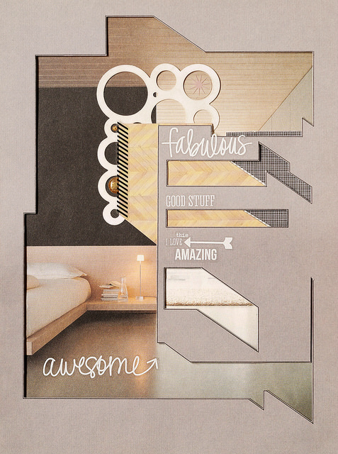
Today's Be Inspired post is about how I take the trends of geometry and cut-out shapes to the next level. I don't own a die-cutting or an electronic-cutting machine. That means I either use pre-cut shapes like this Jillibean circles placemat from the May PL embellishment kit or I hand cut my own. I love browsing through architectural photography magazines and websites for unusual geometric silhouettes which can be translated into cool designs for my scrapbook pages.

When I use a complex cut-out I like to keep everything else simple. Here I place a large photo from an Italian furniture design showroom under my cut-out. My journaling consists of word phrases from the Simple Stories Photo Sticker Sheets that you'll find in the May PL Kit. To create a focal point around the journaling, I juxtapose two different patterns underneath the cut-outs in that area : a wood grain and a B&W check. In keeping with the minimal vibe, I embellish sparsely with two gold enamel dots (from the May Main Kit) and an acrylic star (from the May Add-On Kit).
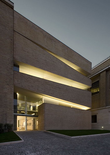
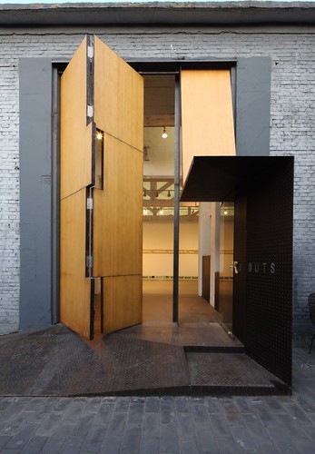
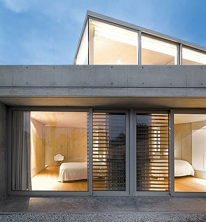
Here are some examples of architectural photography which influenced my layout :

Pontificial Lateran University Rome

Studio X Beijing

Rainha Houses Portgual


No comments:
Post a Comment